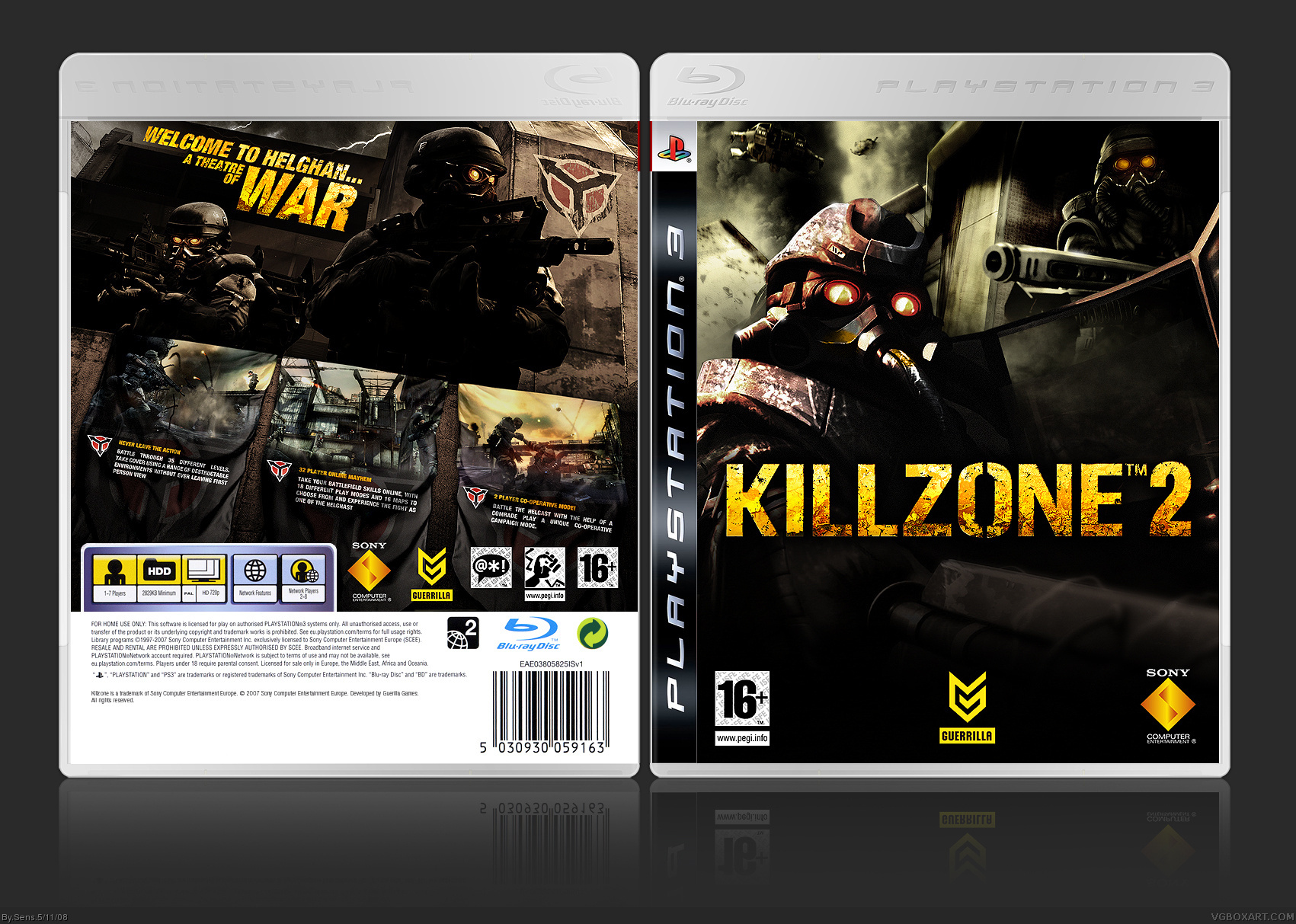
Wow, this turned out very nicely. A few more elements on the front would be nice; the empty space on the bottom is bothering me a bit.
The back is pretty much flawless and is that a custom logo I see? Great job overall. :)
You could've been more crafty and added the main characters (Sev, Rico - there is even some artwork of him from the first game) but since you were using screenshots in the first place and KZ2 is probably the only game where you could pass the screens as CG artwork.
Still that doesn't really take away anything from it. ;)
#21, Yeah looks even cooler, i was gonna use that image of the ISA, but it just didn't really fit right for me, so i scraped it. I like your take on it, looks more complete now!
Edit: Also, whats up with the HoF thing on the right? taking after Mad Spike? :D
#22, Thanks, No Just wanted to have a little more continuety between my designs so im going to frame them this way I think it's a little more subtle than mad spike's. ^_^
 Killzone 2 Box Cover Comments
Done!
[ Reply ]
..................
I am speechless. Best K2 box on the site.
BTW, Sens, get on MSN nao. =D
[ Reply ]
DAMN!
[ Reply ]
Wow, this turned out very nicely. A few more elements on the front would be nice; the empty space on the bottom is bothering me a bit.
The back is pretty much flawless and is that a custom logo I see? Great job overall. :)
[ Reply ]
Ace
[ Reply ]
Excellent -- love it! Also nice that there's no sign of the main characters on the box ;)
[ Reply ]
I now officially proclaim you my bitch. Go make me some money :P
[ Reply ]
#7 he was my bitch first! Back off!
*catfight*
[ Reply ]
You could've been more crafty and added the main characters (Sev, Rico - there is even some artwork of him from the first game) but since you were using screenshots in the first place and KZ2 is probably the only game where you could pass the screens as CG artwork.
Still that doesn't really take away anything from it. ;)
[ Reply ]
I'm surprised this is getting lesser attention than my GoW box.
More comments, people!!!
[ Reply ]
Jeez...
[ Reply ]
Hall of Fame rightaway!
This really makes me prowd I'm Dutch.
[ Reply ]
Back cover is incredible. Very very cool!
Front cover is not so cool, as for me. But fits the overall design.
+ Fav
[ Reply ]
damn this looks awesome, Sens your are great! +Fav! also for the heck of it, why didnt you use the new orange KZ2 logo that looked like metal?
Edited at 1 decade ago
[ Reply ]
I just shat myself in amazement that earns u a fav
Edited at 1 decade ago
[ Reply ]
#14, I always like to bring a little something fresh to the table!
Oh snap, just got HoF thanks guys! ^_^
Edited at 1 decade ago
[ Reply ]
I envy you.
[ Reply ]
oh... hoa... wha... uh... but... why??!
[ Reply ]
Holy cwap
[ Reply ]
Damnnn....
[ Reply ]
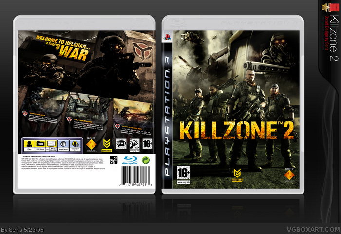
Ok so i've updated the front, I feel it gives a more balaced look to the cover as a whole.
[ Reply ]
#21, Yeah looks even cooler, i was gonna use that image of the ISA, but it just didn't really fit right for me, so i scraped it. I like your take on it, looks more complete now!
Edit: Also, whats up with the HoF thing on the right? taking after Mad Spike? :D
Edited at 1 decade ago
[ Reply ]
#22, Thanks, No Just wanted to have a little more continuety between my designs so im going to frame them this way I think it's a little more subtle than mad spike's. ^_^
[ Reply ]
Wow, updated version looks awsome!
[ Reply ]
oh my god... i think this is a contender for "best box ever made". And I never say that!
[ Reply ]
...and that, children, is what you call the best Killzone 2 box on the site.
[ Reply ]
OMG... wtf is wrong with me. I never even noticed this amazing box art. Dude, it's pretty ace alright.
[ Reply ]
And now, it is perfect. +fav
[ Reply ]
Best box ever. 6/5.
[ Reply ]
Front is quite generic but good but the back is wow. I really love it particularly the tagline
[ Reply ]
wow +fav
[ Reply ]
Edited at 1 decade ago
[ Reply ]