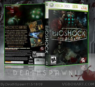
Alright, this would be a remake of my old Bioshock box link
please view printable (uploading in a few seconds) and full view please.
ALSO: a lot of work put into editing the big daddy on the front.
Edit Comparison:
Very cool and it has a grim feeling. I can't help but notice how close the description text is to the end but you can push that a bit more to the right.
Great work... really love the front. Amazing work there.
Not a big fan of the back.. too much black space for me.. I actually prefer your old back cover.
 BioShock Box Cover Comments
Alright, this would be a remake of my old Bioshock box
link
please view printable (uploading in a few seconds) and full view please.
ALSO: a lot of work put into editing the big daddy on the front.
Edit Comparison:
Edited at 1 decade ago
[ Reply ]
Excellent. Very good! It's alot darker than the original.
[ Reply ]
Looks ace.....as Nerdy said much darker an it fit's the game better ;P.
[ Reply ]
Ryan cums in 3..2..1..
[ Reply ]
#4, are you sexually frustrated or are you videogameboxartophile? :P
[ Reply ]
#4, Nah, it's really not that good.
[ Reply ]
Really stunning. :D
Edited at 1 decade ago
[ Reply ]
wow, didn't get much attention =/
thx to the people that actually commented though.
[ Reply ]
Hey I like this. The darkness of it makes it really interesting to look at. Like you have to search for something. Very cool.
BTW my Toki Tori box didn't get much attention either. I feel for you.
Edited at 1 decade ago
[ Reply ]
Very cool and it has a grim feeling. I can't help but notice how close the description text is to the end but you can push that a bit more to the right.
[ Reply ]
Where are all ye foos getting the Bioshock font from? I thought it was, like 60 bucks. Steven, you mind telling me on AIM or something?
By the way, I'm really digging the whole dark scheme going on. Really makes you feel alone and helpless. Great job on this one.
Edited at 1 decade ago
[ Reply ]
Alrighty then.
[ Reply ]
Great work... really love the front. Amazing work there.
Not a big fan of the back.. too much black space for me.. I actually prefer your old back cover.
[ Reply ]
that is awesome
7/5 :D
i love the font and the way you mixed elements together.
I want to be as good as you when I grow up.
[ Reply ]
Looks awesome.
#11, link
^That's the free version.
[ Reply ]
#15, thx dude, I already gave him the fonts though (completely legal ones of course (no lie)).
[ Reply ]
HoF is this boxes destiny.
Don't let it down.
[ Reply ]
Two Hall of Fames in a row. Congratulations.
[ Reply ]
Love this. +Fav and congrats on HoF. Isn't that font the Sonic 3 font?
[ Reply ]
Hurray! Where's rank 9? >_>
#19, You wish.
Edited at 1 decade ago
[ Reply ]
WOO!!! Two halls ^_^
Thanks guys =)
[ Reply ]