This has got an interesting color palette and arrangement. You've got potential.
Things I don't like are undersized company and PEGI logos on the front, the white outside the templates and on the character. Also some more parts of the template are messed up for example the rating box and barcode on the back.
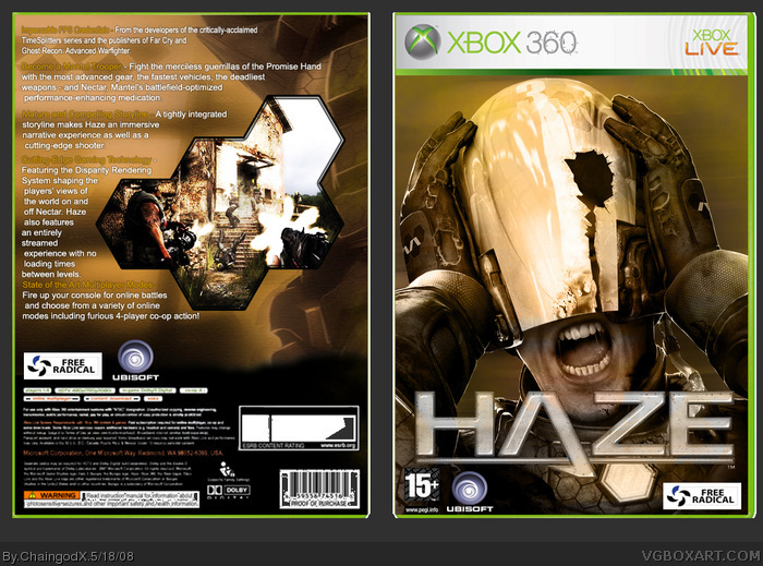
 Haze Box Cover Comments
Woo, really overlooked. This is great fora first.
[ Reply ]
This has got an interesting color palette and arrangement. You've got potential.
Things I don't like are undersized company and PEGI logos on the front, the white outside the templates and on the character. Also some more parts of the template are messed up for example the rating box and barcode on the back.
Edited at 1 decade ago
[ Reply ]
Cheers for the comments, I'll update it soon enough.
Sometimes you don't actually notice the flaws till there up i guess.
[ Reply ]
Wow. I love the color scheme and simplistic design choices. A shamefully overlooked box.
[ Reply ]