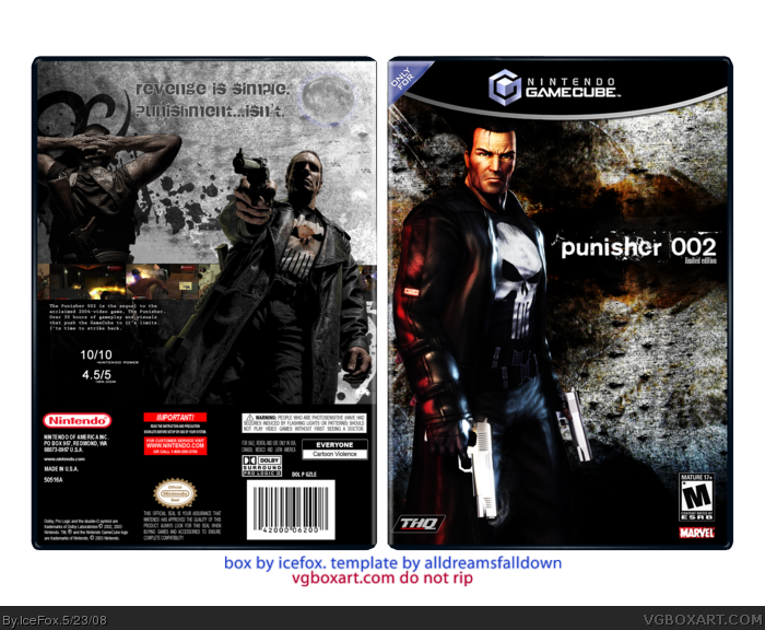
It's cool, I like it a lot, but it could use some improvement:
*Template's choppy. Not your fault, but it is.
*The ESRB/Dev logos look weird where they are.
*IGN rates on a scale of 10. =P
*You spelled "its" wrong.
*The perspective of the Punisher and his victim on the back is a little wonky. Maybe if you moved Punisher over to the left a smidge?
1. It's not that choppy...
2. I know, I just based it on the temp and liked how it turned out.
3. It's just a Haze joke.
4. I make typos like that all the time :P I'll fix it if I fix anything else
5. It's not supposed to look like that.
 The Punisher 2 Box Cover Comments
"I like Ike." ~ Indiana Jones and the Kingdom of the Crystal Skull
Ok...view it at this link if you can:
link
Edited at 1 decade ago
[ Reply ]
OK.
It's cool, I like it a lot, but it could use some improvement:
*Template's choppy. Not your fault, but it is.
*The ESRB/Dev logos look weird where they are.
*IGN rates on a scale of 10. =P
*You spelled "its" wrong.
*The perspective of the Punisher and his victim on the back is a little wonky. Maybe if you moved Punisher over to the left a smidge?
[ Reply ]
1. It's not that choppy...
2. I know, I just based it on the temp and liked how it turned out.
3. It's just a Haze joke.
4. I make typos like that all the time :P I'll fix it if I fix anything else
5. It's not supposed to look like that.
[ Reply ]
IceFox is cool.
[ Reply ]
My only gripe is that I hate the way you designed the tagline, other than that, stylish =D
[ Reply ]
Thanks.
*very disappointed with the amount of views*
[ Reply ]
Bumped for fun. :)
[ Reply ]
I like it.
[ Reply ]
Front is great, but the back could use some improvements :)
[ Reply ]
#1, lol. Nice quote.
I like it a lot, but something just doesn't seem right...
[ Reply ]