Well everything is excellent, I particularly like how you went for "atmosphere" this time and decide to "forgo using blood."
So...the only thing that bothers me (and also takes a lot from the atmospheric feel) is the blood in your sig. The calm darkish blue is very pleasant, and then...the out of place red sig totally destroys the feel- which is also the main reason why I vary my sig style for each of my box...everything in the presentation is supposed to complement and not take away from the box's feel.
But don't think that changes my opinion of this boxx.
It's frackin' awesome. (Battlestar ftw!)
I actually really love the front, and the way the back matches the almost "peaceful" mood it all has.
If it isn't in the Hall, it isn't. There's no need to have everyone fave it... and plus, once it's in, you'll all just go to the next best one and bump that to fucking death.
I wish I'd seen this sooner. This is my favorite Dead Space box, because of the fact you actually did NOT use blood! Awesome layout and great color scheme, as always.
 Dead Space Box Cover Comments
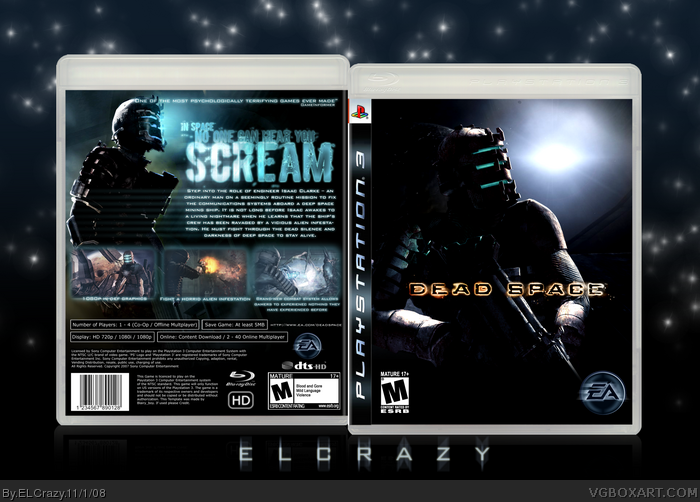
For this one, I decided to forgo using blood. I wanted to create something that was atmospheric, but creepy.
I will start on my comp box, I swear. =P
Cred to blairy_boy for the awesome temp and Ryan for the EA logo^_^
Enjoy! (:
Edited at 1 decade ago
[ Reply ]
Front=to much black
Back=BEAST
Edited at 1 decade ago
[ Reply ]
Nice job man!
fav +author fav
[ Reply ]
I love the back.
[ Reply ]
Thanks for crediting me for the EA logo.
Also, you spelled experience wrong. =P
Edited at 1 decade ago
[ Reply ]
Nice, I love the way you made the tagline look. The gameinformer quote bugs me though, "most scariest", did they really say that?
Edited at 1 decade ago
[ Reply ]
#6, The game hasn't been released yet.
#7, yea yea yea =P
[ Reply ]
In that case you should take out the "most".
[ Reply ]
#8, Well, it does not need to be accurate or realistic, you know.
[ Reply ]
#9, I know, it was just a suggestion.
[ Reply ]
#10, Yeah I know. Thanks anyway (:
[ Reply ]
ELCrazy and his damn pornography. *shakes head*
lmfaololrofl.
;)
[ Reply ]
Pretty cool, i love the tagline too.
[ Reply ]
#12, I told you I'll stop soon. It's too damn addictive. B00b1es....=P
Thanks guys! (:
[ Reply ]
im not in love with the front but i am with the back! nice job :)
Edited at 1 decade ago
[ Reply ]
Elcrazy FTW!!!!
[ Reply ]
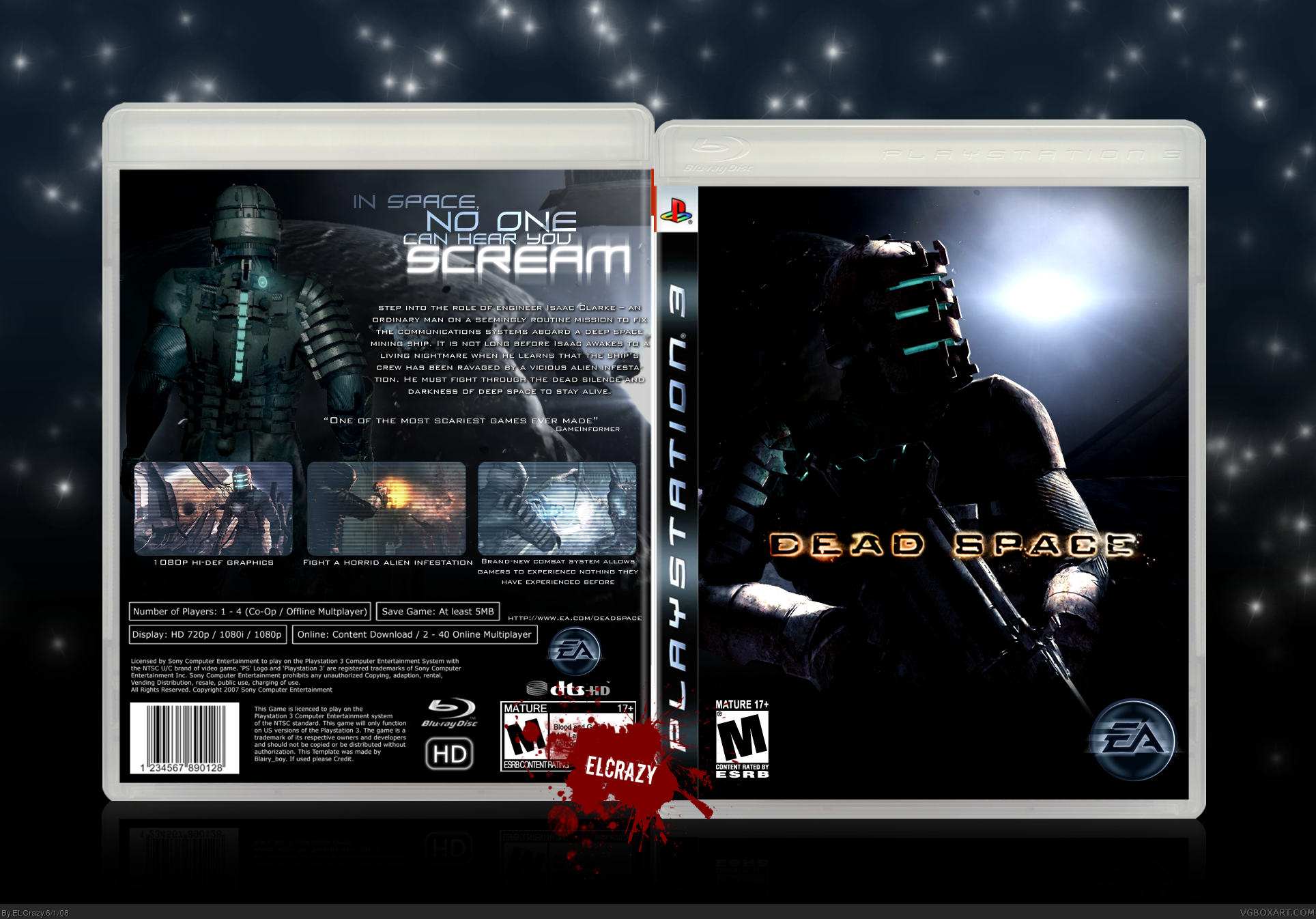
Well everything is excellent, I particularly like how you went for "atmosphere" this time and decide to "forgo using blood."
So...the only thing that bothers me (and also takes a lot from the atmospheric feel) is the blood in your sig. The calm darkish blue is very pleasant, and then...the out of place red sig totally destroys the feel- which is also the main reason why I vary my sig style for each of my box...everything in the presentation is supposed to complement and not take away from the box's feel.
[ Reply ]
#17, gotta agree on the sig thingy.
But don't think that changes my opinion of this boxx.
It's frackin' awesome. (Battlestar ftw!)
I actually really love the front, and the way the back matches the almost "peaceful" mood it all has.
[ Reply ]
#17, Fully agree with ya. I was in a hurry, I think, which is why I just pasted my usual sig. I think this one looks miles better.
[ Reply ]
Atmospherically awesome. Could do with more favs.
[ Reply ]
#19, Absolutely perfect. Does make quite a lot of difference for such a small element, eh? lol
+fav (deserves HoF, come on guys)
[ Reply ]
@17, I was going to say the same. The exact same thing bothered me on his Viewtiful Joe box. As for the box, now it's perfect. +fav
Edited at 1 decade ago
[ Reply ]
Goodness sake.
Only 15 favs? Let's go people, send this to where it belongs.
to VGBA Happy Land, ofcourse. :]
[ Reply ]
#23, =P
Thanks for the support, and I was really surprised, because I thought this hasn't been my best in quite a while.
[ Reply ]
After much consideration, fav. It is a good box I think.
[ Reply ]
hey, love this- really atmospheric. what's the font?
[ Reply ]
#26, For the tagline, it's Zero Hour. For the text, it's Bank Gothic. (:
[ Reply ]
nice, fav
[ Reply ]
Meh. It's not the best I've seen from you, but worth a fave.
[ Reply ]
Amazing box, my friend.
I shall return in 3 days if this isn't in the Hall.
[ Reply ]
I cannot believe this isn't in the Hall.
[ Reply ]
You dumb idiots.
[ Reply ]
If it isn't in the Hall, it isn't. There's no need to have everyone fave it... and plus, once it's in, you'll all just go to the next best one and bump that to fucking death.
[ Reply ]
#32, Is that suppose to be tongue-in-cheek? It's not funny.
[ Reply ]
Maybe my fav will put it in?
[ Reply ]
Updated! With a better and more badass (I think) back.
[ Reply ]
Badass box, nice use of the Alien tagline too. +fav
[ Reply ]
So good and much better now that you really got that feel spot on. Nice job, Dan. ;)
[ Reply ]
Holy shit.
[ Reply ]
There's really nothing to say. This box manifests words on its own, and they say: "I rock".
[ Reply ]
I wish I'd seen this sooner. This is my favorite Dead Space box, because of the fact you actually did NOT use blood! Awesome layout and great color scheme, as always.
[ Reply ]
Thanks guys! (:
#41, Sometimes the most effective way towards a horror box is to not use blood at all :p
[ Reply ]