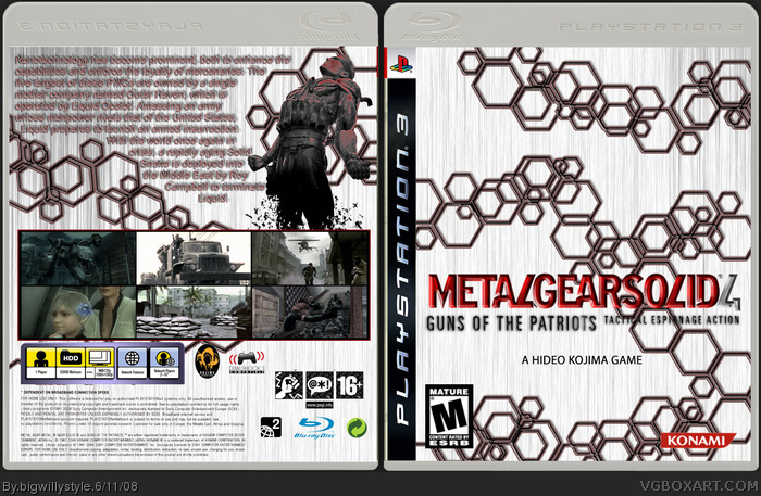
all screen shots, render and logos wernt by me. everything else is by me did have it with a render of snake on the front but i wasnt sure let me know if anyone wants to see it with snake on the front.
the idea is a simple one because i want it to have a minimulistic feel
the pattern on the front with the shapes is suppose to represent the nanotechnologies within the PMC soldiers of the game incase anyone was wondering
 Metal Gear Solid 4: Guns Of The Patriots Box Cover Comments
kinda plain but i like that, the text is quite hard to read looks very blurred try a more defining colour, possibly less screenshots? but me likey.
[ Reply ]
all screen shots, render and logos wernt by me. everything else is by me did have it with a render of snake on the front but i wasnt sure let me know if anyone wants to see it with snake on the front.
the idea is a simple one because i want it to have a minimulistic feel
the pattern on the front with the shapes is suppose to represent the nanotechnologies within the PMC soldiers of the game incase anyone was wondering
Edited at 1 decade ago
[ Reply ]
if you zoom in you can see it clearly its just because the text is small
Edit:...have got rid of the drop shadow on text so it is clearer
Edited at 1 decade ago
[ Reply ]