[ Buy Ninja Gaiden 2 at Amazon ] By ...I am what I am... 3 on June 13th, 2008 No Printable Available Ninja Gaiden 2 Box Cover Comments Comment on ...I am what I am...'s Ninja Gaiden 2 Box Art / Cover. Cancel Reply ...I am what I am... 3 [ 1 decade ago ] yoyo what ya guys think? got the game n like it so i thout id make a cover for it. took awhile feedback please. :) [ Reply ] ...I am what I am... 3 [ 1 decade ago ] please anyone leave a comment! [ Reply ] CruSadEr 10 [ 1 decade ago ] It's nice, I already faved it, but it would look neat in 3-D! :D [ Reply ] Soundwave 38 [ 1 decade ago ] not bad.. but there are some problems.. The pic on the left of the back cover is really blurry. The Ninja render on the front is a bit off (mainly his head). 18 logo is a lttle choppy and blurry. Other than that it's good. 3.9/5 [ Reply ] Macedonia Mafia 3 [ 1 decade ago ] A bit low-res but I like what you did with the back. Fav [ Reply ] ...I am what I am... 3 [ 1 decade ago ] thanx guys i dont know how to do 3D stuff any help? any more feedback? [ Reply ] Redhedd 13 [ 1 decade ago ] #6, Google IMANDIX. Then download it. [ Reply ] ...I am what I am... 3 [ 1 decade ago ] is it free? you like my box #7? [ Reply ] Redhedd 13 [ 1 decade ago ] #8, It's free alright. And yeah, it's a good box. Just use a better font for the description. [ Reply ] Jtvisionworld 1 [ 1 decade ago ] Yeah I rele like the back a lot more then the rest but the front doesnt maytch it in any way rele. Also the spine isnt quite to my taste but whatever I would maybe make the screens a little bigger and more clear and the text up more and smaller. Good box dood 4/5 [ Reply ] bloo11 1 [ 1 decade ago ] awsome serious man awsome Edited at 1 decade ago [ Reply ] Ray Blade 40 [ 1 decade ago ] That back, is so sick... [ Reply ]
 Ninja Gaiden 2 Box Cover Comments
yoyo what ya guys think? got the game n like it so i thout id make a cover for it. took awhile feedback please. :)
[ Reply ]
please anyone leave a comment!
[ Reply ]
It's nice, I already faved it, but it would look neat in 3-D! :D
[ Reply ]
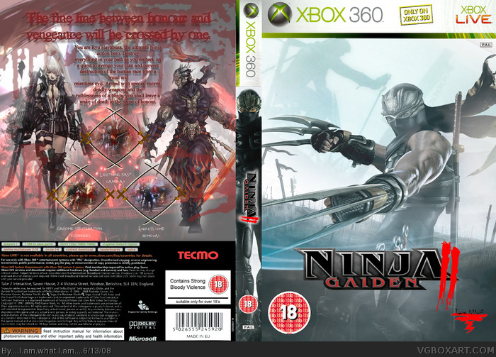
not bad.. but there are some problems..
The pic on the left of the back cover is really blurry.
The Ninja render on the front is a bit off (mainly his head).
18 logo is a lttle choppy and blurry.
Other than that it's good. 3.9/5
[ Reply ]
A bit low-res but I like what you did with the back.
Fav
[ Reply ]
thanx guys i dont know how to do 3D stuff any help? any more feedback?
[ Reply ]
#6, Google IMANDIX. Then download it.
[ Reply ]
is it free? you like my box #7?
[ Reply ]
#8, It's free alright. And yeah, it's a good box. Just use a better font for the description.
[ Reply ]
Yeah I rele like the back a lot more then the rest but the front doesnt maytch it in any way rele. Also the spine isnt quite to my taste but whatever
I would maybe make the screens a little bigger and more clear and the text up more and smaller. Good box dood 4/5
[ Reply ]
awsome serious man awsome
Edited at 1 decade ago
[ Reply ]
That back, is so sick...
[ Reply ]