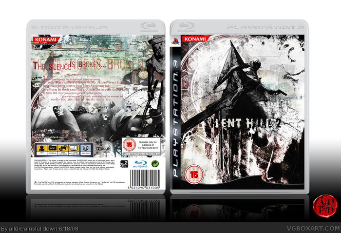
@#22, I agree with you. The crytpic nature of some elements in the box is what makes it soo much more appealing. Its ADFD's style which is absoulutely his own.
I love the front cover. Its one of the best horror covers I've seen. The back would've been sublime with better font and color choices, but it still compliments the front well.
I also agree you should've used a better temp plastic/casing. The one you are using seems out-dated, especially in comparison to the ones made by Shadysaiyan, Techne and Sens.
Well I see that, DMS & LK, but I think the cryptic, abstract nature could be preserved even with the logo slightly more visible, but its ADFD's artistic choice. I love the design choices on the front, but an average consumer might want to be able to see what the game is with just a glance. Regardless, the box is very effective in conveying the horror feel, so by all means, leave the front as is.
Eagerly waiting for the update! :) And congrats on HOF!
I hadn't faved you as an author until now! You certainly deserve it though. Arthouse designer = fav.
See, that's what I was talking about. The actual artwork on the cover. (You know, "Coverart.") I didn't ask "who edited someone else's artwork into a cover?"
Now that that's clear, where'd the artwork you used for James come from? (Official art? Deviantart? Another series entirely?) I'm pretty curious, since it doesn't look like James (Due to the hair.)
#41, Sorry I misunderstood. I found it while googling Silent Hill 2 material, I don't who it's by or where it's from. It's probably not James but it was too perfect for the style I was after. Gald you like it though :)
Okay, I actually loved it, but haven't commented on it. It's freakin, freakin, FREAKIN awesome. One of my favorite styles in GFX is grunge and abstract. And splatter. ;) Anyway, really nice box, the back is awesome, the front is awesome, the characters on the front are awesome, the text on the back is awesome, absolutely EVERYTHING is awesome. :D Definitely a fav.
 Silent Hill 2 Box Cover Comments
First comment! That's really nice! :D
Edited at 1 decade ago
[ Reply ]
Sorry for double post! :)
Edited at 1 decade ago
[ Reply ]
Credit to XCore for the template.
[ Reply ]
AWsome
[ Reply ]
Great box!
[ Reply ]
Awesome! Nice to see a good box after all the spam we've been getting lately.
[ Reply ]
I was thinking of using that Pyramid Head pic when I do a SH2 box. :3 How can I not fav this?
[ Reply ]
Woah, someone with the highest calibre on the site used my template! Well I like the box, and I don't see any flaws so hey, why not a fav?
[ Reply ]
*eats*
[ Reply ]
Yum!
[ Reply ]
this must be a Hall of Fame
[ Reply ]
-hands you a small red dot on a cushion-
[ Reply ]
I don't care if it only has like 66 points, this needs HoF now!
[ Reply ]
*hugs*
Edited at 1 decade ago
[ Reply ]
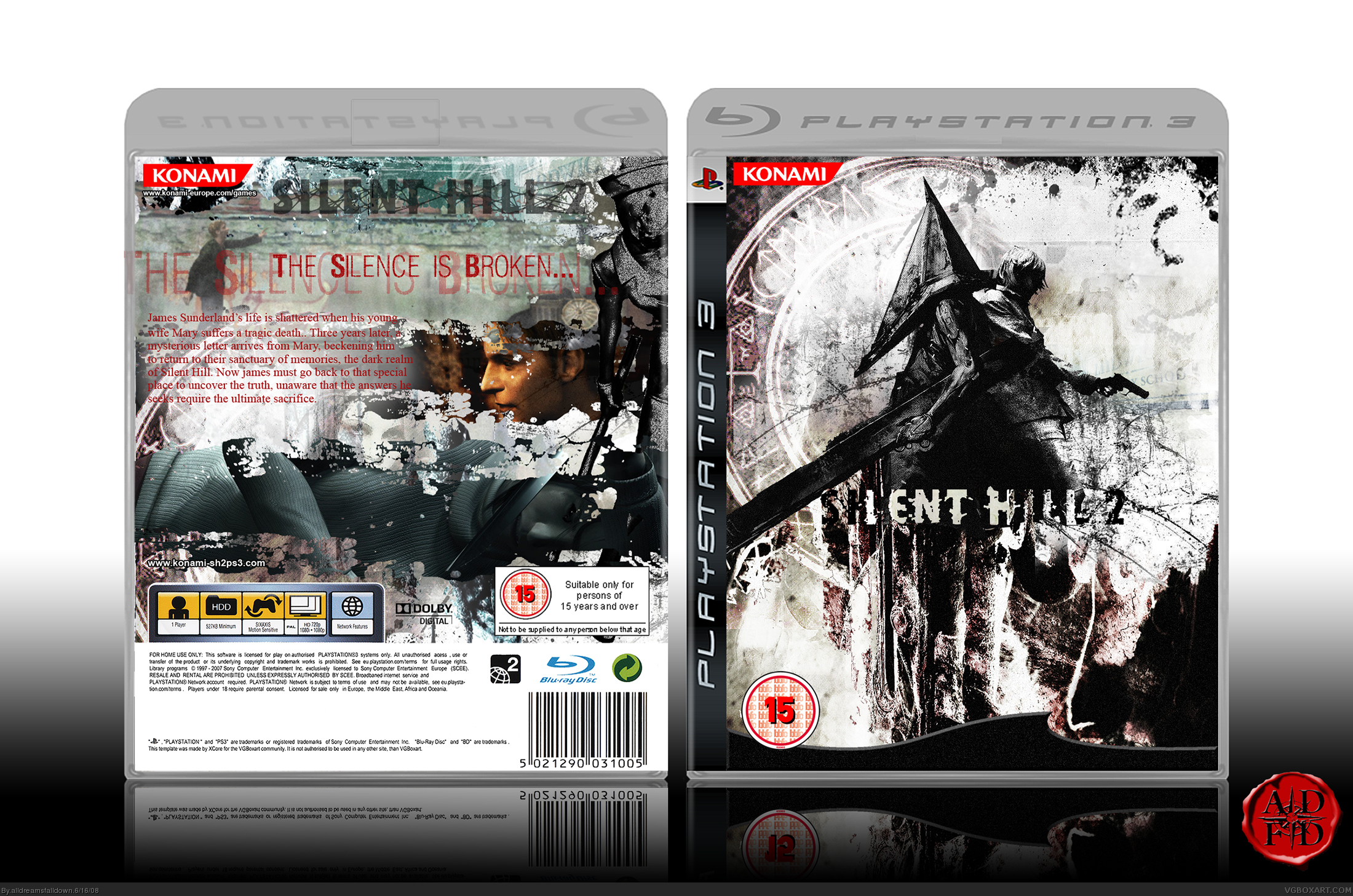
While this old temp is fugly as ever, the box itself is fantastic!
[ Reply ]
It's f'awesome. I especially like the front logo. :)
[ Reply ]
Temp is meh and the logo is hard to see, but everything else is nice. :)
Change the synopsis font/color to mesh more with the box's grungy look.
[ Reply ]
looks great
[ Reply ]
2 words.. Seriously Sweet!! +fav
[ Reply ]
What's wrong with the temp? I tried to get Techne's temp but the links on his template thread don't seem to go anywhere.
#17, The synopsis text is always my weak point.
Edited at 1 decade ago
[ Reply ]
Amazing but it would be better if it was a collector's edition and I can barely see the logo on the front. 4/5
[ Reply ]
#17 & #21, that's the style the logo is supposed to be, atleast probably what adfd was going for here.
I think it's actually very effective, especially in context to the game.
[ Reply ]
I have a thing for slightly unreadable text, don't know why :)
[ Reply ]
uh, oh, that intense feling of rot, I like it :p
[ Reply ]
Whats wrong with my temp? The front is I dunno but the back is mine, so whats wrong with it?
[ Reply ]
Holy Shit that box is great
[ Reply ]
this has so much style and amazing design points! Es Increible!
[ Reply ]
e?! douyatte tsukutta no desu ka?! OMG! HOW DID YOU MAKE THIS?!
5 / 5! Gujjobu! GOOD JOB! =D
[ Reply ]
Holy lovable shit knockers of God... what did I miss while I was gone?
[ Reply ]
AWESOME! Best cover i have ever saw!
[ Reply ]
#25, Your temp is great, but I think they meant the casing.
[ Reply ]
@#22, I agree with you. The crytpic nature of some elements in the box is what makes it soo much more appealing. Its ADFD's style which is absoulutely his own.
I love the front cover. Its one of the best horror covers I've seen. The back would've been sublime with better font and color choices, but it still compliments the front well.
I also agree you should've used a better temp plastic/casing. The one you are using seems out-dated, especially in comparison to the ones made by Shadysaiyan, Techne and Sens.
[ Reply ]
I'm not going to lie or be modest, I love the way the front came out :D I'm going to rework the back a little and use a better temp casing.
[ Reply ]
Well I see that, DMS & LK, but I think the cryptic, abstract nature could be preserved even with the logo slightly more visible, but its ADFD's artistic choice. I love the design choices on the front, but an average consumer might want to be able to see what the game is with just a glance. Regardless, the box is very effective in conveying the horror feel, so by all means, leave the front as is.
Eagerly waiting for the update! :) And congrats on HOF!
I hadn't faved you as an author until now! You certainly deserve it though. Arthouse designer = fav.
Edited at 1 decade ago
[ Reply ]
Where'd that cover art come from?
[ Reply ]
errrrmm.......me?
[ Reply ]
You drew it yourself?
[ Reply ]
#37, link
Don't know where the other came from.
[ Reply ]
[Update] Additional credit to Techne for the plastic casing.
[ Reply ]
#39, Much better. Looks more official.
Edited at 1 decade ago
[ Reply ]
#38, Thanks.
See, that's what I was talking about. The actual artwork on the cover. (You know, "Coverart.") I didn't ask "who edited someone else's artwork into a cover?"
Now that that's clear, where'd the artwork you used for James come from? (Official art? Deviantart? Another series entirely?) I'm pretty curious, since it doesn't look like James (Due to the hair.)
Anyway, great job.
[ Reply ]
#41, Sorry I misunderstood. I found it while googling Silent Hill 2 material, I don't who it's by or where it's from. It's probably not James but it was too perfect for the style I was after. Gald you like it though :)
Edited at 1 decade ago
[ Reply ]
really really cool
[ Reply ]
Okay, I actually loved it, but haven't commented on it. It's freakin, freakin, FREAKIN awesome. One of my favorite styles in GFX is grunge and abstract. And splatter. ;) Anyway, really nice box, the back is awesome, the front is awesome, the characters on the front are awesome, the text on the back is awesome, absolutely EVERYTHING is awesome. :D Definitely a fav.
[ Reply ]
This is great, I don't even like this game (very much, good game tho)
But I would so get it if this is what I was getting!
[ Reply ]
This is amazing, and I love the idea on the front!
[ Reply ]
Great!
[ Reply ]