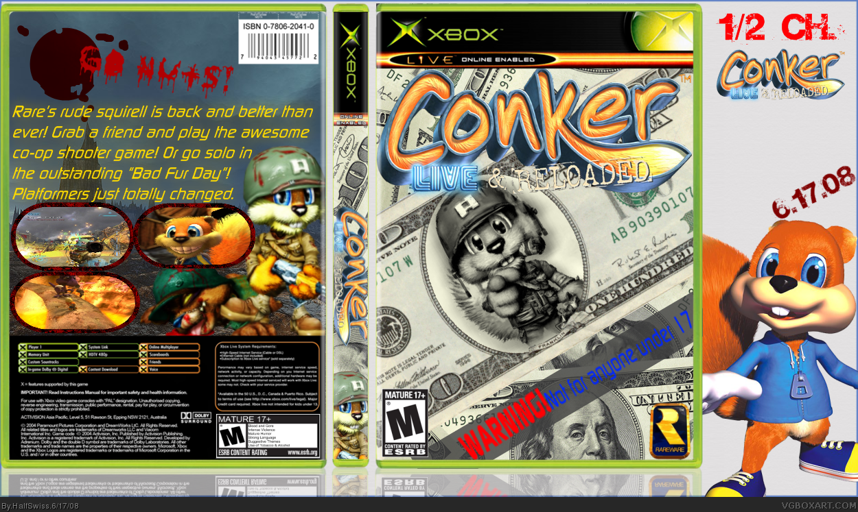
I'm not sure about the rest of the box, but I really liked the concept of my front so I uploaded it.
CREDIT:
Screenshot borders - Ninty
Logo - Rokudaime
Template - ElCrazy and Star89er
That bar on the front is really not needed.
Also, the screenshots on the back look really ugly around the border and the text is or seems too bright and doesn't fit the background. Sorry but 3/5
Make the "reloaded" part of the logo more visible. The rareware logo is also a bit too close to the temp- bump it up a bit. Strengthen the front focus more and lastly...don't overdo the presentation- there are too much distracting elements on the canvas.
Looks really great! Although can I suggest rather just removing the back from version 1, why not try improve it and make it better? Could really enhance the front =)
#16, I would but I seriously suck at backs. I can never find a good background, make a good background, get a good color, find a good font, make good space for evenly sized screenshots, and it pretty much fails every time...
#17 Ahh you remind me of the old me lol. Seriously, I use to be like you (Check out my Sonic:Mountain Rescue back) but the only way to get better is too keep on practising mate =)
Well you could try adding a back, but if you feel that would only ruin it, then it's best that you wait until you practice some more. Anyway, I'm really glad you listened to the suggestions. ^^

 Conker: Live and Reloaded Box Cover Comments
I'm not sure about the rest of the box, but I really liked the concept of my front so I uploaded it.
CREDIT:
Screenshot borders - Ninty
Logo - Rokudaime
Template - ElCrazy and Star89er
[ Reply ]
I think the front rocks
[ Reply ]
That bar on the front is really not needed.
Also, the screenshots on the back look really ugly around the border and the text is or seems too bright and doesn't fit the background. Sorry but 3/5
Edited at 1 decade ago
[ Reply ]
UPDATE! V2: Back and spine removed, WARNING bar removed, Anti-rip tape added.
#2, I liked my front, not so much for the back.
#3, there's one on the official, but I don't like mine anyway...
Edited at 1 decade ago
[ Reply ]
Much better. fav
[ Reply ]
#5, I don't see the fav. But thanks.
EDIT: Now I do.
Edited at 1 decade ago
[ Reply ]
That's actually not bad. +fav
[ Reply ]
lovely fav
[ Reply ]
#8, you didn't fav.
[ Reply ]
Well, I hated V1, but I love V2. Good job HalfSwiss.
[ Reply ]
#10, thanks. That makes 26 points in just 5 fav's. =)
Anyone else?
[ Reply ]
Really cool concept here yo. Nice work.
[ Reply ]
#12, thanks. What can I improve on?
[ Reply ]
Make the "reloaded" part of the logo more visible. The rareware logo is also a bit too close to the temp- bump it up a bit. Strengthen the front focus more and lastly...don't overdo the presentation- there are too much distracting elements on the canvas.
[ Reply ]
#14, I think I fixed it all but the logo. I tried recoloring it, but then it looked really choppy. =/ It it better now, though?
Sorry for the bear overlapping the box. I wanted to prevent ripper just in case...
[ Reply ]
Looks really great! Although can I suggest rather just removing the back from version 1, why not try improve it and make it better? Could really enhance the front =)
[ Reply ]
#16, I would but I seriously suck at backs. I can never find a good background, make a good background, get a good color, find a good font, make good space for evenly sized screenshots, and it pretty much fails every time...
[ Reply ]
#17 Ahh you remind me of the old me lol. Seriously, I use to be like you (Check out my Sonic:Mountain Rescue back) but the only way to get better is too keep on practising mate =)
[ Reply ]
Much better now, good job. :)
[ Reply ]
#18, 'cept (no offence to your old self) I'm not that bad.
Anyone hae some tips on making back s in Paint.NET?
EDIT: #19, anything else to improve?
Edited at 1 decade ago
[ Reply ]
Well you could try adding a back, but if you feel that would only ruin it, then it's best that you wait until you practice some more. Anyway, I'm really glad you listened to the suggestions. ^^
[ Reply ]
#21, thanks a lot, LK. =)
Anyone else?
[ Reply ]
Why is the "live" part of the logo in the sega font?
[ Reply ]
#8, Oh sorry forgot to fav
[ Reply ]
#23, That's the official logo for the game.
[ Reply ]
#20, have a look at some real game cases and look at the layouts and stuff. works for me.
[ Reply ]
#23, it's the official logo.
#26, I'll try. Btw, when will you be done using Conker as your avatar?
[ Reply ]