Is that your template?
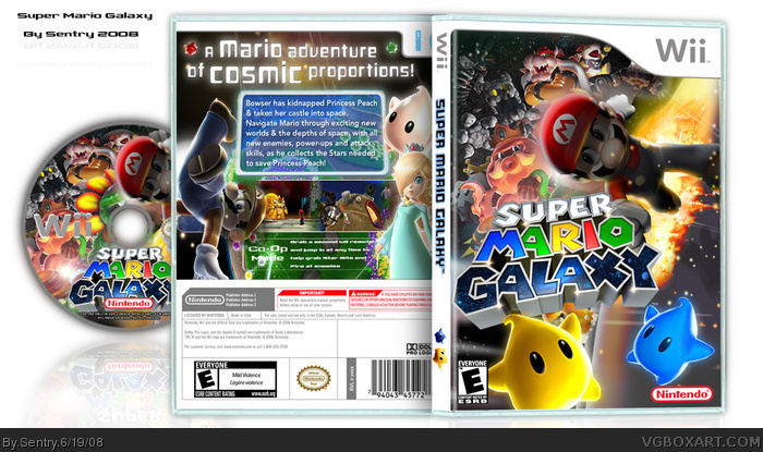
The front is really good I give that a 9/10. Some parts are blurry.
The back needs a little more work. 7/10. I think there should be much more description. Anyway I'll fave.
Its really nice but there are a few things I dislike:
- I dont like the template, the spine looks wierd and whats with the blue outline?
- I dont like how Mario is so dark, especially compared to the logo
- I dont like the layout or design of the back, the text looks wierd and the screenshots do also
te desriction is a bit lacking, and i think i v'e seen the mario pic done like that, so if you didnt make it credit whoever did
(not like you ddnt already know that)
ps. dis should be hof
 Super Mario Galaxy Box Cover Comments
I think it's my best, what do you think
[ Reply ]
AWESOME!!
[ Reply ]
Is that your template?
The front is really good I give that a 9/10. Some parts are blurry.
The back needs a little more work. 7/10. I think there should be much more description. Anyway I'll fave.
[ Reply ]
HOLY GOD! thats awesome! love the front, and the backs... even better! it kills the official box! btw, RASENGAN BOI IS BACK EVEROBODY!
[ Reply ]
woooo i love it
[ Reply ]
Fantastic, but as #3 said the back needs some work.+Fav
I think this box needs more attention
Edited at 1 decade ago
[ Reply ]
Pretty 5/5 +fav
[ Reply ]
Its really nice but there are a few things I dislike:
- I dont like the template, the spine looks wierd and whats with the blue outline?
- I dont like how Mario is so dark, especially compared to the logo
- I dont like the layout or design of the back, the text looks wierd and the screenshots do also
Overall, nice effort 3/5
[ Reply ]
Whoa.
[ Reply ]
Front is awesome. Back is too plain IMO
[ Reply ]
The front is kickass but the back is unappealing i'll still fav it
[ Reply ]
the back should be fixed up
though this style is cool
[ Reply ]
te desriction is a bit lacking, and i think i v'e seen the mario pic done like that, so if you didnt make it credit whoever did
(not like you ddnt already know that)
ps. dis should be hof
Edited at 1 decade ago
[ Reply ]
#4, Oh joy
[ Reply ]
Yes, it is your best. OMG
[ Reply ]
#4, ...Who?
Anyway, probably the most original Galaxy box on the site, very niecly done.
[ Reply ]
#4, HOLY GOD! THAT IS AWESOME not.
[ Reply ]
Sentry is in da hou--oh, oh, he's gone now. :|
Me is bad at jokes. >_>
[ Reply ]
*Updated
I updated the back and added a disc.
I hope this gets into the HoF now
Edited: Oh, I almost forgot #13 I credit Google for giving me the pic of Mario.
Edited at 1 decade ago
[ Reply ]
Nice update, good job Sentry
[ Reply ]
awsome. ( fav )
could u give me the font u used 4 the back?
[ Reply ]
#21, I'm sure you can find the font at dafont-dot-com
Edited at 1 decade ago
[ Reply ]
I feel weird asking this, but wheres my HoF
[ Reply ]
O_o
Dayyyyyum.
[ Reply ]
Wow, v2 is winsome.
[ Reply ]
i really like it i just dont like the disc very much cuz u used the same picture as on the front of the box.
[ Reply ]
AMAZING
[ Reply ]
O______________________O
[ Reply ]
*looks at official box, looks at art, rips the official cover, places sentrys version in* awesome
[ Reply ]
Like what they said,back needs some work.
I love the front,very epic.
[ Reply ]