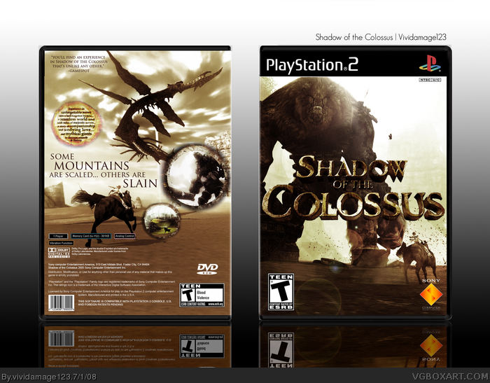
Okay this took alot of hard work, the front I spent a while on trying to find the perfect balance of color and I think I achieved it, the back I used a different pic than the average SotC box, its a dragon type Collisi(I think).... The most trouble I had was the logo, words cant explain (thanks Qwerty lol) how long it took me to render this and I think i completed it very well, besides that credit to numero for the temp and thats all ENjoy
The front is looking much better, though still a tad high in contrast. I also think the light is overdone and very bright- the lens flare filter usually always leaves the wrong impression of light so I should have advice against its use earlier.
The back design is nice and neat. I wish you could have blended the edges of the circular screens/description elements better. Minor nitpick, but still important is the inaccuracy in parts of the back game info (barcode/memory card info etc etc) and their placing. Once again, what killed it for me is the high saturation/contrast. If you've played the game, it's actually very low in saturation.
#2- Haha, you're welcome.. for not rendering the logo. XD
Anyways, I really like the balance of the front. The clouds on the back could use some work so the scene looks more open, and the saturation could still use some tweaking, but overall this is a solid entry from you. :)
#8, Your right it does.... but everyone did the box the same so you cant simply post on mine that they all look the same but I appreciate that because it does but with Vivi touches here and there
#11, lol your right.... Im not completly satisfied with this box while it toook me a long time to do and I finished it nicely I dont feel it was me.... after this right back to Vivi's way.... but for now lol keep faving haha
Its a really great box but I agree with #8. Theres nothing original or creative about it that makes it stand out from other SotC boxes. And I dont see no Vivi touches anywhere? O.o
 Shadow of the Colossus Box Cover Comments
Woa. First post btw :P
Edited at 1 decade ago
[ Reply ]
Okay this took alot of hard work, the front I spent a while on trying to find the perfect balance of color and I think I achieved it, the back I used a different pic than the average SotC box, its a dragon type Collisi(I think).... The most trouble I had was the logo, words cant explain (thanks Qwerty lol) how long it took me to render this and I think i completed it very well, besides that credit to numero for the temp and thats all ENjoy
[ Reply ]
The front is looking much better, though still a tad high in contrast. I also think the light is overdone and very bright- the lens flare filter usually always leaves the wrong impression of light so I should have advice against its use earlier.
The back design is nice and neat. I wish you could have blended the edges of the circular screens/description elements better. Minor nitpick, but still important is the inaccuracy in parts of the back game info (barcode/memory card info etc etc) and their placing. Once again, what killed it for me is the high saturation/contrast. If you've played the game, it's actually very low in saturation.
[ Reply ]
#2- Haha, you're welcome.. for not rendering the logo. XD
Anyways, I really like the balance of the front. The clouds on the back could use some work so the scene looks more open, and the saturation could still use some tweaking, but overall this is a solid entry from you. :)
[ Reply ]
Lovely....
[ Reply ]
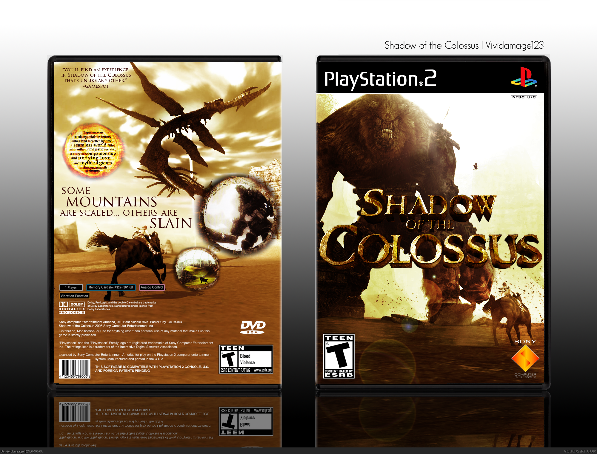
OKay lowered the saturation as directed hopefully this will alter the boxes interpretation
[ Reply ]
Awesome
[ Reply ]
To me it just looks like all the other Shadow of the Colossus boxes. Sorry.
#9, I just posted on your box because it's the newest one.
Edited at 1 decade ago
[ Reply ]
#8, Your right it does.... but everyone did the box the same so you cant simply post on mine that they all look the same but I appreciate that because it does but with Vivi touches here and there
[ Reply ]
double post sorry
#11, lol your right.... Im not completly satisfied with this box while it toook me a long time to do and I finished it nicely I dont feel it was me.... after this right back to Vivi's way.... but for now lol keep faving haha
Edited at 1 decade ago
[ Reply ]
Its a really great box but I agree with #8. Theres nothing original or creative about it that makes it stand out from other SotC boxes. And I dont see no Vivi touches anywhere? O.o
Edited at 1 decade ago
[ Reply ]
Yay! you finished it! Nice job
[ Reply ]
#12, Yeah I did thanks
[ Reply ]