The template looks REALLY bad, the Sega logo should have a white outline, the overall front is a bit boring and uneventful, but I really like that effect you used 3/5
#3,
The template looks really bad, IT'S NOT
the Sega logo should have a white outline, NOT NESESARLY
the overall front is a bit boring and uneventful,BORING? LOOKS AWESOME
but I really like that effect you used ME TOO

 Sonic and the Secret Rings Box Cover Comments
Very nice concept.
[ Reply ]
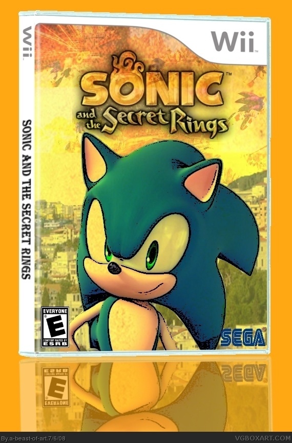
this took a while, and i am glad of how it turned out. my first box with a reflection.
[ Reply ]
The template looks REALLY bad, the Sega logo should have a white outline, the overall front is a bit boring and uneventful, but I really like that effect you used 3/5
[ Reply ]
#3,
The template looks really bad, IT'S NOT
the Sega logo should have a white outline, NOT NESESARLY
the overall front is a bit boring and uneventful,BORING? LOOKS AWESOME
but I really like that effect you used ME TOO
Edited at 1 decade ago
[ Reply ]
#4 Look at the template in full view.
[ Reply ]
i fixed the temp. credit to koopa dasher for it. it is the same as before, but it looks better now for some reason.
[ Reply ]
Sweet
[ Reply ]
I like it
4/5
[ Reply ]
this box looks like a comic feel and its really special.
if you add a back cover will be perfect.
[ Reply ]