![]() »
»
[ Box updated on July 13th, 2008 ] [ original ]
 Grand Theft Auto IV Box Cover Comments
Comment on XCore's Grand Theft Auto IV Box Art / Cover.
Really nice/stylish looking box! I like what you did with the logo too, gives it a very unique feel. +fav
[ Reply ]
Nice, well very nice.
but the front looks a bit too similar to other GTA boxes, and the back could do with another screenshot. but other than thats it looks Great 3.8/5
[ Reply ]
Wow! :D
Great GTAIV box!
It has that GTA feeling!
+fav
[ Reply ]
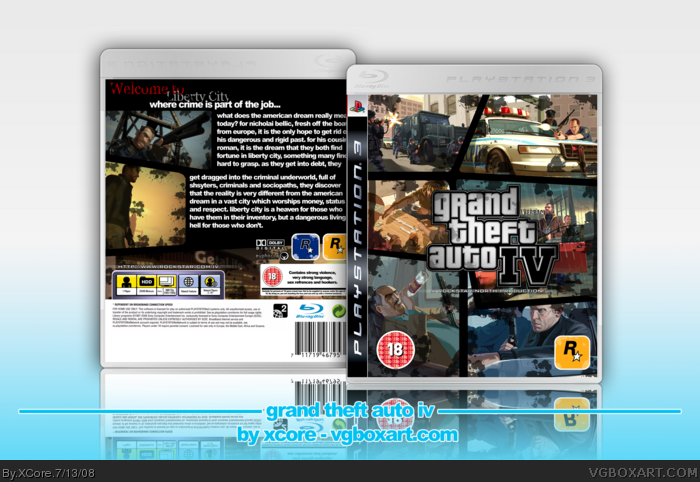
* Full View Please *
* Whoever can find the stupid joke in the box, based on prostitution, gets a cookie :P *
Well Yeah
This bitch took me 5 days, straight. I know that sounds too long, but I had other things in my hands, as I recently unbricked my PSP, and went on a Killing frenzy in GTA Vice City Stories :P
Well here it is, my probably unique GTA IV box. This was supposed to unique from the start, and really grungy to resemble the feel of the game. I think I pulled it off nicely. Comments and favs welcome.
Credit has to go to Sens, for the inlay template and plastic template. I dont know what inspriated me. All I remember is that I was doing a GTA IV wallpaper for my PS3, and it ended up being a box.
EDIT: #1,#2,#3 FAST!
Edited at 1 decade ago
[ Reply ]
Why did you send me the box if you weren't going to listen to my suggestions? The font on the back is boring, the splatters on the front look random, and the back looks too plain, even for a GTA box.
#6, or maybe he didn't want to change anything. Now shut up and get off my back.
Edited at 1 decade ago
[ Reply ]
#5, probably he doesn't like the way you suggest.
Nice box, XCore.
Edited at 1 decade ago
[ Reply ]
*gasp*
[ Reply ]
I like it very much Xcore. I see an improvement in quality over your other GTA IV box.
Edited at 1 decade ago
[ Reply ]
#5, I didn't really see how to improve it, soo yeah.
Thanks #5, #6 and #8.
Edit: 300dpi Printable Added
Edited at 1 decade ago
[ Reply ]
great one but the tagline is hard to read.
[ Reply ]
Cool, but I'd have preferred if you had the blood just on the border, and not randomly on the images. You know what I mean? If you can do that,then I'll fav.
[ Reply ]
#11 Yeah, I understand you, but from the start, I didn't want to use blood at all. This box was to resemble GTA IV's like grungy feel, which I think other artists havn't done yet. Basically, those splatters are to resemble how most of the characters are cold hearted and don't care about what they do or who they murder.
#10, I've updated it, making it a tat bit brighter.
[ Reply ]
It looks great, troll. lol
[ Reply ]
Dude, I told you not to over do it on the grunge, it looks like someone just dropped it in mud. I also don't like the text on the back, but it's pretty cool.
Edited at 1 decade ago
[ Reply ]
#14 You didnt tell me to do it in grunge, you actually pushed me to do it in grunge and gave me a bunch of grunge brushes :P
[ Reply ]
nice
[ Reply ]
#12, I know, but what I'm trying to say is, make blood part of the black borders, not the images. Like, draw the borders with the Pen Tool, add the stroke, then brush ONTO the border, and not on the images. That'll give it a better effect then what you currently have, it looks too random right now.
[ Reply ]
Real nice!
[ Reply ]
Really good, but too much blood. The back's also a bit boring, but I still over all like it. 4.5/5+fav
[ Reply ]
What I see, is that the front seems animated, like a trailer, I dunno, the logo looks like it's fading from black, the thing under it looks animated. Anyway, I agree with Karma (#17). And...that's pretty much my only critique. Oh, make the Liberty City header part less erased. The borders are keeping me from faving
[ Reply ]
I'm not sure :(
I don't like how you grunged it up. I'm guessing you just used a brush and went crazy? :P
Edited at 1 decade ago
[ Reply ]
nice i like it
[ Reply ]
nice i like it
[ Reply ]
Woo, 10th Hall. This box is pretty old, but anyway, thanks for the faves and support.
[ Reply ]
uhh, I havent been commenting on stuff, so I keep missing this good stuff...
anyways.... awesome
[ Reply ]
just amazing it's as good if not better than the real deal
[ Reply ]
I found the text about hookers and sex...now where's my DAMN COOKIE!!!
*walking over to the kitchen and getting himself a cookie*
[ Reply ]
bro... it's been 4 years.
[ Reply ]