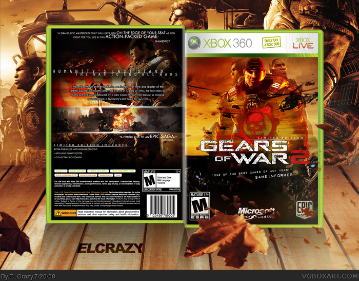
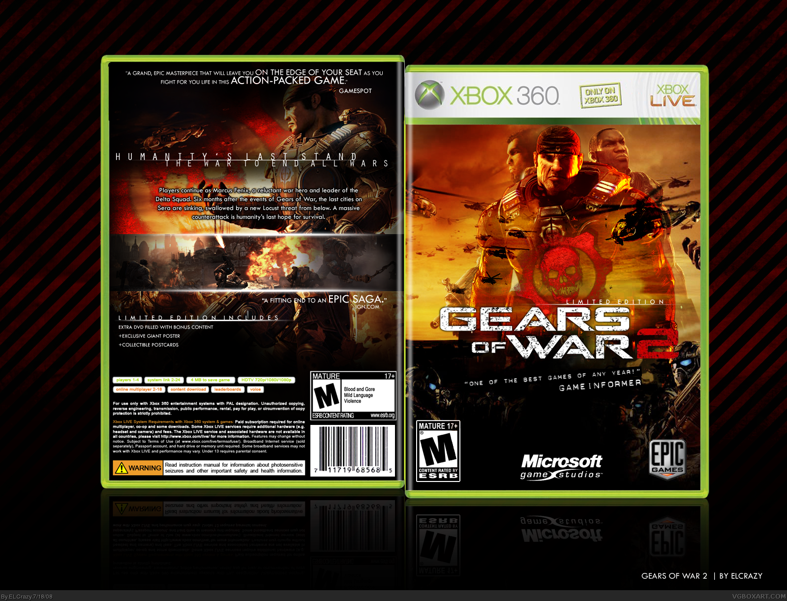
I tried to do something different, steering away from the grunge-laden style that most have been doing. I was inspired by the Saving Private Ryan poster to do the front.
#11, Im not saying it isnt im just saying to me it looks wierd that their heads are completely there and their bodies are just totally transparent out of nowhere.
Love the helicopters flying through the characters... nice touch, although not keen on the darker bottom part. Love that text across his chest on the back too.. nice effect. Nice job ;)
 Gears of War 2 Box Cover Comments
Jumping on the Gears of War 2 bandwagon.
I tried to do something different, steering away from the grunge-laden style that most have been doing. I was inspired by the Saving Private Ryan poster to do the front.
Enjoy! (:
[ Reply ]
Awesome. Pure awesomnosity
[ Reply ]
Awful.
=P
Everything's fantastic, but the quote on the back is wrong. It's not the end of Gears.
[ Reply ]
great
[ Reply ]
Make a printable plz.
[ Reply ]
#5, Hmmm...okay. I'll try my best not to make it look so blurry.
[ Reply ]
Amazing.
[ Reply ]
nice,welcome to the GOW2 club.can i take your jaecket lol.
[ Reply ]
Back is insane. I dont really like the transparencies on the front of the characters.
[ Reply ]
Oh My...
Please add a printable
[ Reply ]
#9, The transparency was actually done on purpose. Something like this: link
#10, I'm working on it ;)
[ Reply ]
Printable added! Now it is blurry in full view, but I'm sure when it is printed out, it would look great.
#13, OMG thank you for that. Now I'm gonna update it.
EDIT: Updated!
Edited at 1 decade ago
[ Reply ]
awesome!
one little thing though. you still have marcus' hand on the front (right side). im pretty sure that's not meant to be there.
[ Reply ]
#11, Im not saying it isnt im just saying to me it looks wierd that their heads are completely there and their bodies are just totally transparent out of nowhere.
[ Reply ]
Blows mine out of the water. And I haven't even uploaded mine yet. *.*
[ Reply ]
#15, cant wait to see yours.
[ Reply ]
I'll be jumping on the GoW2 bandwagon soon myself. Looks great. +Fav
[ Reply ]
lovely i like it
[ Reply ]
I love it!
One problem, one of the quotes is "a fitting end...", isn't Gears a trilogy?
[ Reply ]
Sexy.
[ Reply ]
One of my favourites of yours ELCrazy =}
Oh yeah, FAV
Edited at 1 decade ago
[ Reply ]
Thanks guys! (:
[ Reply ]
Love the helicopters flying through the characters... nice touch, although not keen on the darker bottom part. Love that text across his chest on the back too.. nice effect. Nice job ;)
[ Reply ]
where did you got that Marcus render? (the one on the front)
[ Reply ]
I'm not sure if I like the two faded characters, but other than that, it's great! +Fav.
[ Reply ]
#24, Somewhere ;)
Thanks guys!
[ Reply ]
GrAtZ!!!!1!!!
[ Reply ]
The front looks like some kind of movie cover xD
[ Reply ]
niiice. congrats on da hall!
[ Reply ]
Can you PM the temp?
[ Reply ]
Awesome one dude. Sweet job as always. ;)
[ Reply ]
Wow, good use of art.
[ Reply ]
Marcus's bandana looks too flat. Needs more shading for better effect.
Edited at 1 decade ago
[ Reply ]
"A fitting end to an Epic Saga" ??
Gears 2 is not the end of the Gears saga. =S
[ Reply ]
*whistles*5/5
Edited at 1 decade ago
[ Reply ]
i cannot wait for this game!!!
[ Reply ]
Great job, Its beautiful...
[ Reply ]