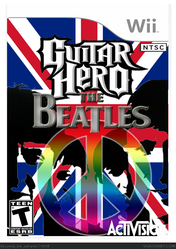
Well, since nobody ever comments on my WiP Threads, I'll Post My Box. This Is only the front cover just to give you a Taste Of What I did. I Made The Logo, And Edited Everything else, except the template, which belongs to CrayonMan, And the Union Jack. Please Rate and Leave Constructive Criticism. I don't Want Comments That Say "This sucks because the Beatles Suck." The Beatles Are one of My fave bands, and I would Like to See a Guitar Hero Game made. The game would be for all systems, but I am Not going to post that many.
#3, Agreed.
Also, what is the NTSC box in the top right corner doing there?
Wii Games dossent have it.
Ant the Activision logo blends in to the Union Jack.
otherwise, I like it.
#5, Yeah, I understood that, but it still looks weird.
The logo is pretty boring too. (I know its their logo, but it could be better mixed in whit the GH logo)
I'm not sure, I'm not saying its a ripoff or anything, its just the vector style I guess. The box isn't bad but it's too busy, and needs more of a focal point
Not half bad (And I really don't like Beatles one bit, and don't attack me because of it, though. =/). Nice dea with the peace sign. If possible, I would rearrange the lines to go on the lnes of the flag.
Blah, Blah, Blah... so much to read! I will just post my comments. FRONT- Close.... I like where it is going, but it looks way too cluttered. The Union Jack is needed, the peace sign... well, I guess you would merge the two or something. Sooo many colors merging. GOING BLIND. BACK- Poor, very poor. Everything is good EXCEPT the stuff you added for real, like the "Become part of..." part. Needs a billion times better typography. CONCEPT- 10/10, really enjoy the Beatles and Guitar Hero... shame though, seems like GUITAR HERO stands for ROCK and the Beatles are waaaaayyy tooooo Mello for rocking out with Lars Umlat.
 Guitar Hero: The Beatles Box Cover Comments
Well, since nobody ever comments on my WiP Threads, I'll Post My Box. This Is only the front cover just to give you a Taste Of What I did. I Made The Logo, And Edited Everything else, except the template, which belongs to CrayonMan, And the Union Jack. Please Rate and Leave Constructive Criticism. I don't Want Comments That Say "This sucks because the Beatles Suck." The Beatles Are one of My fave bands, and I would Like to See a Guitar Hero Game made. The game would be for all systems, but I am Not going to post that many.
Edited at 1 decade ago
[ Reply ]
I like it, and not only because i am in love with the beatles!
[ Reply ]
Pretty cool, but kinda hurts your eyes after a little.
[ Reply ]
#3, Agreed.
Also, what is the NTSC box in the top right corner doing there?
Wii Games dossent have it.
Ant the Activision logo blends in to the Union Jack.
otherwise, I like it.
[ Reply ]
#2 and #3, Thanks.
#4, ok, i'll remove that. and as for your Problem with the activision Logo, I could not make it any other color but black, and that was worse.
[ Reply ]
#5, Yeah, I understood that, but it still looks weird.
The logo is pretty boring too. (I know its their logo, but it could be better mixed in whit the GH logo)
[ Reply ]
i agree with #6 about the logo, other than that it's pretty good
[ Reply ]
this somewhat reminds me of my very old GHII box... link
[ Reply ]
#7, Look at the AeroSmith Box, It's their official.
#8, How, and What do you think of the box?
[ Reply ]
I'm not sure, I'm not saying its a ripoff or anything, its just the vector style I guess. The box isn't bad but it's too busy, and needs more of a focal point
[ Reply ]
#10, There is no vector style, IMO. The Focal Point is the Group, And, Most Newbie Boxes are busy.
EDIT: Updated with a small outer glow around the Activision logo, Moved the Peace Sign up, and slightly lowered the opacity, and removed NTSC logo.
Edited at 1 decade ago
[ Reply ]
maybe if you add a small black stroke to the activision logo it would be better.
[ Reply ]
Not half bad (And I really don't like Beatles one bit, and don't attack me because of it, though. =/). Nice dea with the peace sign. If possible, I would rearrange the lines to go on the lnes of the flag.
[ Reply ]
better whit the update
Its a bit colourful to be GH, but its Beatles :P
Fav
[ Reply ]
#14, no you didn't.
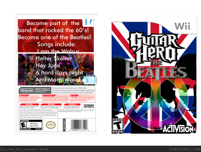
Added a Back, and Please ignore the Printable, I pressed the wrong button, and did not realize it.
Edited at 1 decade ago
[ Reply ]
lol, I forgot.
Well, The back kinda make it bad.
ant the ERSB is E on the back and T on the front.
[ Reply ]
#16, SHIT!
[ Reply ]
and the front ESRB is to far to the corner, and the Players guide logo is going on the temp.
also, if to be picky, GH is just 2 player and do not support nunchuck.
[ Reply ]
Well this version is 4 Player, and supports the nunchuck
[ Reply ]
I think this would be the easyest Guitar Hero ever. I like the front but the back looks badly done. 2.5/5
[ Reply ]
#20, should I remove the back?
[ Reply ]
the front is instresting but the back is terrible
3.9/5
[ Reply ]
#22, thanks?
[ Reply ]
Nice and original... i like!
[ Reply ]
Blah, Blah, Blah... so much to read! I will just post my comments. FRONT- Close.... I like where it is going, but it looks way too cluttered. The Union Jack is needed, the peace sign... well, I guess you would merge the two or something. Sooo many colors merging. GOING BLIND. BACK- Poor, very poor. Everything is good EXCEPT the stuff you added for real, like the "Become part of..." part. Needs a billion times better typography. CONCEPT- 10/10, really enjoy the Beatles and Guitar Hero... shame though, seems like GUITAR HERO stands for ROCK and the Beatles are waaaaayyy tooooo Mello for rocking out with Lars Umlat.
[ Reply ]