![]() »
»
 The Legend of Zelda: Ocarina of Time Box Cover Comments
Comment on VGMaster's The Legend of Zelda: Ocarina of Time Box Art / Cover.
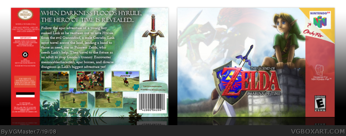
My competition box against Cerium (Best luck to him) for the "What's Guna Happen Next" Competition. I had to make a box for my favorite game. Which has always been hard for me, cuz I've tried making an OoT box many times before with failed products. But this time I really feel like I nailed the style I wanted. And the screen borders are suppossed to look like that, check the official back.
So, comments are appreciated and go vote.
Thanks.
[ Reply ]
Nice! :D
[ Reply ]
Nice! :D
[ Reply ]
Awesome, but the back dishonors the front. The text doesn't look proper, it just doesn't stand out to me. Outside of that, hells yeah you nailed it!
[ Reply ]
#2, wow thanks man.
#3, thanks
#4, ehh, I tried on the text, I couldn't get it as well as I hoped.
[ Reply ]
Ah man i remember this game. I had it when i was 5 or 6 and the Eggplant things scared me. lol
I never found out what those were called.
The box Kick ass
[ Reply ]
#6, peahats.
I remember being so scared of going into the field at night as a kid becuase of the stalchildren. And I hate redeads. HATE THEM!!! That's why I hated going adult Link, cuz they populated the town when you got out. And thanks
Edited at 1 decade ago
[ Reply ]
Looks great.... not a fan of the 'cute-looking' whipper-snapper on the front, but rest of the box is nice ;)
[ Reply ]
Very well done. Is the font you used for the box called "Sylphaen" or "Felix Tilting" by any chance? Whatever it is, it looks incredibly close to those two fonts and it works really well here. Nice job. ^^
[ Reply ]
Very,very nice job,mate!
[ Reply ]
#8, no one is. but me of course. Thanks.
#9, in fact, I believe it is. Thanks.
#10, thanks.
[ Reply ]
wow this is sick! 5/5
[ Reply ]
i thinky o should move a little over to the right so you can links first sword
fav
[ Reply ]
#13, well, I wanted to have the logo centered. And it happenes to be covering that. sorry.
But thanks for the fav.
[ Reply ]
Well that took a while, but HOF.
[ Reply ]
#7, Same here, thos zombies rape you til youre dead. The red snake thing underwater in Mario 64 scared the crap outta me too.
Edited at 1 decade ago
[ Reply ]
What a beautiful work you offer, and also, let me tell you, very nice the skill of playing with light and offer a diffumination of the picture. Beside, this is a "must have" game for everyone that can call himself a "nintendo fan". Excellent work, dude!
5/5
[ Reply ]