You just recolored shadwo, but it looks cool but center shadow more on the cover
and fix the sega logo. this great for a first. fix the words at the top there hard to read + fav
Hello.
I just wanted to ask you if you have a 3rd grade education. I realized that "The story begins with that some kids by misstake," makes no sence whatsoever. If you plan to continue making box arts, then I suggest you to either go back to school or if you haven't attended school ever, which it looks like it, the board of education will be happy to accept you as a new student. Futhermore, your vocabulary sucks.
PS: If you find this comment to be offencive or abusive, I highly reccomend you to get some help with your writing skills so you can respond back.
On another note, great cover! ^_^
You have abused the blur tool a bit much. In short, I agree with RaveMaster122's comments in a sense that you need work on your descriptions a lot, because that is just horrible.
I'm also led to believe that you are underage (only people 13 or older are allowed on the site) due to the weak storyline that you've put together.
With those issues aside, this isn't bad, but needs a ton of work.
Also, please add proper credit to the outside sources you used for the art, you can still link them in a new comment.
 Mephiles The Dark Box Cover Comments
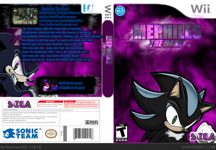
my first boxart , and im new here , say what u think and dont be so mean. I like Mephiles so i gave him a own game ^^
[ Reply ]
You just recolored shadwo, but it looks cool but center shadow more on the cover
and fix the sega logo. this great for a first. fix the words at the top there hard to read + fav
Edited at 1 decade ago
[ Reply ]
i didnt make the pictures oh!
Credit for the rightfull owners och the pictures ^^ i found them on devaint art and google
i fixed the sega logo to look more like dark ^^ but thanks (Y) i will try the next time
[ Reply ]
#3, You should try to be more specific by posting a link and the artist's name, this is what it says on the upload screen.
[ Reply ]
#4, oh ._. , i will do it the next time
[ Reply ]
nice first! apart from a few typos on the back its quite good. it is a bit blurry too in some places but overall its good.
[ Reply ]
#6, thanks! :'D
[ Reply ]
this is a great first!
[ Reply ]
SWEET!
[ Reply ]
Hello.
I just wanted to ask you if you have a 3rd grade education. I realized that "The story begins with that some kids by misstake," makes no sence whatsoever. If you plan to continue making box arts, then I suggest you to either go back to school or if you haven't attended school ever, which it looks like it, the board of education will be happy to accept you as a new student. Futhermore, your vocabulary sucks.
PS: If you find this comment to be offencive or abusive, I highly reccomend you to get some help with your writing skills so you can respond back.
On another note, great cover! ^_^
[ Reply ]
You have abused the blur tool a bit much. In short, I agree with RaveMaster122's comments in a sense that you need work on your descriptions a lot, because that is just horrible.
I'm also led to believe that you are underage (only people 13 or older are allowed on the site) due to the weak storyline that you've put together.
With those issues aside, this isn't bad, but needs a ton of work.
Also, please add proper credit to the outside sources you used for the art, you can still link them in a new comment.
[ Reply ]
Thanks for the back-up.
Edited at 1 decade ago
[ Reply ]
Nice!
[ Reply ]