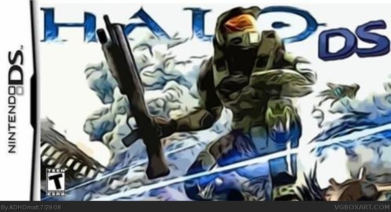
Yes Its even more blury but I fixed the ds template so its overlapping and also made it not so wide. I would half to go through alot to make it not blury so im not going to even try right now. Also this is my first Box so give me a Break. Thanx and enjoy.
#5, as a first, it's not to much of an assault to the eyes, but if you insist on using the current pic as the cover image, maybe try to remove the actual "Halo" logo thats part of it, and try to work your own logo into the image by way of fonts or a good render.
If your using an applicable program for your graphics, some effects on said font or logo render will work wonders for the design.

 Halo DS Box Cover Comments
this is the 1st version so more will be added on like a back side
[ Reply ]
While the concept is nice.
the box is way too wide. and it's blurry.
[ Reply ]
ADHD... I have a feeling you won't be listening to us.
[ Reply ]
#3, That ain't very nice...
:|
Edited at 1 decade ago
[ Reply ]
Yes Its even more blury but I fixed the ds template so its overlapping and also made it not so wide. I would half to go through alot to make it not blury so im not going to even try right now. Also this is my first Box so give me a Break. Thanx and enjoy.
Edited at 1 decade ago
[ Reply ]
#5, as a first, it's not to much of an assault to the eyes, but if you insist on using the current pic as the cover image, maybe try to remove the actual "Halo" logo thats part of it, and try to work your own logo into the image by way of fonts or a good render.
If your using an applicable program for your graphics, some effects on said font or logo render will work wonders for the design.
Edited at 1 decade ago
[ Reply ]
#6, Thanx dude. I will do that.
[ Reply ]