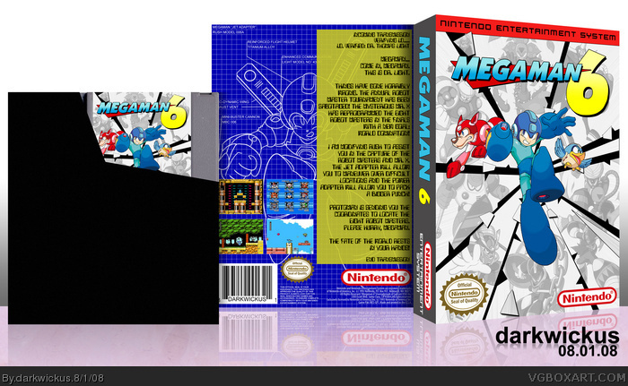
Not your best. The back looks weird, its an odd font choice and the screen shots have a weird placing and theres an empty space that needs to be filled. But i absolutely love the front, so +fav
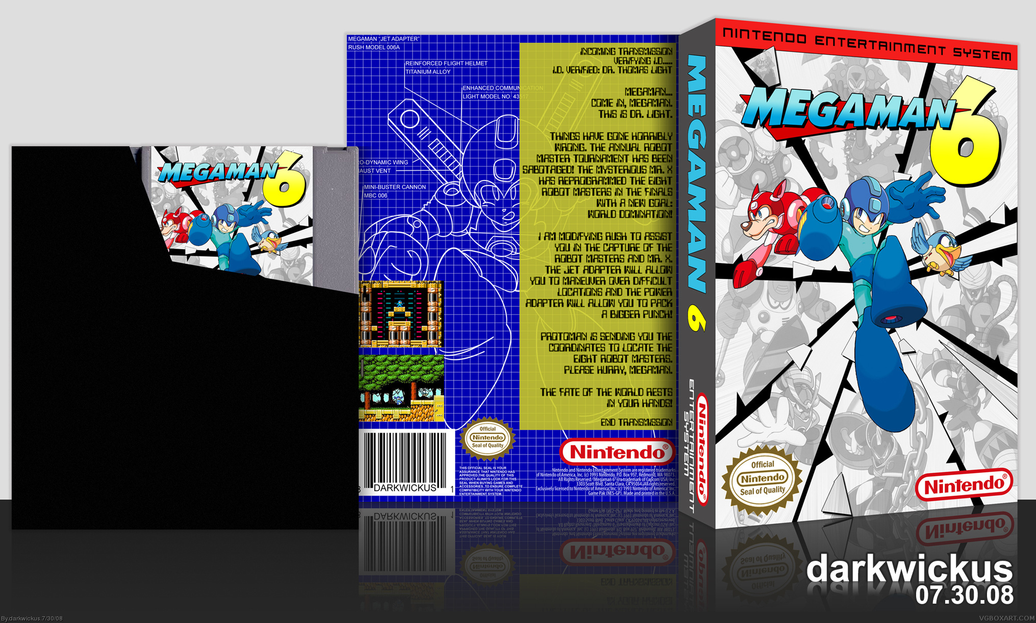
Oh, excellent question! Fans of the NES will know that Capcom really had no interest in releasing this game in the U.S., after all it was 1994 when it finally came out! Nintendo licensed the game to release after they had released their "top-loading" Nintendo and wanted to fuel late-release sales. So, I've stayed true to history here.
Being the last Megaman game on the NES, I'd like to throw this one out to a couple people. First, this one goes out to ladykiller, who stated in my Megaman 2 box thread that this was his favorite Megaman game on the NES! This also goes out to Ervo, who continues to help put some Megaman content out there for everyone, and who's Rockman 6 box was just SWEET!
Please enjoy in full!
Oh, and #1: First, comment w00t! Was going for the blueprint/computer screen for the back. Trying something completely different. /shrug
#3: Yeah, I had to take that original image of Megaman on the back and redraw it in Illustrator, because that was the only way I could get it to look sharp. I think that's the longest I've spent on a back!
#4: I think I could set another 2 screens in at the bottom and put them in a square. That would also fit the grid theme as well. Thanks for the advice!!
#5: Thanks man! It becomes quite boring making Megaman boxes with the same style theme... trying to put all the bosses on the front, etc. I really tried to break the rules with this one a little bit and the front is a good metaphor for that!
#10: Nice to hear from you again sir! It's also good to know that people are still into the Megaman boxes after so many of them LOL! After doing 4, which I think was the weakest of them so far, I tried really hard to get creative with the layouts. I'm glad that it seems to have worked!
 Megaman 6 Box Cover Comments
Not your best. The back looks weird, its an odd font choice and the screen shots have a weird placing and theres an empty space that needs to be filled. But i absolutely love the front, so +fav
[ Reply ]
"Um... where's the Capcom logo?"
Oh, excellent question! Fans of the NES will know that Capcom really had no interest in releasing this game in the U.S., after all it was 1994 when it finally came out! Nintendo licensed the game to release after they had released their "top-loading" Nintendo and wanted to fuel late-release sales. So, I've stayed true to history here.
Being the last Megaman game on the NES, I'd like to throw this one out to a couple people. First, this one goes out to ladykiller, who stated in my Megaman 2 box thread that this was his favorite Megaman game on the NES! This also goes out to Ervo, who continues to help put some Megaman content out there for everyone, and who's Rockman 6 box was just SWEET!
Please enjoy in full!
Oh, and #1: First, comment w00t! Was going for the blueprint/computer screen for the back. Trying something completely different. /shrug
Edited at 1 decade ago
[ Reply ]
...
Blueprint idea for the back is awesome. I cant describe how awesome the front is.
[ Reply ]
I think the back could use a few more screens, but I like the front a lot.
[ Reply ]
Agreed with Ervo. Front is absolutely stunning, certainly did justice to the game. Awesome work! ^^
[ Reply ]
Thanks guys!
#3: Yeah, I had to take that original image of Megaman on the back and redraw it in Illustrator, because that was the only way I could get it to look sharp. I think that's the longest I've spent on a back!
#4: I think I could set another 2 screens in at the bottom and put them in a square. That would also fit the grid theme as well. Thanks for the advice!!
#5: Thanks man! It becomes quite boring making Megaman boxes with the same style theme... trying to put all the bosses on the front, etc. I really tried to break the rules with this one a little bit and the front is a good metaphor for that!
[ Reply ]
Mindblowing, 10/10
[ Reply ]
I gotta bump this one. CMON EVERYBODY!
[ Reply ]
Updated! I added a couple more screens to the back cover to balance the box out a bit. Thanks TTT for the suggestion!
#8: I thank you sir. I'm sure people will see it eventually.
[ Reply ]
Absolutely delicious.
It's good to know you're still pumping them out with the same quality you started with. I believe I'll be adding this one to my favorites list.
[ Reply ]
#10: Nice to hear from you again sir! It's also good to know that people are still into the Megaman boxes after so many of them LOL! After doing 4, which I think was the weakest of them so far, I tried really hard to get creative with the layouts. I'm glad that it seems to have worked!
[ Reply ]
It would never be as good as the original hand drawn box arts... But its a great update and i really like it.. Mega Man VI best in the series!
[ Reply ]