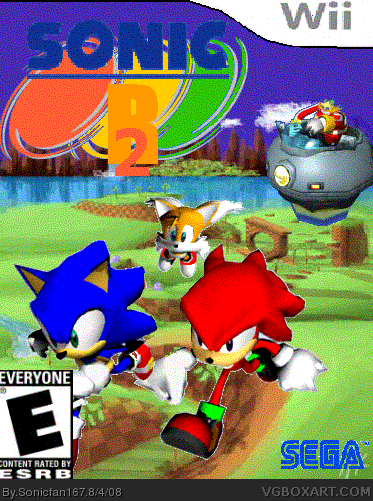
Okay, what format did you save this in? That is probably why it's so fuzzy.
You should use a different template and this box is either in the wrong dimensions or your ESRB is too big and too far to the left.
You can see white edges all around Sonic, Knuckles, and Tails so you need to clean that up; Sonic and Knuckles look like they are Running on air.
I don't like the logo, it's badly cut out and I don't understand your color choice. I think you should look at some examples of logos, I personally think their always hard to make look good.
The background seems pretty bland also. Sonic R is about racing, so I would hope to see some exciting and related to that.
I like the idea, but the execution could use some work. The "R" and even a bit of the "2" are hard to read because of the color, and if you're using Paint, find better renders (if you're using Photoshop, just use the Defringe tool)
And I just lost my train of thought, I'll help you more once those things are fixed.
EDIT: And check the forums, KoopDasher has posted plenty of templates and whatnot for you to use =P

 Sonic R 2 Box Cover Comments
Sorry its fuzzy and that its only showing part of the top is missing
[ Reply ]
Okay, what format did you save this in? That is probably why it's so fuzzy.
You should use a different template and this box is either in the wrong dimensions or your ESRB is too big and too far to the left.
You can see white edges all around Sonic, Knuckles, and Tails so you need to clean that up; Sonic and Knuckles look like they are Running on air.
I don't like the logo, it's badly cut out and I don't understand your color choice. I think you should look at some examples of logos, I personally think their always hard to make look good.
The background seems pretty bland also. Sonic R is about racing, so I would hope to see some exciting and related to that.
[ Reply ]
#2, The reason its not exciting and related to racing is because i made it very simmilar to the first sonic r.
[ Reply ]
whta's the dif between versone one?
[ Reply ]
Version 1 is more fuzzy =P
I like the idea, but the execution could use some work. The "R" and even a bit of the "2" are hard to read because of the color, and if you're using Paint, find better renders (if you're using Photoshop, just use the Defringe tool)
And I just lost my train of thought, I'll help you more once those things are fixed.
EDIT: And check the forums, KoopDasher has posted plenty of templates and whatnot for you to use =P
Edited at 1 decade ago
[ Reply ]
#5 thanx
Edited at 1 decade ago
[ Reply ]
over all, it's nice but logo is quite awkward! should change it back 2 the normal logo wef a 2! that'll b better!
[ Reply ]