a lot of effort has been put in this box and it has been redone like 3 different times so I could make it right so please comment.
and also credit to the guy from deviantart for making this awsome temp!!!
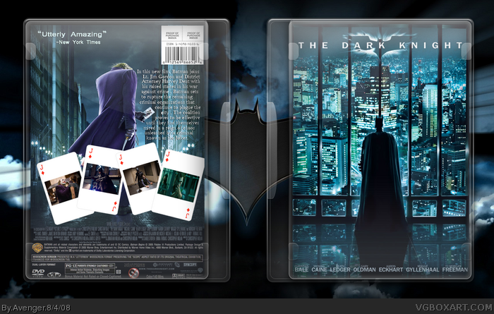
I like it a lot.. Especially the front and the template owns the whole world (could you please pm me a link or post it on the forums? thanks in advance).. Only keep in mind that on the back of a movie box there are normally not that much screenshots as on a game box +fav
Agreed. The cards are way too plain, and obviously the Jack of Diamonds is not the same as the joker card. Cool idea, but you need to add a lot of detail for it to work. Great start though.
Pretty good... but I guess you just ignored my comments in the Critique forum about moving the Joker to the left thus giving more space to your text, and filling in the cards, and using one as the feature list.... oh well.
#8 *GASP*
Somebody ignored Markers critique?! How dare they! If I would of ignored his comments, I wouldn't be where I am today!! And I mean literally!
Give your kerning some love too. Rarely would a client want both characters facing away (also what made that part of the campaign so ballsy). I think the issue with the cards is they look like cut outs.. would be better in a beige-yellow with lots of distressed texture and edges.
Yeahh good Idea just needs to be executed better with the cards nd I was reading the description on the back it wouldn't say some things like "IN THIS NEW FILM" Pretty much a solid idea/foundation just start fresh
 The Dark Knight Box Cover Comments
a lot of effort has been put in this box and it has been redone like 3 different times so I could make it right so please comment.
and also credit to the guy from deviantart for making this awsome temp!!!
[ Reply ]
I like it a lot.. Especially the front and the template owns the whole world (could you please pm me a link or post it on the forums? thanks in advance).. Only keep in mind that on the back of a movie box there are normally not that much screenshots as on a game box +fav
[ Reply ]
Its nice, but the back, with the cards.. doesnt look too good
[ Reply ]
I'm sick of the same tired layout/art for Dark Knight boxes. Someone needs to introduce a little anarchy, upset the establishment.
[ Reply ]
#4, agreed... -cackles- ;)
agreed with jinchuuriki here,i REALLY dislike the cards, you oughtta make them blue-ish, and add some medieval-styled lines/border to it.
[ Reply ]
Agreed. The cards are way too plain, and obviously the Jack of Diamonds is not the same as the joker card. Cool idea, but you need to add a lot of detail for it to work. Great start though.
[ Reply ]
the back is very plain, and like hunter said, i too am tiered of the same layout for EVERY Dark Knight box. 2/5
[ Reply ]
Pretty good... but I guess you just ignored my comments in the Critique forum about moving the Joker to the left thus giving more space to your text, and filling in the cards, and using one as the feature list.... oh well.
[ Reply ]
#8 *GASP*
Somebody ignored Markers critique?! How dare they! If I would of ignored his comments, I wouldn't be where I am today!! And I mean literally!
Edited at 1 decade ago
[ Reply ]
Give your kerning some love too. Rarely would a client want both characters facing away (also what made that part of the campaign so ballsy). I think the issue with the cards is they look like cut outs.. would be better in a beige-yellow with lots of distressed texture and edges.
[ Reply ]
Yeahh good Idea just needs to be executed better with the cards nd I was reading the description on the back it wouldn't say some things like "IN THIS NEW FILM" Pretty much a solid idea/foundation just start fresh
[ Reply ]
Anyone elese notice he's staring at a pole....
[ Reply ]