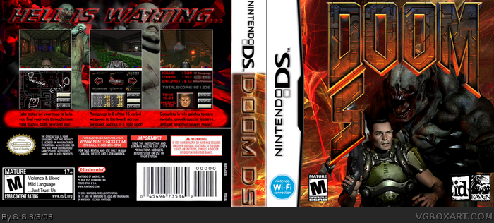
Ok guys, this is my first box in a long while, but I took a long time on this one to make up for it =D
The "S" in the logo was made by me (took several hours!) and the bottom screens were also made by me by ripping images (even letters and numbers) directly from Doom screenshots and compiling the weapon sprites.
The template was made by Sockey Meow (I think that's how it's spelled O_O) and the screenshots (top screens) are from a fan-made add-on to Doom II. All renders found at Planet Renders.
Comments and critiques please! It's my 3rd box and I'm really happy with it, but should I be? Oh, and note the ESRB Rating description on the back ;D
EDIT: CRUD! Part of the "S" is messed up (still looks ok, but it's missing a part) and I saved over the logo!!! X{
*assumes fetal position and cries in corner*
Think of it as being acrostic..."DOOM" goes left-to-right and "DS" goes up-to-down ;P Or at least that was my goal when I started making this and was part of the reason I picked DS as the platform O_o
#4 We just used the same render, that's it O_o Well, and part of the official logo, but that's to be expected =P
#5 Thanks! ^_^ I was wondering if anyone would comment about the logo size, but I like the way it surrounds the render. And what do you mean by random? What couls I do to fix that?
Well, what I mean by random is, we gamers don't think too quickly unless we're actually playing the game, so when we pick up the box, the first thing we're going to say is, what's that "S" for?
Then maybe after we're done with the game, we'll look at the box again and say, Oh it's for the "S" for "DS".
Maybe that's just me, but I dunno. Anyway, the logo is still just a tad too big in my opinion, but eeh. The front art is good, but the large DOOM overpowers it, Size it down, and reposition the S to make it more obvious that it's for DS. Hope that helped. ^^'
Also it looks like you're using photoshop, if you are, I'd suggest adjusting the sidebar's hue to match the red hue on the front cover, then applying an outer glow on DOOM DS to make it stand out more.
Yes I am using Photoshop...the sidebar was originally the same color as the front, but you couldn't even read the "DOOM DS" because the color was too bright. I'll try it with the outer glow though and see if it's any better. And I wondered about that which is why I put "DOOM DS" on the spine, hoping to make it more obvious =P Where should I put the "S"? Unless I make another "D" I can't think of anyplace to put the "S" =P
I'll size down the logo after you respond though so I can see exactly what I'm going to do =P Thanks for helping ^_^
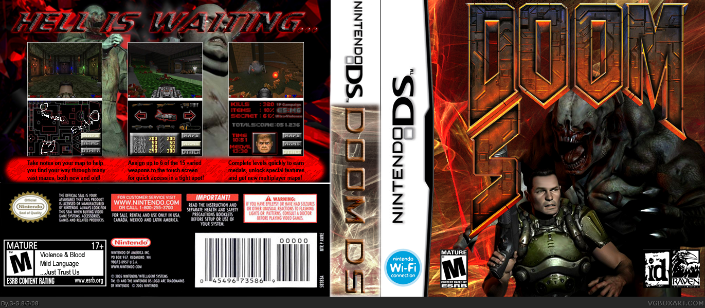
Sorry for the bump (wouldn't let me edit) but I fixed the spine. How is it now Ray? And I'm working on a new logo...kinda sucks since the first one took so long, but I guess if you don't think it looks good I don't have much of a choice. =P
Not bad, but I don't like the background on the front or what you did with the logo. The text on the back is quite boring as well. Try a grunge background for the front and back instead of what you currently have.
The Spine is great now S-S. And I'm thinking that you could put the DS Centered underneath the DOOM logo after you size it down. That's just my idea but whatever you think is good is fine.
And I kind of agree with Tinker. Try just using a black background with various objects faded into the background with prominent blood stains on top, for the back, and something similar on the front, but make it dark, and less vivid. Something like this for the back.
Cool thanks ^_^ I just worry about how much of the logo will block the render, but I'll give it a shot once I'm done with the new logo.
Hm...not sure about the background situation...the front was supposed to be flames but I think I need a better picture for that to show. And since most of the back isn't visible I'm not sure what to do. Hm, how did you make those blood stains in your example? The bg for the back was intended to be blood streaks and smears but it's obviously not quite right.
EDIT: TripleT, what do you mean "the text on the back is quite boring?" Which text, and do you mean the font, the styles, or the the descriptions?
Sorry for the late response. I use brushes in photoshop that I've downloaded from places around the net. Try a google search for blood stain brush, and download a pack for photoshop. They come in handy.
 Doom DS Box Cover Comments
Ok guys, this is my first box in a long while, but I took a long time on this one to make up for it =D
The "S" in the logo was made by me (took several hours!) and the bottom screens were also made by me by ripping images (even letters and numbers) directly from Doom screenshots and compiling the weapon sprites.
The template was made by Sockey Meow (I think that's how it's spelled O_O) and the screenshots (top screens) are from a fan-made add-on to Doom II. All renders found at Planet Renders.
Comments and critiques please! It's my 3rd box and I'm really happy with it, but should I be? Oh, and note the ESRB Rating description on the back ;D
EDIT: CRUD! Part of the "S" is messed up (still looks ok, but it's missing a part) and I saved over the logo!!! X{
*assumes fetal position and cries in corner*
Edited at 1 decade ago
[ Reply ]
It looks pretty good overall, but yeah, it just says "Doom S"
[ Reply ]
Thanks ^_^
Think of it as being acrostic..."DOOM" goes left-to-right and "DS" goes up-to-down ;P Or at least that was my goal when I started making this and was part of the reason I picked DS as the platform O_o
[ Reply ]
Reminds me of my Doom 3 box.
link
[ Reply ]
Very Innovative idea, however the logo is too large, and the S for DS looks random. I would so play that game though.
[ Reply ]
#4 We just used the same render, that's it O_o Well, and part of the official logo, but that's to be expected =P
#5 Thanks! ^_^ I was wondering if anyone would comment about the logo size, but I like the way it surrounds the render. And what do you mean by random? What couls I do to fix that?
[ Reply ]
Well, what I mean by random is, we gamers don't think too quickly unless we're actually playing the game, so when we pick up the box, the first thing we're going to say is, what's that "S" for?
Then maybe after we're done with the game, we'll look at the box again and say, Oh it's for the "S" for "DS".
Maybe that's just me, but I dunno. Anyway, the logo is still just a tad too big in my opinion, but eeh. The front art is good, but the large DOOM overpowers it, Size it down, and reposition the S to make it more obvious that it's for DS. Hope that helped. ^^'
Also it looks like you're using photoshop, if you are, I'd suggest adjusting the sidebar's hue to match the red hue on the front cover, then applying an outer glow on DOOM DS to make it stand out more.
Edited at 1 decade ago
[ Reply ]
Yes I am using Photoshop...the sidebar was originally the same color as the front, but you couldn't even read the "DOOM DS" because the color was too bright. I'll try it with the outer glow though and see if it's any better. And I wondered about that which is why I put "DOOM DS" on the spine, hoping to make it more obvious =P Where should I put the "S"? Unless I make another "D" I can't think of anyplace to put the "S" =P
I'll size down the logo after you respond though so I can see exactly what I'm going to do =P Thanks for helping ^_^
[ Reply ]
Sorry for the bump (wouldn't let me edit) but I fixed the spine. How is it now Ray? And I'm working on a new logo...kinda sucks since the first one took so long, but I guess if you don't think it looks good I don't have much of a choice. =P
[ Reply ]
Not bad, but I don't like the background on the front or what you did with the logo. The text on the back is quite boring as well. Try a grunge background for the front and back instead of what you currently have.
The screenshots are nice.
[ Reply ]
The Spine is great now S-S. And I'm thinking that you could put the DS Centered underneath the DOOM logo after you size it down. That's just my idea but whatever you think is good is fine.
And I kind of agree with Tinker. Try just using a black background with various objects faded into the background with prominent blood stains on top, for the back, and something similar on the front, but make it dark, and less vivid. Something like this for the back.
Here's an example of what I mean: link
Edited at 1 decade ago
[ Reply ]
Cool thanks ^_^ I just worry about how much of the logo will block the render, but I'll give it a shot once I'm done with the new logo.
Hm...not sure about the background situation...the front was supposed to be flames but I think I need a better picture for that to show. And since most of the back isn't visible I'm not sure what to do. Hm, how did you make those blood stains in your example? The bg for the back was intended to be blood streaks and smears but it's obviously not quite right.
EDIT: TripleT, what do you mean "the text on the back is quite boring?" Which text, and do you mean the font, the styles, or the the descriptions?
Edited at 1 decade ago
[ Reply ]
Sorry for the late response. I use brushes in photoshop that I've downloaded from places around the net. Try a google search for blood stain brush, and download a pack for photoshop. They come in handy.
[ Reply ]