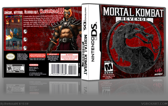
Yes, the title is generic, deal with it. And i know this is a bad time to submit (i've seen a lot of boxes come in today) but i wanted to. Mortal Komabt boxes are hard because each one requiers heavy editing of the symbol and loads of brushing and blending. Anyways, enjoy!
Wow this is really good but the front looks pretty weird and the text on the back kinda blends in making it hard to read cause the drop shadow doesnt help at all behind it.
I think it would be much more forgivable if not for the fact that the cover is almost identical to Ultimate Mortal Kombat's. That said, it's not badly made, but two things that are bothering me that you may want to take note of is that the texture for the dragon logo is very intense. If it were more subtle then I think it would be much better.
The other thing is that the scratches you've placed on the cover go from the background onto the dragon logo seemlessly. It makes it look like you just took an image and threw filters/brushes on top of it. If you were to try to make the logo look as if it's isolated from the background, it'd look top notch.
 Mortal Kombat: Revenge Box Cover Comments
Yes, the title is generic, deal with it. And i know this is a bad time to submit (i've seen a lot of boxes come in today) but i wanted to. Mortal Komabt boxes are hard because each one requiers heavy editing of the symbol and loads of brushing and blending. Anyways, enjoy!
[ Reply ]
Ooh, very stylish.
[ Reply ]
Thats pretty cool. fav
[ Reply ]
2 comments? Thats kinda dissapointing
[ Reply ]
it is not your best the fronts pretty plain,and most of the text is unreadable , 3/5
[ Reply ]
Wow this is really good but the front looks pretty weird and the text on the back kinda blends in making it hard to read cause the drop shadow doesnt help at all behind it.
Edited at 1 decade ago
[ Reply ]
I think it would be much more forgivable if not for the fact that the cover is almost identical to Ultimate Mortal Kombat's. That said, it's not badly made, but two things that are bothering me that you may want to take note of is that the texture for the dragon logo is very intense. If it were more subtle then I think it would be much better.
The other thing is that the scratches you've placed on the cover go from the background onto the dragon logo seemlessly. It makes it look like you just took an image and threw filters/brushes on top of it. If you were to try to make the logo look as if it's isolated from the background, it'd look top notch.
[ Reply ]
It says 'Game experience may change during online play', yet there's no Wifi logo! Maybe that's one thing that may be required to add to the picture.
Overall, very well designed. 5/5 +fav
Edited at 1 decade ago
[ Reply ]