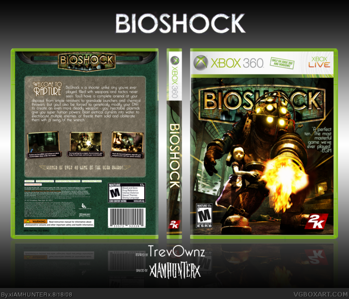
The front is kickassmofoaction.
The back isn't as great, as everyone else said, mainly because of the lack of explosions or color. I do like the art deco fonts though. :)
Overall, it's still fav-worthy.
Yay analogy time: Front is to amazing as Back is to just ok :(. Back is just a little too bland for my tastes but still you got my fav just through the front its pure awesomeness! Fix the back up with a few renders and a lot more of that bioshock rust colors.
#18, What part of "start it again" hasn't entered your mind? I mean, it was only a render and a rising sun during your WIP, surely you can re-create that >___O (yeah, I'm copying you)
#14, okay, fine, I'll learn to take a joke. But you've been giving an attitude lately. And I didn't notice that you faved it.
#16, thats really old and overused now.
#19, at least I said it was sexy. That was constructive. Compared to the front, the back just seems a little too plain. Vengeance said it was disgusting, but now I know he was only "joking". And I thought we were cool?
 BioShock Box Cover Comments
Back is too plain and I don't like the text, but the front...
O_O
[ Reply ]
Front = Incredible.
Back = Too bland, kinda boring.
[ Reply ]
Your name is victory.
----------------
Tribute to my best buddy Trevor and the box that basically changed box-making on the site.
Uber thanks to him for helping me out tremendously on the project and the template, which took an incredible amount of time.
=D
[ Reply ]
Screens could be bigger, and there could be more going on on the back, but hey, well done, now finish your printable collection >:(
[ Reply ]
Like a great man once said...
"Front- =o
Back- *fart noise* its to plain."
[ Reply ]
:o
[ Reply ]
Disgusting.
[ Reply ]
The front is pretty good although I dont like how so much of the logo is being covered.
The back is.... disappointing from you Ryan.
[ Reply ]
The front is kickassmofoaction.
The back isn't as great, as everyone else said, mainly because of the lack of explosions or color. I do like the art deco fonts though. :)
Overall, it's still fav-worthy.
[ Reply ]
The front is kickass but the back is pretty plain..:D other than that its quite good.
Edited at 1 decade ago
[ Reply ]
these bioshock boxes are being all the same...
I like it anyway. fav.
[ Reply ]
#7, start being constructive, okay?
The box is sexy, xIAMHUNTERx, but the back = :@
[ Reply ]
Just noticed the scan lines...they don't look that great going over the characters, and you use them way too much.
[ Reply ]
#12, I faved it, you fool. Don't you understand a joke?
[ Reply ]
Im not just shocked, I'm BIOSHOCKED!! (lame)
[ Reply ]
#12, *facepalms*
[ Reply ]
Yay analogy time: Front is to amazing as Back is to just ok :(. Back is just a little too bland for my tastes but still you got my fav just through the front its pure awesomeness! Fix the back up with a few renders and a lot more of that bioshock rust colors.
[ Reply ]
#4, What part of "it got deleted" don't you understand? >___O
And fuck all your carrots, I love the back. It took me a lot more time than the front and I don't find it plain at all.
[ Reply ]
#12, I find it both ironic and hypocritical that you told him to be constructive with his comments and then you said "...but the back = :@".
[ Reply ]
#18, What part of "start it again" hasn't entered your mind? I mean, it was only a render and a rising sun during your WIP, surely you can re-create that >___O (yeah, I'm copying you)
[ Reply ]
#20, The hell it was.
[ Reply ]
wow looks great, its fine as it is.
[ Reply ]
I...don't....like....the....back.
At All.
It doesn't go with the theme of the game.
But the front.
Is amazing.
Edited at 1 decade ago
[ Reply ]
#23, Having played BioShock extensively (four playthroughs and counting), I can confidently say that it fits the theme of the game like a glove.
[ Reply ]
#14, okay, fine, I'll learn to take a joke. But you've been giving an attitude lately. And I didn't notice that you faved it.
#16, thats really old and overused now.
#19, at least I said it was sexy. That was constructive. Compared to the front, the back just seems a little too plain. Vengeance said it was disgusting, but now I know he was only "joking". And I thought we were cool?
I'll admit, I embarrassed myself.
Edited at 1 decade ago
[ Reply ]
Printable added if anyone's interested.
Look, I'll try to do something about the "plainness" of the back, but honestly I don't think there's anything to add.
[ Reply ]
#25, Dersnap is the one with the attitude?
[ Reply ]
nice man, keep up the hard work
[ Reply ]
What a sweety pie <3
[ Reply ]
I think you should change the texture at the back. I don't know how, but I think it'll look better than how it is now. But I really like the front.
[ Reply ]
Yea the texture on the back looks like throw up.
[ Reply ]
Haha, which one? There are two.
[ Reply ]
I like it. Nice job.
[ Reply ]
Okay, let's HoF this puppy. I dig it completely!
[ Reply ]
needs to be PS3 i vote against it
[ Reply ]
Yay!
[ Reply ]
Congrats. The back is actually not that bad at all. Great work here.
[ Reply ]