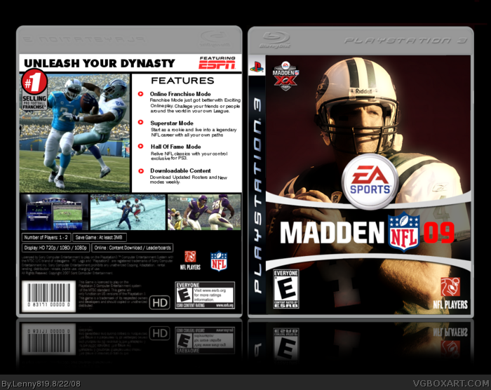
NIce layout and execution. Might want to bring in a bit of the left side of Favre's face but not necessary. Back is well executed but the copy box seems a bit empty (also keep an eye out for the type running too far over to the left- there is a live area to be considered) so mI'd consider using a bold-condensed version of the font to beef it up a bit and then tend to the kerning as well. Just some type thoughts, otherwise bang-up job!
#22, This isnt my first sports cover, I wasnt inspired.
#23, it lacks effects? what more do you want from a sport cover. also overlapping the logo if u look at the box you'll see that if i have any part of farve overlaping the logo then it would cover the logo and that wouldnt look cool. and i still think that you two are the same person.
 Madden NFL 09 Box Cover Comments
Heres a box ive been working on. It was originaly gonna be Hall Of Fame editon but i scratched that idea.
view full view
Credit to Shady for logo
Credit to Kirbylore for reflection
[ Reply ]
Awesome, you finished it. Nice job
[ Reply ]
Nice, and the back stays true to the madden series layout.
[ Reply ]
i'm a packers fan, but i'll fav anyway. :P
[ Reply ]
#4, im a Pats fan, i put him on cause he's on the real one.
Edited at 1 decade ago
[ Reply ]
Yes please.
[ Reply ]
Maybe use a cool texture on the white background on the back? You know like a generic Madden metal image thing. Know what I mean?
[ Reply ]
#7 Aggree'd
I'd say either that or a gradient maybe.
[ Reply ]
#&7,#8, I have no idea what you guys are talking about can you link me to a page to show a better understanding.
[ Reply ]
vera nice
[ Reply ]
nice nice nice.
Farve is a tool though :P
[ Reply ]
Amazing. Check your PMs
[ Reply ]
Credit goes to Rossagues for the inspiration! Nice box!
[ Reply ]
nice, beautiful
[ Reply ]
#13, O_______O
[ Reply ]
you finally posted!
[ Reply ]
#13, Or not? Anyways, great box Lenny, although the back could use some spice.
Edited at 1 decade ago
[ Reply ]
#17, well i mean have you seen the back cover of a madden. Its preaty identical to mine but with diffrent info.
[ Reply ]
I likey. I like the colorscheme on the front.
[ Reply ]
#18, Exactly why it'd be a good idea to spice it up ;)
[ Reply ]
NIce layout and execution. Might want to bring in a bit of the left side of Favre's face but not necessary. Back is well executed but the copy box seems a bit empty (also keep an eye out for the type running too far over to the left- there is a live area to be considered) so mI'd consider using a bold-condensed version of the font to beef it up a bit and then tend to the kerning as well. Just some type thoughts, otherwise bang-up job!
[ Reply ]
#17, Get lost, after he looked at my NBA Live 09 Cover... he decided to do a sports box sooo... anyways...
Edited at 1 decade ago
[ Reply ]
Nice effect, but i say it lacks effects, something overlapping the logo and stuff.. look at the past ones... or Rossagues design..
Edited at 1 decade ago
[ Reply ]
#22, This isnt my first sports cover, I wasnt inspired.
#23, it lacks effects? what more do you want from a sport cover. also overlapping the logo if u look at the box you'll see that if i have any part of farve overlaping the logo then it would cover the logo and that wouldnt look cool. and i still think that you two are the same person.
[ Reply ]
Wowzaz.
[ Reply ]