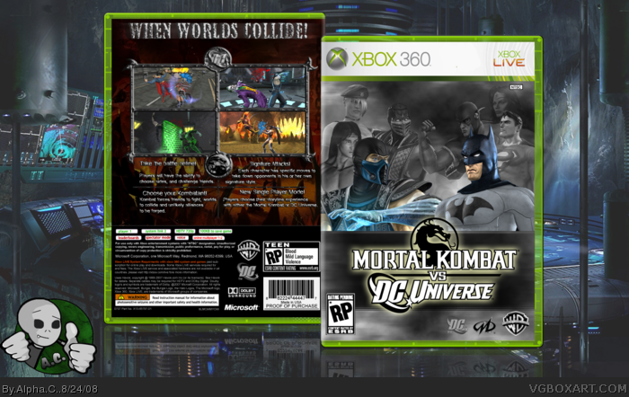
Okay so.. this box was a challenge. Haha.
I had to cut out all the pictures of the character son the front, and had to make a custom border for the screenshots, and I really like how it turned out. Took me about 2-3 hours.
Hope ya like it.
I would have liked to have seen more color on the cover. it just doesn't draw me in. I love the ideafor the cover, simple but catchy... just lacks color. If you're gonna highlight 2 characters in the front, I'd try and go w/ Scorpion and Flash. Those 2 would give the cover a nice pop against the desaturated bg. This is just my opinion. Great other wise.
 Mortal Kombat vs. DC Universe Box Cover Comments
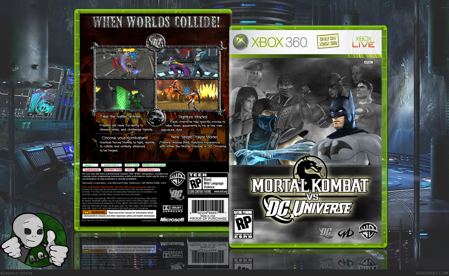
Okay so.. this box was a challenge. Haha.
I had to cut out all the pictures of the character son the front, and had to make a custom border for the screenshots, and I really like how it turned out. Took me about 2-3 hours.
Hope ya like it.
[ Reply ]
wow... unbelieveable o___o 5/5 =D
[ Reply ]
Nice ;)
[ Reply ]
thanks everyone.
[ Reply ]
i like the engraving of the MK symbol and the DC symbol on the pictures, that really looks real. nice job!
5/5!
Edited at 1 decade ago
[ Reply ]
This is really good, can't wait for the game. +fav
[ Reply ]
this is pretty good
[ Reply ]
hey can i ask you how you did the border?
[ Reply ]
Just minor stuff, like patterns and contour on photoshop, the spirals on the corners were by just drawing them out.
thanks to the favs.
[ Reply ]
k thanks.
[ Reply ]
Well I can understand that there arent many great pictures to use to make a good box for this game but you used them pretty well. Nice job.
[ Reply ]
My Air is taken away from me.... 5/5!
[ Reply ]
thanks.
[ Reply ]
I would have liked to have seen more color on the cover. it just doesn't draw me in. I love the ideafor the cover, simple but catchy... just lacks color. If you're gonna highlight 2 characters in the front, I'd try and go w/ Scorpion and Flash. Those 2 would give the cover a nice pop against the desaturated bg. This is just my opinion. Great other wise.
[ Reply ]