[ Buy Resident Evi... at Amazon ] By AManWithAPlan 1 on August 24th, 2008 No Printable Available Resident Evil 5: Collector's Edition Box Cover Comments Comment on AManWithAPlan's Resident Evil 5: Collector's Edition Box Art / Cover. Cancel Reply AManWithAPlan 1 [ 1 decade ago ] first box woot, critiques are welcome, i'm thinking about making the logo bigger, you decide [ Reply ] super-mega-hyper-sonic 41 [ 1 decade ago ] too plain [ Reply ] KanebroughRocks 1 [ 1 decade ago ] LAWL Thats too Plain. I mean TOO PLAIN. But for a Fitst one I cant complain. [ Reply ] Pan 48 [ 1 decade ago ] It just says 5, where's the "Resident Evil?" [ Reply ] sd1833 48 [ 1 decade ago ] It's too plain, you need to add an image so there's more than just the logo. Also the template is cut off at the top. Edited at 1 decade ago [ Reply ] AManWithAPlan 1 [ 1 decade ago ] #2, I knew someone was gonna say that #4, yeah I thought that was a problem #5, I didn't see of that [ Reply ] afifan000 44 [ 1 decade ago ] it is plain, and you should add resident evil, but it was a good idea. i don't think the ESRB and CAPCOM logo should'nt be faded in if you update this and keep the idea, i might fave Edited at 1 decade ago [ Reply ] Rossagues 42 [ 1 decade ago ] Just add some more textures.. [ Reply ] spypilot 43 [ 1 decade ago ] that is more plain than my DOT box (which i am trying to delete) [ Reply ]
 Resident Evil 5: Collector's Edition Box Cover Comments
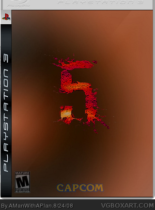
first box woot, critiques are welcome, i'm thinking about making the logo bigger, you decide
[ Reply ]
too plain
[ Reply ]
LAWL Thats too Plain. I mean TOO PLAIN. But for a Fitst one I cant complain.
[ Reply ]
It just says 5, where's the "Resident Evil?"
[ Reply ]
It's too plain, you need to add an image so there's more than just the logo.
Also the template is cut off at the top.
Edited at 1 decade ago
[ Reply ]
#2, I knew someone was gonna say that
#4, yeah I thought that was a problem
#5, I didn't see of that
[ Reply ]
it is plain, and you should add resident evil, but it was a good idea. i don't think the ESRB and CAPCOM logo should'nt be faded in
if you update this and keep the idea, i might fave
Edited at 1 decade ago
[ Reply ]
Just add some more textures..
[ Reply ]
that is more plain than my DOT box (which i am trying to delete)
[ Reply ]