[ Box updated on August 24th, 2008 ] [ original ]
 Shadow of the Colossus DX Bundle Box Cover Comments
Comment on master_general's Shadow of the Colossus DX Bundle Box Art / Cover.
[ Box updated on August 24th, 2008 ] [ original ]
Comment on master_general's Shadow of the Colossus DX Bundle Box Art / Cover.
Phew, since Jun. this has been an idea
since july this has been in the wroks
and Now, my Anniversery box(birthday box for skyrunner too)
I would like to thank alot of people for this last year
Al, for helping me all the time and keeping me going
Sky, Shadow, Icefox, Xcore, and a few other friends for making me feel like I belong here
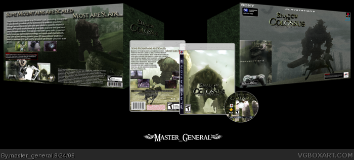
Now the box, i wanted a box that would stand out from other boxes, a box noone thought of, and i finally got my copy of the SotC art book and WOW good discarded colossi, then the idea was born. I spent hours a day working on this, temps, logos, all of it is mine. And then i got help from a few good people and now it's done
Enjoy,
M_G
[ Reply ]
Shouldn't there be something other than white on the sides of the box? O.o +fav
[ Reply ]
#2, yeah i was about to say that? but other than that it looks pretty cool
Edited at 1 decade ago
[ Reply ]
#2, What he said, but looks pretty good.
[ Reply ]
Meh...
The sides of the bundle are blank, the PS3 is poorly placed/edited, the horse doesn't look like he's on the ground, the logo is poorly cut and somewhat stretched, the creature on the back is poorly added in, the text looks bad and I don't like the overall layout. The design isn't very original, either.
The layout of the actual box is boring and doesn't work well.
Sorry, but I don't like it.
[ Reply ]
it looks kinda streched. and the sides are blank.
[ Reply ]
agreed with TTT about the sides, and the horse. But its awesome so you get my fav
[ Reply ]
I like it and you get a fav from me. The only thing I would change is the sides.
[ Reply ]
the horse is like that on the image -_________-
i'll fix the white and the stretched
[ Reply ]
I love my present!
[ Reply ]
Glad you like it
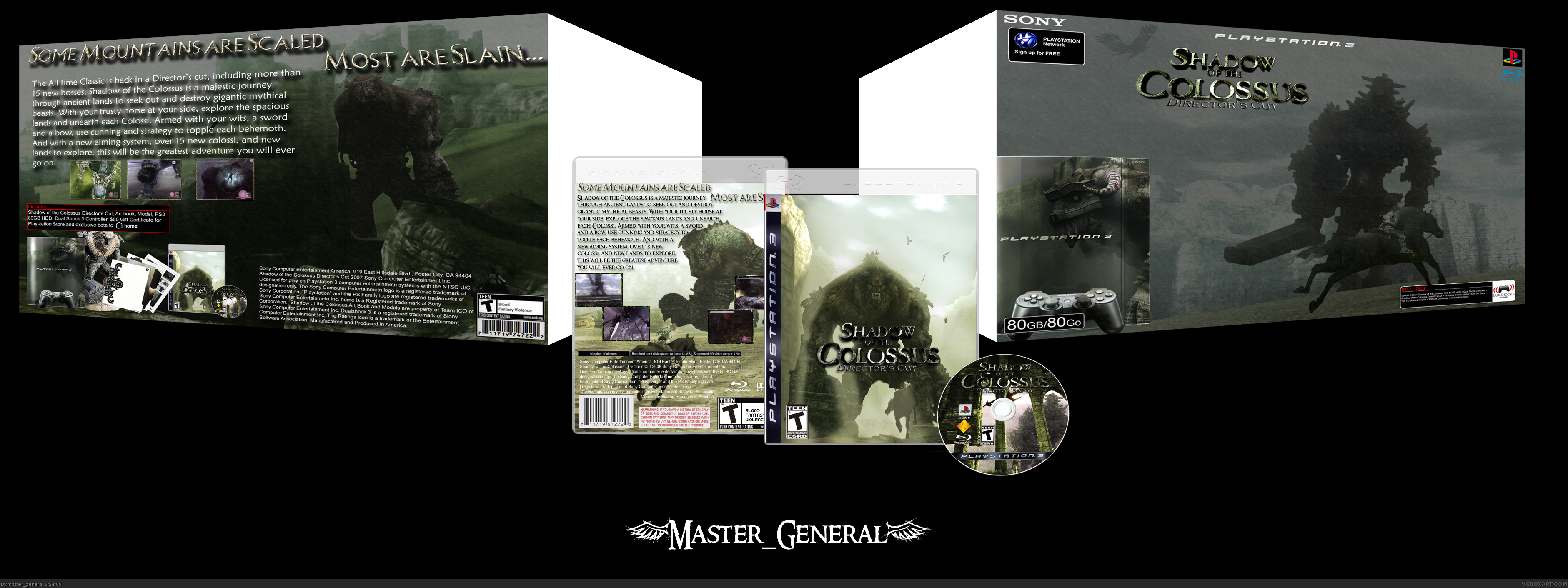
UPDATE
[ Reply ]
There is no need to turn the logo around on the right side, else people would have to read it backwards.
[ Reply ]
You didn't skew the logos properly. :|
[ Reply ]
Update again
i skewed more properly
[ Reply ]
#9, Thank you lol
[ Reply ]
it looks a lot better now. +author fav
[ Reply ]