It's definitely not bad, and the design is certainly reasonable.
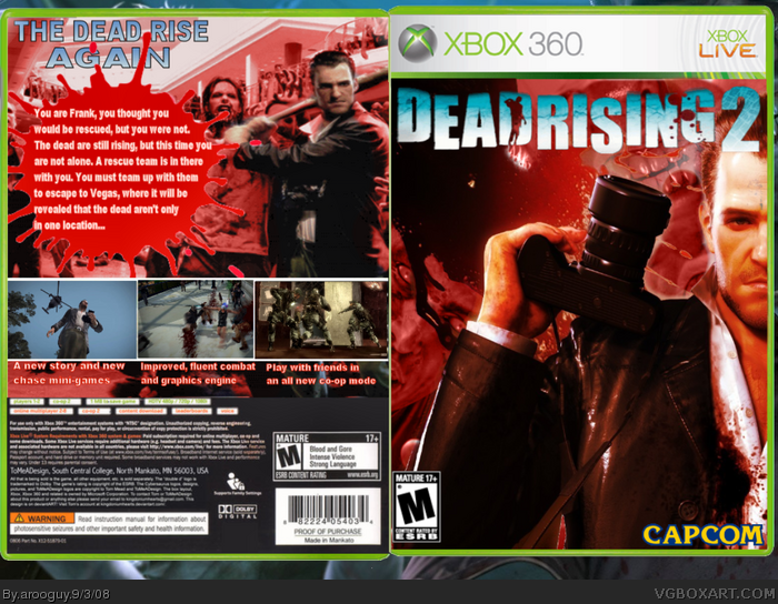
I like the blood effect on the front, but I feel that I'd like to see more happening on the box as it is. It might also look better if the resolution was a little higher, that way we can see the layer work and effects you've used on this piece better.
You read my mind about the online co-op for this game though. :)
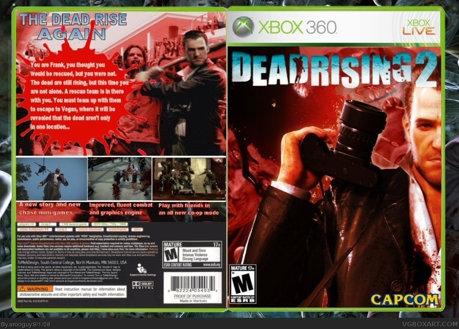
I added a higher res version :D Thank you for the advice Drakxxx. I will appreciate other comments as well. I never get comments so I may sound like an ass kisser when people comment on my boxes. lol
 Dead Rising 2 Box Cover Comments
Dead Rising 2 box...don't know what else to really say. Just hoping that this shows improvement as an artist, and I really would like advice.
[ Reply ]
It's definitely not bad, and the design is certainly reasonable.
I like the blood effect on the front, but I feel that I'd like to see more happening on the box as it is. It might also look better if the resolution was a little higher, that way we can see the layer work and effects you've used on this piece better.
You read my mind about the online co-op for this game though. :)
[ Reply ]
Ok, thank you very much. I appreciate it. :D
Edited at 1 decade ago
[ Reply ]
I added a higher res version :D Thank you for the advice Drakxxx. I will appreciate other comments as well. I never get comments so I may sound like an ass kisser when people comment on my boxes. lol
[ Reply ]
maybe change the color of the logo to red and add a small black stroke to the outside of it
[ Reply ]