#3, Well actually I was commenting it because no one else was....I hate when I upload a box art and NO ONE comments it. So yeah this box is not perfect but its not to bad. And I do think you are being a little harsh by giving him a 1 out of 5. I would give it a 3.5 out of 5 mostly because all of the flaws you listed but I don't think those are worth a 1 out of 5.
 Dragonball Z Taisen Box Cover Comments
New Box art? Is it good?
Credits to: Ahuron for those sprites; I think I spelled his name right..
SDB for the background
Jajaja.
Edited at 1 decade ago
[ Reply ]
Well I think this is pretty good. I cant really point out anything wrong.
[ Reply ]
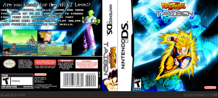
#2, really, i think this box is horrible
- you didn't use the new official DBZ logo, they stopped using that logo
- the esrb on the front is way too small
- the nintendo logo on the front is way too small
- that's just a horrible text for a dbz game
- the screens are okay but they need borders
- you didn't add the atari logo, atari still had a huge hand in making this game, yet you simply stuck with the nintendo logo
1/5 for effort
Edited at 1 decade ago
[ Reply ]
#3, Well actually I was commenting it because no one else was....I hate when I upload a box art and NO ONE comments it. So yeah this box is not perfect but its not to bad. And I do think you are being a little harsh by giving him a 1 out of 5. I would give it a 3.5 out of 5 mostly because all of the flaws you listed but I don't think those are worth a 1 out of 5.
[ Reply ]
yeah #3 that was jacked up! 4/5 -) cyclops.
[ Reply ]
Jesus!That's Awesome!
[ Reply ]
I love the concept. :)
[ Reply ]