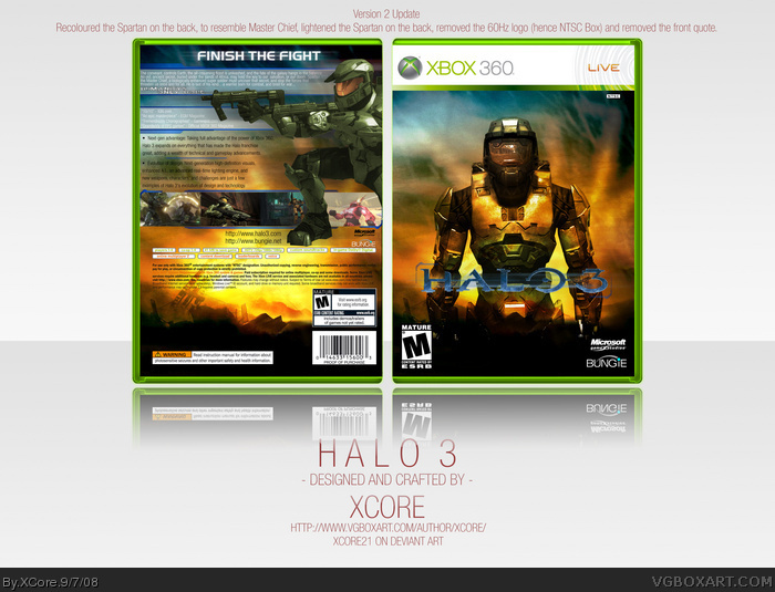
Sorry, I still don't like the back. The spartan looks really bad tbh. He isn't visible enough and the colours don't feel right. The text is really boring, he should be more interesting. As it's set in the future. Also, the spartan looks really out of place. Finally., I hate the blurry effect on the whole box. Sorry.
Nice box, but I have a few things. Some have been said, some are a bit nit-picky xD
* The plastic looks kinda bleh
* The MC should be a bit greener...
* Spartan on back should be lighter
* Background is a bit grainy, but I think thats kinda fair because the box is so big
* ESRB on Back is E and on front is M
* I don't like the "Humanity's only hope"
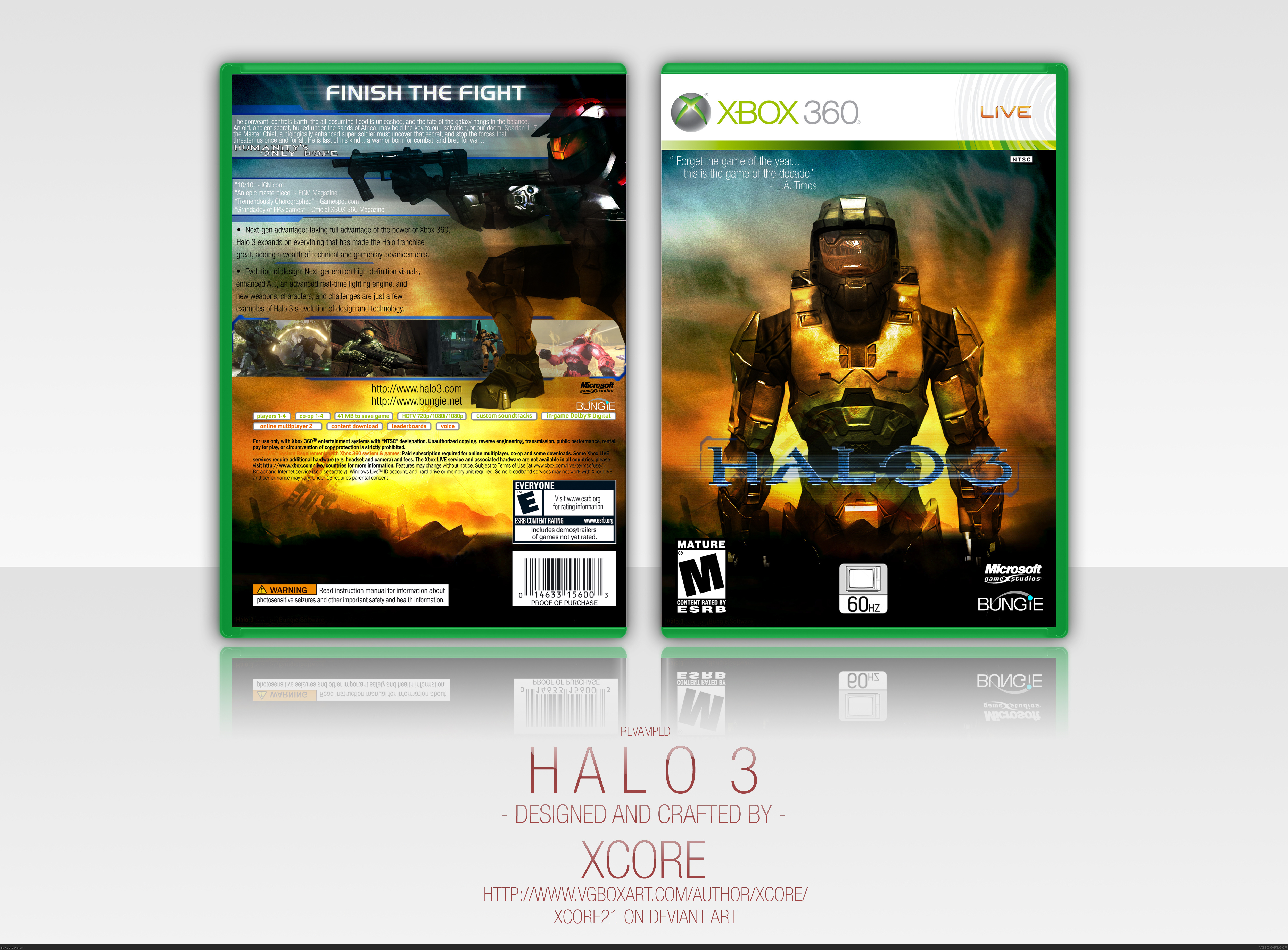
Changed the Plastic's Colour (Apollo)
Recoloured the Spartan on the Back (Apollo)
Lightened the Spartan (Apollo)
Changed the back ESRB (Solar Destruction)
Removed the front quote (Techne)
 Halo 3 Box Cover Comments
Very nice use of color. Spartan on the back could be a little brighter though
[ Reply ]
Great work dude!
+fav
[ Reply ]
Why didn't you update it?
[ Reply ]
#3 Because, I totally deleted it, without the fate of going back, but I reconsidered it, and remade it.
[ Reply ]
WOW! O.O
[ Reply ]
EPIC front.
Back could use some work.
Still, fav.
(by the way, that canvas is way too large)
[ Reply ]
Sorry, I still don't like the back. The spartan looks really bad tbh. He isn't visible enough and the colours don't feel right. The text is really boring, he should be more interesting. As it's set in the future. Also, the spartan looks really out of place. Finally., I hate the blurry effect on the whole box. Sorry.
[ Reply ]
I'd make it smaller, the logo and the chief look somewhat low res.
Also, the background. Too much white space, I shouldn't have to scroll to see the entire box due to a huge background.
"Humanity's only hope" looks out of place.
Other than that, a great unique design. 4.5/5
On other dislike. The spartan on the back. His foot. Yeeeaaahh....
Edited at 1 decade ago
[ Reply ]
The back is rated E, but the front is rated M.
[ Reply ]
Very nice. it's a lot better than it was before.
#9, Yes it does please fix it
Edited at 1 decade ago
[ Reply ]
The update looks alot better! +fav
[ Reply ]
I love it FAVE
[ Reply ]
One of my favorite halo 3 boxes on the site. Simply fabulous.
[ Reply ]
Front is supoib. Back is fantastic as well, although the rating is different, and the specs could be lowered.
[ Reply ]
Amazing front but I still wish you had removed the quote on the cover like I has suggested!
[ Reply ]
Nice box, but I have a few things. Some have been said, some are a bit nit-picky xD
* The plastic looks kinda bleh
* The MC should be a bit greener...
* Spartan on back should be lighter
* Background is a bit grainy, but I think thats kinda fair because the box is so big
* ESRB on Back is E and on front is M
* I don't like the "Humanity's only hope"
Nice box overall, though
[ Reply ]
Looks very nice! dont like the spartan on the back but i can live with that. Very nice look overall!
[ Reply ]
Updated, took in the critique left by the users:
Changed the Plastic's Colour (Apollo)
Recoloured the Spartan on the Back (Apollo)
Lightened the Spartan (Apollo)
Changed the back ESRB (Solar Destruction)
Removed the front quote (Techne)
[ Reply ]
Oh wow, I feel bad that you changed half of the stuff for me xD
I actually meant MC on the front should be greener, but I don't care, the back Spartan looks really cool now. I'll have to fave...
Edited at 1 decade ago
[ Reply ]
Very noice.
Also its good to see someone actually taking in the crit.
most people just listen to it and dont bother with it...
Well done for that XCore
[ Reply ]
Excellent, your canvas is huge but I dig the presentation style
[ Reply ]
sweet box man +fav
[ Reply ]
congrats, man
[ Reply ]
Did anyone notice that it doesn't say "Only on Xbox"
[ Reply ]
Another familar presentation
[ Reply ]
#25, Yes I know it's familiar to yours, but I based mine on Imandix.
And #24, I forgot, and it's just a small flaw. Nothing big.
Thanks for the support guys. 7th HoF! 4th in a row!
[ Reply ]
#25, You say that on every presentation that has a simplistic white background... Jesus, you dont own the rights to it... get over it >.>
[ Reply ]
its ok not that good though
[ Reply ]
#28 I could have some proper critique, than, it's not good though. ¬.¬'
[ Reply ]
spartan looks out of proportion
[ Reply ]