Was this one the one that was gonna be your best? Lol, nice concept, unfortunately I can't say I like the design too much. Dick is just pushed to the side, leaving the silhouette vector brushes to take center stage. I'd also have to say it's pretty uninspiring, sorry if I sound too harsh, but I'm expecting more from you :(
 Dick Gumshoe: Ace Investigator Box Cover Comments
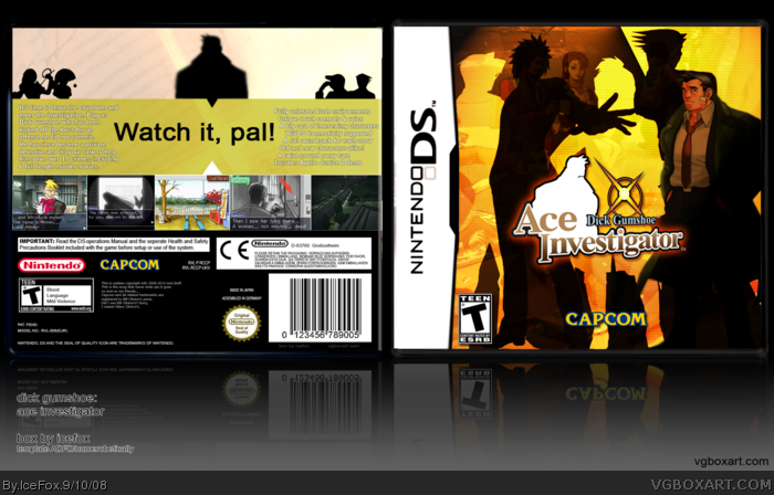
Enjoy. Logo by Rokudaime.
Full view please.
Edited at 1 decade ago
[ Reply ]
Was this one the one that was gonna be your best? Lol, nice concept, unfortunately I can't say I like the design too much. Dick is just pushed to the side, leaving the silhouette vector brushes to take center stage. I'd also have to say it's pretty uninspiring, sorry if I sound too harsh, but I'm expecting more from you :(
[ Reply ]
2, no it's not the one.
[ Reply ]
i know this is not the one best one
but this is good
[ Reply ]
Amazing, I love it.
[ Reply ]
I love the front, but the back seems a lil plain.
[ Reply ]
"enviroements" typo on the back.
Otherwise awesome job. +fav.
[ Reply ]
The text on the back is horrible, Arial usually doesn't pull off headings.
Edited at 1 decade ago
[ Reply ]
It should be called Incredible Investigator or something that start on I. 5/5
[ Reply ]