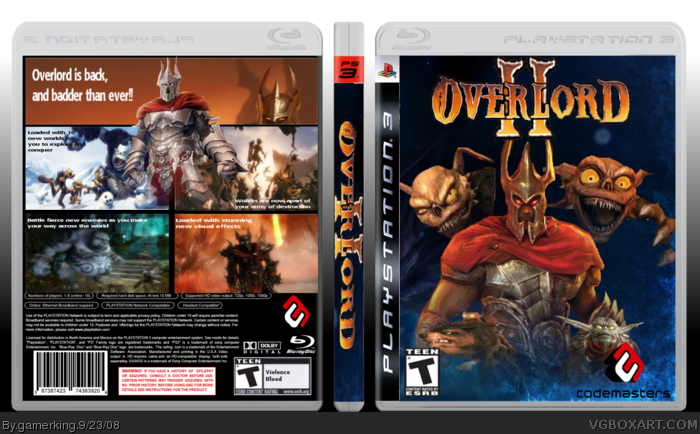
But badder just hurts my senses. Everything I have ever been taught, so seriously insulted.
I'm sorry, it's just that I'm one of the people that struggled through the long and painful way of learning English. It just makes me go bananas when I see something like that, I remember being harshly punished by my English teachers whenever I did a mistake of this kind (or didn't use "s" in 3rd person singular).
But really, you should've used something different... maybe "more evil than ever"...
I'm sorry, once again.
Backto the box, I like it pretty much except a few flaws that I mentioned, and also the Overlord in the back is just looking over those boxes... looks kind of satiric. It would've been a good idea with a minion like that.
i don't know, i like the "badder" better. lol. but yeah, now that you mention it, that overlord on the back does look funny, like he's peering over the edge. didn't notice that when i made it. lol.
 Overlord 2 Box Cover Comments
i think this came out really good. what do you guys think of it?
[ Reply ]
oops, i completely forgot. credit to venom1 for the template. thanks man, cause i really like this template.
[ Reply ]
a little choppy, the font in the back doesn't fit and the logo is low-quality.
And the comparative of "bad" is "worse". My english teacher would rip you to shreds.
[ Reply ]
what are you talking about with the comparative of bad?
[ Reply ]
bad, worse, worst.
not badder.
[ Reply ]
well, if i use the word worse, then it makes it sound like the game is bad.
"Overlord is back, and worse than ever!!" That would be terrible :)
[ Reply ]
But badder just hurts my senses. Everything I have ever been taught, so seriously insulted.
I'm sorry, it's just that I'm one of the people that struggled through the long and painful way of learning English. It just makes me go bananas when I see something like that, I remember being harshly punished by my English teachers whenever I did a mistake of this kind (or didn't use "s" in 3rd person singular).
But really, you should've used something different... maybe "more evil than ever"...
I'm sorry, once again.
Backto the box, I like it pretty much except a few flaws that I mentioned, and also the Overlord in the back is just looking over those boxes... looks kind of satiric. It would've been a good idea with a minion like that.
[ Reply ]
i don't know, i like the "badder" better. lol. but yeah, now that you mention it, that overlord on the back does look funny, like he's peering over the edge. didn't notice that when i made it. lol.
[ Reply ]
I really like the front, it's very attractive, very simplistic and basic, your also improving greatly on your backs
hell, i'll fav :)
[ Reply ]
thank you so much #9!!
[ Reply ]