[ Buy Saving Priva... at Amazon ] » 2008 Hall of Fame Winner! By ELCrazy 50 on September 28th, 2008 No Printable Available Saving Private Ryan Box Cover Comments Comment on ELCrazy's Saving Private Ryan Box Art / Cover. Cancel Reply ELCrazy 50 [ 1 decade ago ] Box that was made for the DVD comp long time ago. Forgot to upload it. So yeah....enjoy! (: [ Reply ] Apollo 41 [ 1 decade ago ] Looks beaute. Not sure about the text on the top at the back, but still fave worthy! [ Reply ] Karma 33 [ 1 decade ago ] It's great, but I think the Director's Cut text is oddly placed, and the gradiented text looks a bit odd. Great design though, it's really nice ;) [ Reply ] hsoldier 44 [ 1 decade ago ] O__o im still reading the book lol its really good and so is this box! :D [ Reply ] TrevOwnz 42 [ 1 decade ago ] Looks sweet but you should have retyped a lot of things and not just cut it off of another cover or official. There is a lot of bad areas in the template copyright and Digital Surround Sound thing. Looks cool overall. [ Reply ] Ninjamojo27 37 [ 1 decade ago ] Lol, I remember when I was in a DVD comp I wqas gonna do a Saving Private Ryan box and the front looked just like that one. [ Reply ] E_G 39 [ 1 decade ago ] Very dramatic and arty. The tag line is out of place and too stylized compared to the rest. [ Reply ] shadysaiyan 42 [ 1 decade ago ] Very nice!, never saw this movie, remember hearing a lot about it when i was young though. [ Reply ] Maybe Tomorrow 30 [ 1 decade ago ] On the back, remember to anti-alias your text. It looks pixely. [ Reply ] Drakxxx 46 [ 1 decade ago ] looking good man. [ Reply ] sven.2007 13 [ 1 decade ago ] looks amazing. I really love your style. [ Reply ] FLAMEZ95 1 [ 1 decade ago ] take away the writing at the top of the back, or try a different font and dont have it sideways and this would be perfect [ Reply ]
 Saving Private Ryan Box Cover Comments
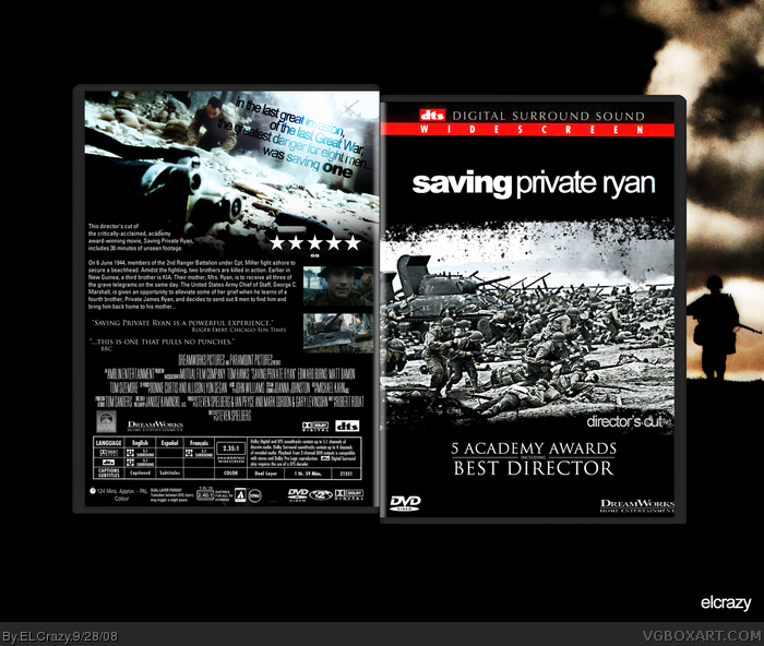
Box that was made for the DVD comp long time ago. Forgot to upload it.
So yeah....enjoy! (:
[ Reply ]
Looks beaute. Not sure about the text on the top at the back, but still fave worthy!
[ Reply ]
It's great, but I think the Director's Cut text is oddly placed, and the gradiented text looks a bit odd. Great design though, it's really nice ;)
[ Reply ]
O__o im still reading the book lol its really good and so is this box! :D
[ Reply ]
Looks sweet but you should have retyped a lot of things and not just cut it off of another cover or official. There is a lot of bad areas in the template copyright and Digital Surround Sound thing. Looks cool overall.
[ Reply ]
Lol, I remember when I was in a DVD comp I wqas gonna do a Saving Private Ryan box and the front looked just like that one.
[ Reply ]
Very dramatic and arty. The tag line is out of place and too stylized compared to the rest.
[ Reply ]
Very nice!, never saw this movie, remember hearing a lot about it when i was young though.
[ Reply ]
On the back, remember to anti-alias your text. It looks pixely.
[ Reply ]
looking good man.
[ Reply ]
looks amazing. I really love your style.
[ Reply ]
take away the writing at the top of the back, or try a different font and dont have it sideways and this would be perfect
[ Reply ]