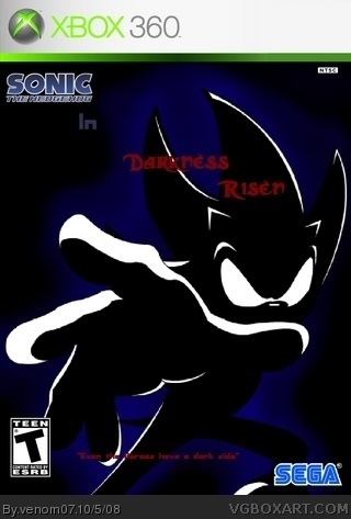
This is O.K. The Shadow looks cool, but drowns out the 'Darkness Risen' I would move it or recolour it to a more visable colour. Also your Sonic Logo is too small to have people recognise it as a Sonic Game. When zoomed in all the graphics are VERY pixallated. You must refrain from zooming in the picture. Anyway, It could be a decent box if it was clearer. I give it a 3.5/5.
 Sonic the hedgehog 2 :Darkness Risen Box Cover Comments
This is O.K. The Shadow looks cool, but drowns out the 'Darkness Risen' I would move it or recolour it to a more visable colour. Also your Sonic Logo is too small to have people recognise it as a Sonic Game. When zoomed in all the graphics are VERY pixallated. You must refrain from zooming in the picture. Anyway, It could be a decent box if it was clearer. I give it a 3.5/5.
[ Reply ]