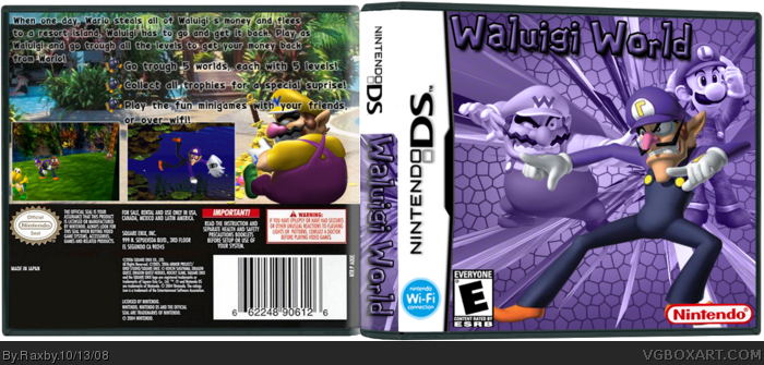
Well, here's my first box ever, Waluigi World!
The screenshots are a bit low quality because there aren't many resources. If I forgot to add anything, please do tell! Also, I didn't make a background (for behind the box) because I think it takes away your attention from the box itself.
Please comment, fave and enjoy!
For a first box, this is beyond impressive.
Correct template, check.
Correct use of logos, check.
Non choppy renders, check.
The only thing I would say improve on is some screenshot borders and maybe a different layout/colour for the text on the back to make it stand out more. Overall, an excellent first and i'll look forward to your next box 4/5
#6, Thank you for the comment. And as I said, I had a lot of trouble with the screenshots. And I'll keep the text layout and colour in mind for my next box. :3
#7, Thank you for the fave :3
And I'll work on my text and screenshots.
super-mega-hyper-sonic, thank you for the +fave :D
 Waluigi World Box Cover Comments
Well, here's my first box ever, Waluigi World!
The screenshots are a bit low quality because there aren't many resources. If I forgot to add anything, please do tell! Also, I didn't make a background (for behind the box) because I think it takes away your attention from the box itself.
Please comment, fave and enjoy!
Edited at 1 decade ago
[ Reply ]
This is incredible for a first! +fav 5/5
[ Reply ]
#2, Thank you :3
[ Reply ]
Very Nice, but you spelled "through" as "trough" on the back.
[ Reply ]
#4, Thank you, and also thanks for pointing out that mistake, I'll fix it if I get the time (an motivation :p)
[ Reply ]
For a first box, this is beyond impressive.
Correct template, check.
Correct use of logos, check.
Non choppy renders, check.
The only thing I would say improve on is some screenshot borders and maybe a different layout/colour for the text on the back to make it stand out more. Overall, an excellent first and i'll look forward to your next box 4/5
Welcome to the site.
Edited at 1 decade ago
[ Reply ]
man, this is pretty good, though the back lost me
try some screenborders and try to make the text stand out, it blends in a little to much
Welcome! fav for effort
[ Reply ]
#6, Thank you for the comment. And as I said, I had a lot of trouble with the screenshots. And I'll keep the text layout and colour in mind for my next box. :3
#7, Thank you for the fave :3
And I'll work on my text and screenshots.
super-mega-hyper-sonic, thank you for the +fave :D
Edited at 1 decade ago
[ Reply ]
wow fav
[ Reply ]
#9, Thank you for the fav :3
[ Reply ]
The back needs some help, but I am really feeling the front. This shows a heck of a lot of promise.
[ Reply ]
I like this :D
[ Reply ]
#11, Thanks dude.
#12, Thanks :3
[ Reply ]
Waluigi deserves more attention :P the background is a -little- off but that doesn't stop it from being awesome :)
[ Reply ]