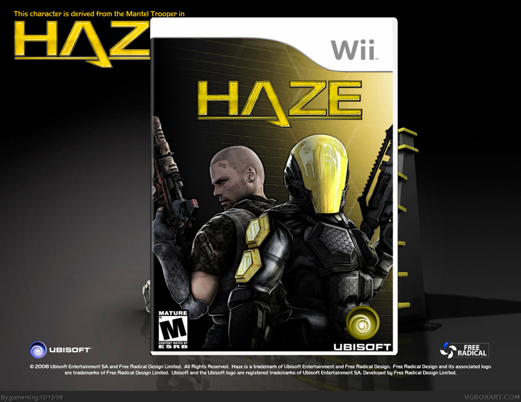
What is up with your background, man? Did you take some wallpaper for it? If so, not cool, you can do better than that. The box itself isn't too bad though.
My suggestion for the back is to put a stroke around the text instead of a drop shadow. And for me the image of the background (behind the box) is distracting. It's looking good for the most part, though.
#17, Okay, I had to download GIMP and read a tutorial to find the answer for you.
Here's what you need to do:
1. Create Text, as you already have.
2. Make a copy of the text, make it the color you want the stroke to be. (You want this layer to be below the original text layer.)
3. Blur that layer with Filters>Blur>Blur
4. Copy blurred (stroke) layer.
5. Combine the two blurred layers.
Repeat 4 and 5 to personal taste.
It's a lot easier in Photoshop, but this is the best result I could find in GIMP.
BTW, I forgot to fav this, so I fixed that problem.
 Haze Box Cover Comments
my latest box! credit to adfd for temp.
anyway, i know it's kind of plain but i like it like that...plus the original isn't very exciting either. lol. please tell me what you think of it! :)
[ Reply ]
What is up with your background, man? Did you take some wallpaper for it? If so, not cool, you can do better than that. The box itself isn't too bad though.
[ Reply ]
This is one of my favorite boxes you've done.
[ Reply ]
Yep, I sure do like it :)
[ Reply ]
thanks guys!! :)
[ Reply ]
I thinks this is your best, you should try to make a back for it.
[ Reply ]
thank you!! and okay, i'll try and make a back tomorrow. but no guarantees. lol.
[ Reply ]
it's good one of the best you've done.
[ Reply ]
thank you! :)
[ Reply ]
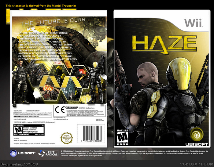
i made a back!! :) i worked really hard on it. what do you think?
--------------------------------------------------
ANYBODY????? :(
Edited at 1 decade ago
[ Reply ]
looks better now joe!
[ Reply ]
lol, thanks ryan.
[ Reply ]
Looks good but hard to see teh back texts
[ Reply ]
okay. i'll see what i can do tomorrow. :)
[ Reply ]
My suggestion for the back is to put a stroke around the text instead of a drop shadow. And for me the image of the background (behind the box) is distracting. It's looking good for the most part, though.
[ Reply ]
okay, thanks. i'll try and do a stroke and just make the background black. :)
[ Reply ]
thanks for the fav afifan!! :)
oh, and tleeart. how do i add a stroke? i can't seem to find it on gimp.
[ Reply ]
I think it looks good, the only hting I would do is try to make the text more noticeable on the back. It blends in with the background.
[ Reply ]
so i heard. lol. but thank you! and i'm still trying to figure out how to add a stroke. lol. but thanks!
[ Reply ]
Wow! Now this box is VERY nice!
[ Reply ]
#17, Okay, I had to download GIMP and read a tutorial to find the answer for you.
Here's what you need to do:
1. Create Text, as you already have.
2. Make a copy of the text, make it the color you want the stroke to be. (You want this layer to be below the original text layer.)
3. Blur that layer with Filters>Blur>Blur
4. Copy blurred (stroke) layer.
5. Combine the two blurred layers.
Repeat 4 and 5 to personal taste.
It's a lot easier in Photoshop, but this is the best result I could find in GIMP.
BTW, I forgot to fav this, so I fixed that problem.
Edited at 1 decade ago
[ Reply ]
thanks for the tutorial and fav!!
[ Reply ]