I would like to give major credit here to ~Manganiac over at deviantart.com. I found this image of Samus that I used on the front as I was browsing the archives there, and it really inspired me to put this together.
Please take the chance to take a look at the wonderful art of ~Manganiac.
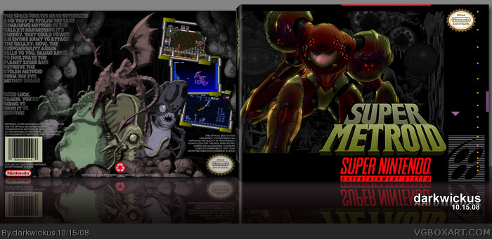
Now, as for the box. One of the most iconic images that I can remember playing Super Metroid when it was first released (yes, I am old, we all know this...) was the statue of the bosses that led to Tourian. I really wanted to focus on re-creating that statue on the back using offical artwork.
Also a shoutout to KoopaDasher for hearing me b*tch and whine for about 3 nights as I tried to finish this up!
Yes! It's finally done! :-p What's the word I'm looking for...? Oh yeah! EPIC! The stonework looks great, and the text looks fine in full view. My only gripe is that the screen borders don't really fit, I don't think, but overall, it's excellent and of course you get your first fave!
#9 & 10: Sorry that you feel that way about the back image/bevel. I really feel that this is the reason the box works. It's quite an iconic image in the game. As for the bevel, that was really a last resort choice for me to use. I tried using a number of different filters to replicate the feel of a stone statue, and a lot of what I was doing just kind of ruining the original artwork. So, as a compromise, I added the bevel, at first to Ridley, and it immediately gave more of a sculpted look for me (remember statue!) and then for consistency, added smaller ones to the rest.
And don't forget, I work with real size resolutions first before I scale down, so the screenshots on the back (borders not included) are the typical 1" height that Nintendo commonly used on boxes like Star Fox, Super Mario Kart, Super Mario World 2 (Yes, I take boxes out of the closet and measure them with a ruler as I work...)
#8: But, I loves teh Super Nintendo. Can I make more? Please? PLEASE!?!?!
#13, Maybe if you made the bevel a little softer instead of so hard-edged...maybe that will make it a little better. It reads more as if they were carved into a flat piece of stone the way they are, kind of like a frieze. Softening the bevel will make it feel a little more rounded, I think.
 Super Metroid Box Cover Comments
I would like to give major credit here to ~Manganiac over at deviantart.com. I found this image of Samus that I used on the front as I was browsing the archives there, and it really inspired me to put this together.
link
Please take the chance to take a look at the wonderful art of ~Manganiac.
Now, as for the box. One of the most iconic images that I can remember playing Super Metroid when it was first released (yes, I am old, we all know this...) was the statue of the bosses that led to Tourian. I really wanted to focus on re-creating that statue on the back using offical artwork.
Also a shoutout to KoopaDasher for hearing me b*tch and whine for about 3 nights as I tried to finish this up!
Enjoy!
[ Reply ]
Yes! It's finally done! :-p What's the word I'm looking for...? Oh yeah! EPIC! The stonework looks great, and the text looks fine in full view. My only gripe is that the screen borders don't really fit, I don't think, but overall, it's excellent and of course you get your first fave!
[ Reply ]
I love the dark tone of this. Excellent!
[ Reply ]
...
[ Reply ]
Beautiful Job
[ Reply ]
Really good job.
[ Reply ]
An awesome box for one of my favorite games of all time.
[ Reply ]
Why Mr Wickus, you spoil us with these SNES boxes.
Edited at 1 decade ago
[ Reply ]
screenshots a little small and back image i dislike but other than that its really good +fav
[ Reply ]
Agreed with #9 on the back image. The renders are ruined with the bevel on them. I like the screen borders. Either way, it's still good. 4/5 and fav.
[ Reply ]
That is awesome.
[ Reply ]
I actually love how the back image looks, it's my favorite part of this awesome box!
[ Reply ]
Once again I wake up to some fine comments! Rawr!
#9 & 10: Sorry that you feel that way about the back image/bevel. I really feel that this is the reason the box works. It's quite an iconic image in the game. As for the bevel, that was really a last resort choice for me to use. I tried using a number of different filters to replicate the feel of a stone statue, and a lot of what I was doing just kind of ruining the original artwork. So, as a compromise, I added the bevel, at first to Ridley, and it immediately gave more of a sculpted look for me (remember statue!) and then for consistency, added smaller ones to the rest.
And don't forget, I work with real size resolutions first before I scale down, so the screenshots on the back (borders not included) are the typical 1" height that Nintendo commonly used on boxes like Star Fox, Super Mario Kart, Super Mario World 2 (Yes, I take boxes out of the closet and measure them with a ruler as I work...)
#8: But, I loves teh Super Nintendo. Can I make more? Please? PLEASE!?!?!
[ Reply ]
#13, Maybe if you made the bevel a little softer instead of so hard-edged...maybe that will make it a little better. It reads more as if they were carved into a flat piece of stone the way they are, kind of like a frieze. Softening the bevel will make it feel a little more rounded, I think.
[ Reply ]
Top notch, you really captured the feel of a Metroid game, more so than the other Metroid boxes on this site.
[ Reply ]
I LOVE that front.
[ Reply ]
best metroid box on the site IMO
[ Reply ]
Thanks everyone! Just noticed this had made it into the hall...
[ Reply ]
The front is amazing.
[ Reply ]
Best Super Metroid box I've seen so far! Great job on one of my favorite game titles!
[ Reply ]
Epic!
[ Reply ]