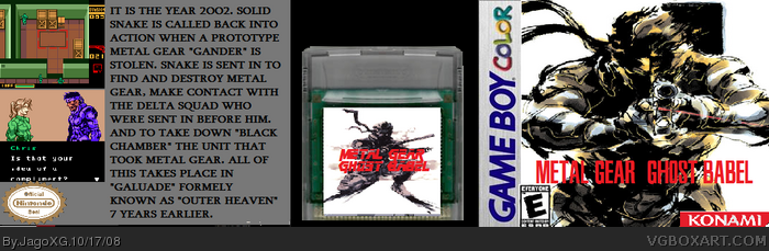
#1, Front's pretty simple, but okay. Is this rated E? I've not seen a Metal Gear get below a T rating.
Anyway, the back is plain...I think the screens need to be smaller just a tad so you don't have them right on top of each other. I suggest also a Shinkawa art for the background, something like the game's respective Metal Gear, at a low opacity and also check into GameBoy Color boxes here or on the net for any kind of logos needed, such as "Only on GameBoy Color!" and stuff like that.
 Metal Gear Ghost Babel/ Metal Gear Solid Box Cover Comments
Yeah, It's not that Good
[ Reply ]
#1, Front's pretty simple, but okay. Is this rated E? I've not seen a Metal Gear get below a T rating.
Anyway, the back is plain...I think the screens need to be smaller just a tad so you don't have them right on top of each other. I suggest also a Shinkawa art for the background, something like the game's respective Metal Gear, at a low opacity and also check into GameBoy Color boxes here or on the net for any kind of logos needed, such as "Only on GameBoy Color!" and stuff like that.
Not bad though, just needs improvement.
[ Reply ]
#2, The real Game was Rated E Actually. And yeah I did try adding in the Official Artwork in the Back but I had No Room for the Text
[ Reply ]
#3, As for the E, I was just curious, didn't know. As for the Art as long as it's kind of muted out, you can put it in behind the text and screens.
[ Reply ]