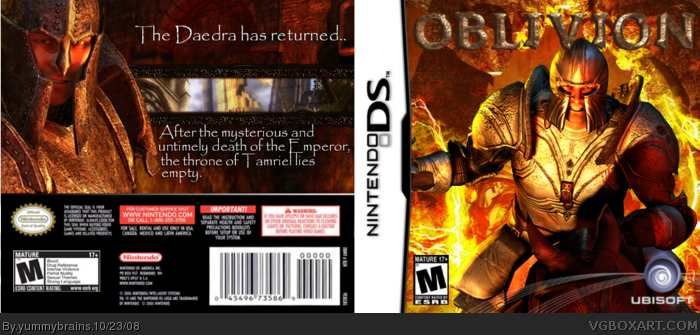
Yeah. I made a box.
Credits: Mist for the Ubisoft lines things;Star89er for the screenboarders and everyone who critiqued.
Anywho, don't ask why it's on DS =P
It looks pretty good, for the aim of the good, abit "old" if you ask me. I havn't seen that style on a box, for years, but I think you've nailed it well here. Rank 6, here we come :p
Hmm...Well, the front looks ok. It still feels a bit empty though, like there's something you could have added to it. The logo doesn't really stand out...it could use a glow or something around it, because it's kind of blending into the background... it just feels tacked on, and I'm not sure what to do. Talk to Vekta about it.
As far as the back...it's reaaaaally empty. Your screenshot borders are ok, and the placement is fine, but PLEASE don't blend your screenshots together like that....I can't tell you how much I hate it. A simple line to separate them will work wonders. I'm not entirely sure off the top of my head what the back needs, but it needs a lot of help, and it feels a bit rushes. Like you threw it together just so you could post it.
Not a whole lot you can do to fix this one, unless you want to update it, which is never the best option... I would just say on your next box, spend as much time on it as you can, within reason, until it looks great. Don't just throw your back together just to post. It doesn't work, believe me, I've tried. My test is: Look at it. Just sit back and look at it. If you can honestly tell yourself that you could see this case on the shelf, and that you would buy it, then you've got a good case. /rant
The only thing I don't really like is the lack of title on the front. I would have used the full title for the logo. But this is still pretty cool, and I would hope it would be a good game if it existed.
The front looks pretty decent although would look nicer if the logo stood out a bit more. Well the back... basically I agree with everything KoopaDasher said. Very empty and I just dont like the whole arrangement with the screenshots and text. Im not saying the back is terrible, just could be alot better! Still overall, a fairly decent box! Just not the great comeback we was all expecting ;) 3.5/5
#5, I agree about the logo. Also, yeah, the back was kinda rushed. Whenever I make a box I need it to get done quickly so I don't lose concentration. I'll work more on my next box
#6, Again, I agree. But I don't think it needs the full logo
#7, Basically what I said to Koopa ;)
#8, It is Ubisoft, I was looking at the box whilst doing it. I didn't use the Bethesada (Or whatever) because it would of looked out of place with the Ubi lines and it's a port :P
 The Elder Scrolls DS: Oblivion Box Cover Comments
Yeah. I made a box.
Credits: Mist for the Ubisoft lines things;Star89er for the screenboarders and everyone who critiqued.
Anywho, don't ask why it's on DS =P
Edited at 1 decade ago
[ Reply ]
5/5 nice
[ Reply ]
It looks pretty good, for the aim of the good, abit "old" if you ask me. I havn't seen that style on a box, for years, but I think you've nailed it well here. Rank 6, here we come :p
[ Reply ]
#2, Thanks
#3, Thank you, I do hope so :P
[ Reply ]
Hmm...Well, the front looks ok. It still feels a bit empty though, like there's something you could have added to it. The logo doesn't really stand out...it could use a glow or something around it, because it's kind of blending into the background... it just feels tacked on, and I'm not sure what to do. Talk to Vekta about it.
As far as the back...it's reaaaaally empty. Your screenshot borders are ok, and the placement is fine, but PLEASE don't blend your screenshots together like that....I can't tell you how much I hate it. A simple line to separate them will work wonders. I'm not entirely sure off the top of my head what the back needs, but it needs a lot of help, and it feels a bit rushes. Like you threw it together just so you could post it.
Not a whole lot you can do to fix this one, unless you want to update it, which is never the best option... I would just say on your next box, spend as much time on it as you can, within reason, until it looks great. Don't just throw your back together just to post. It doesn't work, believe me, I've tried. My test is: Look at it. Just sit back and look at it. If you can honestly tell yourself that you could see this case on the shelf, and that you would buy it, then you've got a good case. /rant
[ Reply ]
The only thing I don't really like is the lack of title on the front. I would have used the full title for the logo. But this is still pretty cool, and I would hope it would be a good game if it existed.
[ Reply ]
The front looks pretty decent although would look nicer if the logo stood out a bit more. Well the back... basically I agree with everything KoopaDasher said. Very empty and I just dont like the whole arrangement with the screenshots and text. Im not saying the back is terrible, just could be alot better! Still overall, a fairly decent box! Just not the great comeback we was all expecting ;) 3.5/5
[ Reply ]
UbiSoft? This is a Betesda and 2K game, still good tho
[ Reply ]
#5, I agree about the logo. Also, yeah, the back was kinda rushed. Whenever I make a box I need it to get done quickly so I don't lose concentration. I'll work more on my next box
#6, Again, I agree. But I don't think it needs the full logo
#7, Basically what I said to Koopa ;)
#8, It is Ubisoft, I was looking at the box whilst doing it. I didn't use the Bethesada (Or whatever) because it would of looked out of place with the Ubi lines and it's a port :P
Love Always, The Answer Man =P
lol
[ Reply ]
i think its great but it needs more pics at the back anyway my boxes arnt much better mine suck
[ Reply ]
#10, lol. Sam, you just need to practice. I used to suck =P
[ Reply ]
grammar fix- The Daedra have returned..
[ Reply ]