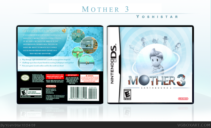
I decided to make this for plenty of reasons. The first reason is that I'm a really big Mother / Earthbound series fan. Second, this game (and the rest of the games in the series) don't have a worthy boxart! A great game should have atleast a decent boxart, so I decided to make this. It was a challenge as there aren't many renders available. I did the best I could from whatever I had. Oh, and I made it for DS cause I thought a DS remake would be sweet.
Okay, a couple of things to point out :
I remade the Mother 3 Logo completely by scratch on Photoshop except for the tree trunks which I got from the original logo. The original logo was very small and not easy to work with. Plus, I like my version more, haha.
I used the Brawl Lucas render because there isn't a proper pic of him anywhere ... Okay, this is a kinda rough version. PLEASE TELL ME WHAT I CAN DO TO MAKE IT BETTER! Thanks!!
I don't love the brown on the logo but other than that, this is freaking excellent. The scheme is perfect and - it's hard to explain but this is a 5/5 + fav
Another Awesome one! I probably would have gone for a red scheme to go with the original Japanese Mother 3 box, but this presentation is really slick, cool color scheme. I think it's just fine you used Brawl Lucas, it looks really cool that way.
#10, I know now! I've seen his boxes. He's gooood.
#13, the brown on the logo is from the original logo. I would've done something different to it, but I figured it was symbolic of something so I didn't change it. I would have a little, though. =)
#19, yeah, you're right. I wanted to, but there weren't many things to work with, and its my opinion that a simplistic red box looks strange.
I actually like the bits of red in the logo against the blue background. I would have added some more reddish highlights on the back of the box, but that's just me. Still great. ;)
You guys, the red/brown you guys are talking about are actually tree/earth like growths on the logo. He did that to represent the Earthbound surname to "Mother". A brilliant idea, that I believe was executed nicely.
 Mother 3 Box Cover Comments
Okay, there's a lot to say about this one.
I decided to make this for plenty of reasons. The first reason is that I'm a really big Mother / Earthbound series fan. Second, this game (and the rest of the games in the series) don't have a worthy boxart! A great game should have atleast a decent boxart, so I decided to make this. It was a challenge as there aren't many renders available. I did the best I could from whatever I had. Oh, and I made it for DS cause I thought a DS remake would be sweet.
Okay, a couple of things to point out :
I remade the Mother 3 Logo completely by scratch on Photoshop except for the tree trunks which I got from the original logo. The original logo was very small and not easy to work with. Plus, I like my version more, haha.
I used the Brawl Lucas render because there isn't a proper pic of him anywhere ... Okay, this is a kinda rough version. PLEASE TELL ME WHAT I CAN DO TO MAKE IT BETTER! Thanks!!
Edited at 1 decade ago
[ Reply ]
Pwnsome!
[ Reply ]
O_O
That looks INCREDIBLE!! +fav
[ Reply ]
You never cease to amaze me Yoshi! i love this! this is a spectacular peace of work especially for your thirdd box :) i love the colours..nice one :D
[ Reply ]
Thanks guys!! Anything I should change?
Edited at 1 decade ago
[ Reply ]
Wasa-bi would be proud.
[ Reply ]
Cool!
[ Reply ]
You are a certified beast.... This is amazing,
[ Reply ]
#6, Who's that? haha
[ Reply ]
#9, link
[ Reply ]
Wow. Thats brilliant
[ Reply ]
Hall of Fame.
Now.
[ Reply ]
I don't love the brown on the logo but other than that, this is freaking excellent. The scheme is perfect and - it's hard to explain but this is a 5/5 + fav
[ Reply ]
nice, this is just as good as your first
[ Reply ]
I love it so much.
I actually thought this was a wasabi box too aha.
+fav
[ Reply ]
Yoshi that is incredible. You are going to become the next MARKER in no time, +author fav
[ Reply ]
Very nice.
[ Reply ]
It's really great. Nice work dude :)
[ Reply ]
Another Awesome one! I probably would have gone for a red scheme to go with the original Japanese Mother 3 box, but this presentation is really slick, cool color scheme. I think it's just fine you used Brawl Lucas, it looks really cool that way.
5/5
[ Reply ]
Whoa, those faves came really fast! Haha.
#10, I know now! I've seen his boxes. He's gooood.
#13, the brown on the logo is from the original logo. I would've done something different to it, but I figured it was symbolic of something so I didn't change it. I would have a little, though. =)
#19, yeah, you're right. I wanted to, but there weren't many things to work with, and its my opinion that a simplistic red box looks strange.
Thanks for all the comments and faves, guys!!
[ Reply ]
Beautiful work.
[ Reply ]
I actually like the bits of red in the logo against the blue background. I would have added some more reddish highlights on the back of the box, but that's just me. Still great. ;)
[ Reply ]
You guys, the red/brown you guys are talking about are actually tree/earth like growths on the logo. He did that to represent the Earthbound surname to "Mother". A brilliant idea, that I believe was executed nicely.
[ Reply ]
#23, Plus it's part of the original Mother 3 logo.
Oh, and congrats on the HoF!
[ Reply ]
Nice job! The back could suit the game a bit more, but it works well enough.
Awesome game, if you haven't played it.
Edited at 1 decade ago
[ Reply ]
Ive just noticed the legal info is from pokemon.
[ Reply ]
Whooooooooops. Even I didn't notice that. You've gotta good eye ... don't know if I'll ever change that xD
[ Reply ]
#20, *Glass Breaking sound* Wasa-bi is a dude!? i thought he was a chick!
[ Reply ]
your's is way better than mine, great job!
[ Reply ]
FANTASTIC 5/5
[ Reply ]