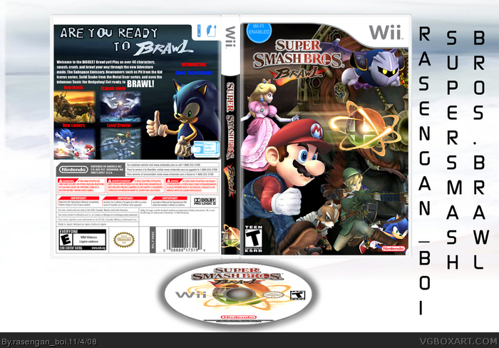
It's not perfect, but nice improvement shown here. A higher level of effort here. I think the screens can be shifted 10-20 pixels to the left so it's not right on the edge. I'll fav the effort.
If you want, you can send me that smash ball render and I'll make it better for you.
#4, I agree, but I really like it not in full view.
but there's wrong ESRB on the back, and that wifi logo looks really bad.
nintendo logo is small too
 Super Smash Bros Brawl Box Cover Comments
hmm... how is it... credit techne... temp... C-D... cerium...
[ Reply ]
Now this is quality work my friend! Very Nice!
Only problem is the badly rendered sphere on the front. And the fact that there's no background to the back.
Edited at 1 decade ago
[ Reply ]
yea!
[ Reply ]
It's not perfect, but nice improvement shown here. A higher level of effort here. I think the screens can be shifted 10-20 pixels to the left so it's not right on the edge. I'll fav the effort.
If you want, you can send me that smash ball render and I'll make it better for you.
Edited at 1 decade ago
[ Reply ]
#4, I agree, but I really like it not in full view.
but there's wrong ESRB on the back, and that wifi logo looks really bad.
nintendo logo is small too
[ Reply ]
FLYING CHARACTERS and what #2 #4 and #5 said - oh #4 "I'LL FAVE THE EFORT" can't see your name
[ Reply ]
Why this is pretty damn good, exapt for the problems pointed out before.
[ Reply ]
Hmmmmm not bad, not bad.
A slight improvement from your previous boxes.
[ Reply ]
Front is awesome! Back needs some work, but I'll still fav :)
[ Reply ]
i love your effort, i see improvement in you
[ Reply ]