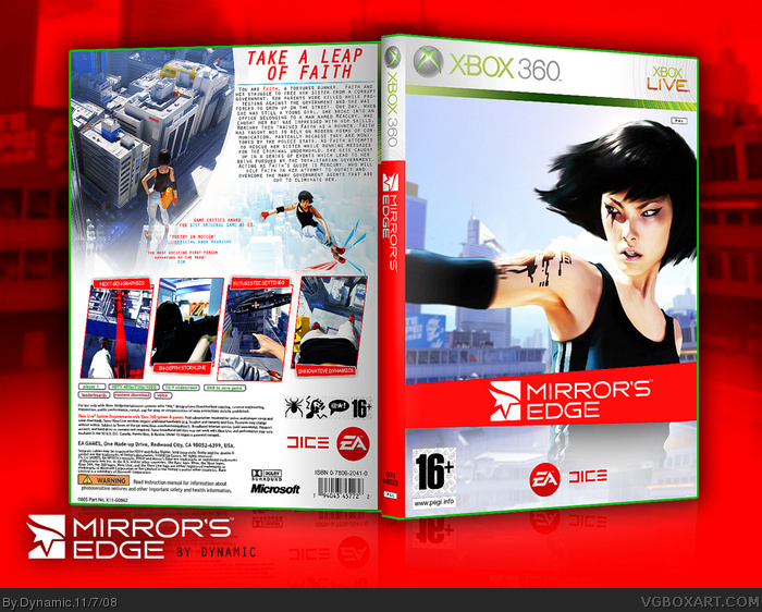
Hey guys, this is my 3rd individual box, hope its an improvement, though I worry my Endwar one is gonna be hard to beat by myself :( However, a challenge is a challenge and I attempted this, I feel there was a few ideas I could have went with but finished with this one and I am am very happy with it. Comments and faves are greatly appreciated.
Bewst viewed in printable(referring to the text, looks horrible on preview.)
Wow. This is incredible. I wouldn't be surprised if this was the the actual cover. Mirrors Edge looks good, and you made it look better. Well Done!!! This over-rules all of mine anyday probably cause I use paint because my Adobe Photoshop is way to hard to use. Awesome Work! 5/5.
Front's alright for me. But the back is where this box really shines. Very stylish layout though a bit too much text below the tagline. Presentation is really sweet btw, the contrast really directs the eyes to focus on the box. Great job!
hey dynamic! I got your printable and used it imandix pro, pm me if you want it because the casing will look better!
anyway very nice boxfaved and author faved!
It looks very professional. Something that you would see at Gamestop. As for it's artistic aspects, it's alright. I would have liked to have seen the front played up some. The back is very clean and sharp. I like that. Decent job overall :)
Thanks guys :) To #14, gotta agree with you, its not very original to be fair, and the front is simple, but I like the front's that way, however i'll try and work on the originality and artistic aspecs a bit more, but I kinda rushed it towards the end, cos I'm only able to do this stuff at my mates right now.
 Mirror's Edge Box Cover Comments
Hey guys, this is my 3rd individual box, hope its an improvement, though I worry my Endwar one is gonna be hard to beat by myself :( However, a challenge is a challenge and I attempted this, I feel there was a few ideas I could have went with but finished with this one and I am am very happy with it. Comments and faves are greatly appreciated.
Bewst viewed in printable(referring to the text, looks horrible on preview.)
Laters-
Dynamic
Edited at 1 decade ago
[ Reply ]
I love it!
[ Reply ]
Pretty Fantastic for a newbie :D
[ Reply ]
Only one thing... the second sentence should say "Faith struggles to free her sister from a corrupt government."
other than that... 5/5!
[ Reply ]
Thanks #4, i'll get that sorted soon.
[ Reply ]
Wow. This is incredible. I wouldn't be surprised if this was the the actual cover. Mirrors Edge looks good, and you made it look better. Well Done!!! This over-rules all of mine anyday probably cause I use paint because my Adobe Photoshop is way to hard to use. Awesome Work! 5/5.
[ Reply ]
great job, i really like it. maybe the pal ratings should be black, but its not that important. overall its great:)
[ Reply ]
ahha i seen this form a blank document
yes i gave him a little help with this lol
anywayz good work man
p.s you finally went home lol
[ Reply ]
awesome!
[ Reply ]
Front's alright for me. But the back is where this box really shines. Very stylish layout though a bit too much text below the tagline. Presentation is really sweet btw, the contrast really directs the eyes to focus on the box. Great job!
[ Reply ]
Thanks guys, appreciate the comments and fav's :)
[ Reply ]
1 more fav from anyone with 1 or more rank squares and this is HOF, pretty please :)
[ Reply ]
hey dynamic! I got your printable and used it imandix pro, pm me if you want it because the casing will look better!
anyway very nice boxfaved and author faved!
[ Reply ]
It looks very professional. Something that you would see at Gamestop. As for it's artistic aspects, it's alright. I would have liked to have seen the front played up some. The back is very clean and sharp. I like that. Decent job overall :)
[ Reply ]
well done man another HoF i just need a few more fav's and i get my first :)
[ Reply ]
Thanks guys :) To #14, gotta agree with you, its not very original to be fair, and the front is simple, but I like the front's that way, however i'll try and work on the originality and artistic aspecs a bit more, but I kinda rushed it towards the end, cos I'm only able to do this stuff at my mates right now.
[ Reply ]