-try making the front logo stand out better
-show more thought in the back concept and layout - pay close attention to the details that will match the theme of the game, from the tagline to the screen borders.
-go for something that complements the box presentation wise. Experiment! And keep up the good work. :)
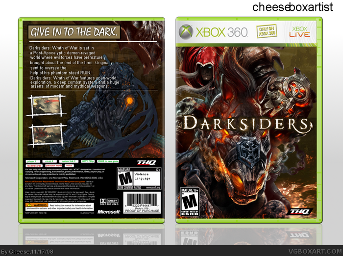
Same as pretty much everybody else. I like the front, but the back doesn't reflect much thought. The font is completely bare bones. And the older, blue render of War kind of looks odd with your color scheme.
 Darksiders Box Cover Comments
^.^ Enjoy!
[ Reply ]
I like the front, not the back.
[ Reply ]
Back's alright, it's an improvement though :)
[ Reply ]
That's what everyone says. -___-
[ Reply ]
Nice front.
[ Reply ]
Pretty good. Here are some pointers:
-try making the front logo stand out better
-show more thought in the back concept and layout - pay close attention to the details that will match the theme of the game, from the tagline to the screen borders.
-go for something that complements the box presentation wise. Experiment! And keep up the good work. :)
[ Reply ]
#6, That!
[ Reply ]
Could I get credit for the screenshot borders? I wouldn't generally mind but since they weren't exactly made for you, I'd appreciate it.
Edited at 1 decade ago
[ Reply ]
Credit to Techne for template?
[ Reply ]
Very good.
[ Reply ]
I think this looks pretty good.
[ Reply ]
#8 and 9, Yeah, ok. Credit to TTT for the sceenshot borders and Techne for the temp.
[ Reply ]
Same as pretty much everybody else. I like the front, but the back doesn't reflect much thought. The font is completely bare bones. And the older, blue render of War kind of looks odd with your color scheme.
Front is pretty solid, though, like I said.
[ Reply ]