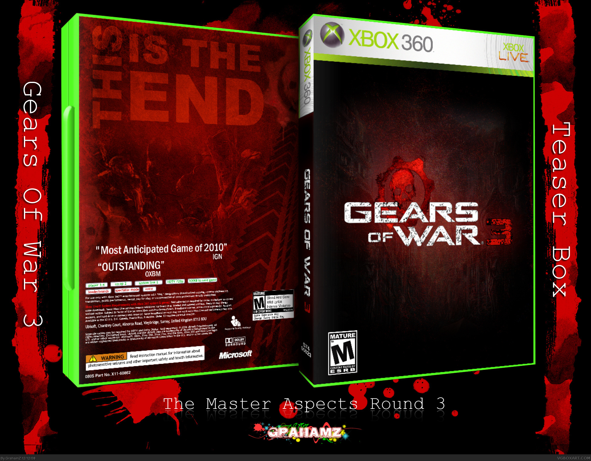
Cool that you know what IGN and OXM (Oficial Xbox Magasine shorten it to OXM, not OXBM btw ;) ) will say... :P
plain back, but then look at PAL Resident evil to GC...
#9, cause most people do live in america, also i didnt say that if you read it all, and i wanted to be on the safe side with the dev logo's as i dint know who will be doing it, it will probably be epic but things change.
#10, cheers man as you can tell it was hard to do and careful with the artwork i used as there is NOTHING for this game yet. (game is a trilogy) as as usual your comments mean alot :D
#11, thanks you i will try a few colour changes to the back maybe give it more of a dark mysterious feeling. but cheers for noticing this. as you all know when you look at a small difference in photoshop for a long time it seems to look ok lol
#12 err here it is OXBM lol
and cheers to everyone who comment and faved i love you all :D
 Gears of War 3 Box Cover Comments
This might have worked as a collections edition but I think more is needed on the back other wise.
[ Reply ]
Hey guys :D
20th box.
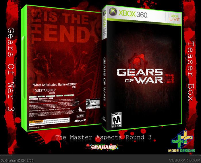
READ: this was to be a basic box with little on it as it was a teaser box for fans.
hope you still enjoy it :D
and thanks for comment Trev
Edited at 1 decade ago
[ Reply ]
#1,#2, What are you guys doing up at 4:30
Box is simple and nice although i think you should render off that big black blob on the 3.
Haha well its 7:30 now, thats why im up, 2 hours ago it was 4 lol
Edited at 1 decade ago
[ Reply ]
#3, lmao i live in scotland it's 12:34 in the afternoon here
what are you doing up at this time! lol
i will update soon and thanks
-UPDATED-
Edited at 1 decade ago
[ Reply ]
looking good ;)
[ Reply ]
cheers man i love you too ;) lol
[ Reply ]
love the back typography, and the texture.
gotta love grunge.
+fav =D
edit: not sure why it would be given an outstanding review until it was near release though. Its not a big deal, anyway.
Edited at 1 decade ago
[ Reply ]
#7, i never actually thought about that lol i think i put it there to fill up the space :p
[ Reply ]
#3 Why do you assume everyone lives in America =S
The box is missing a developer.
[ Reply ]
This is a great box based off the contest guidelines M_G set up. i think you did a great job with this.
[ Reply ]
Hmmm, thumbs up, but maybe the tagline should be less Red.
[ Reply ]
Cool that you know what IGN and OXM (Oficial Xbox Magasine shorten it to OXM, not OXBM btw ;) ) will say... :P
plain back, but then look at PAL Resident evil to GC...
[ Reply ]
#9, cause most people do live in america, also i didnt say that if you read it all, and i wanted to be on the safe side with the dev logo's as i dint know who will be doing it, it will probably be epic but things change.
#10, cheers man as you can tell it was hard to do and careful with the artwork i used as there is NOTHING for this game yet. (game is a trilogy) as as usual your comments mean alot :D
#11, thanks you i will try a few colour changes to the back maybe give it more of a dark mysterious feeling. but cheers for noticing this. as you all know when you look at a small difference in photoshop for a long time it seems to look ok lol
#12 err here it is OXBM lol
and cheers to everyone who comment and faved i love you all :D
[ Reply ]
Its ok, maybe a bit TOO bland, but I quite like the back arrangement, its nice :)
[ Reply ]
cheers man but it was to be bland! :)
[ Reply ]
Hmm. GoW 3 is not coming until next generation. You should have thought of that before you wrote down 2010.
[ Reply ]