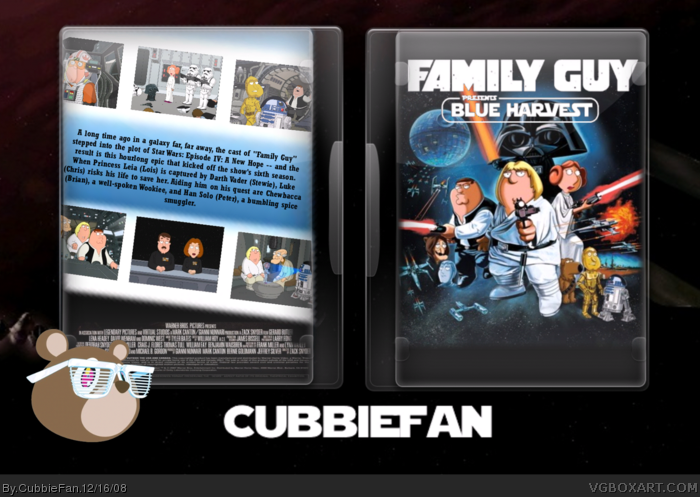
Just saw this hour long show and was like, man i should do a box for that. Originaly i was only going to make it for fun, but liked it so much i uploaded it. The White part the pics on the back are in are lightsabers if you didnt no and or guess. Credit to Mauricio Estrella for the temp
Wow man, your really showing us what you got now. The screenshots aren't in a perfect diagonal across the back, but otherwise, this looks terrific. Great job, and I love the little bear with the Big Trouble in Little China Glasses.
#10, Does that make it any better? Gather around kids, it's time for some harsh criticism with uncle Dersnap!
Prepare for the inevitable; it's bad. The front is just a blurry, sized up picture with a poorly cut out logo (most likely a 2-second magic wand job) and the back is just a gradient with some turned (blurry, I might add) images with some wierd black around them, accompanied by an unfitting font with no effects what so ever. It's an improvement, but it's not great.
Basically,
1. Get some renders, cut them out and add them onto-or make-a background.
2. Get less blurry screenshots.
3. Be more original with your back, maybe add some stars, better text, a few renders.
Follow those guidelines and you should have a decent box.
Ok, #11. A couple questions though.
1. Whats wrong with my logo? It is not cut out badly at all.
2. Am i realy that bad that this is an improvment? You say it so bad, yet you say that this is an improvment.
Thanks for the help, and i will take some of it into consideration. You can have your oppinion, your intitled to it.
#16, I actuly worked hard on this box. And like i told Dersnap, you are entitled to your own opinion. But do you realy have to be so harsh about it? Not an improvment? This is my best box, ever. And #15, yea GK it is funny.
Yea, thought about that. Working on a v2 that should be up later when i get home, it will have a tag line, along with some of the things that Dersnap wanted me to change.
 Family Guy Presents: Blue Harvest Box Cover Comments
Just saw this hour long show and was like, man i should do a box for that. Originaly i was only going to make it for fun, but liked it so much i uploaded it. The White part the pics on the back are in are lightsabers if you didnt no and or guess. Credit to Mauricio Estrella for the temp
Edited at 1 decade ago
[ Reply ]
Wow man, your really showing us what you got now. The screenshots aren't in a perfect diagonal across the back, but otherwise, this looks terrific. Great job, and I love the little bear with the Big Trouble in Little China Glasses.
[ Reply ]
Thanks Drakxxx, that means alot comming from you
[ Reply ]
the front is the official.
[ Reply ]
the front is a pic on google but its good
[ Reply ]
#4, read #5. Yea its a pic, with a cut out logo on top. Hey #4, look at half your boxes, Theyre the same thing.
[ Reply ]
great back. don't think they look like lightsabers, but it's good nonetheless.
[ Reply ]
Thanks #7, lol
[ Reply ]
#6, wth are you talking about?
[ Reply ]
#9, the front is not official, its a pic with a logo on it.
[ Reply ]
#10, Does that make it any better? Gather around kids, it's time for some harsh criticism with uncle Dersnap!
Prepare for the inevitable; it's bad. The front is just a blurry, sized up picture with a poorly cut out logo (most likely a 2-second magic wand job) and the back is just a gradient with some turned (blurry, I might add) images with some wierd black around them, accompanied by an unfitting font with no effects what so ever. It's an improvement, but it's not great.
Basically,
1. Get some renders, cut them out and add them onto-or make-a background.
2. Get less blurry screenshots.
3. Be more original with your back, maybe add some stars, better text, a few renders.
Follow those guidelines and you should have a decent box.
[ Reply ]
Ok, #11. A couple questions though.
1. Whats wrong with my logo? It is not cut out badly at all.
2. Am i realy that bad that this is an improvment? You say it so bad, yet you say that this is an improvment.
Thanks for the help, and i will take some of it into consideration. You can have your oppinion, your intitled to it.
[ Reply ]
very nice. very nice. :)
[ Reply ]
Thanks GK, you no i learn alot from looking at your boxes.....well at least the ones that actuly do have backs, lol
Edited at 1 decade ago
[ Reply ]
that's not funny! xD
[ Reply ]
#12 Its not an improvement. A logo isnt hard to make, the back is terrible, and the front is an image on google.
Edited at 1 decade ago
[ Reply ]
#16, I actuly worked hard on this box. And like i told Dersnap, you are entitled to your own opinion. But do you realy have to be so harsh about it? Not an improvment? This is my best box, ever. And #15, yea GK it is funny.
[ Reply ]
nice but the back could use a tagline
[ Reply ]
Yea, thought about that. Working on a v2 that should be up later when i get home, it will have a tag line, along with some of the things that Dersnap wanted me to change.
[ Reply ]
i still don't understand that template. lol.
[ Reply ]
I dont either, but i love how it looks
[ Reply ]
I personally believe that this is the best you've done! I like it!
[ Reply ]
Thanks Outcast, that means alot
[ Reply ]
Thanks for all the favs and comments :)
[ Reply ]