Just a quickie, sorry some of the back is hard to read. 3D version coming soon.
UPDATE: 3D version by ChuckyCheese123, click Version 1 to see the original, 2D one
2- Ok, I deleted the "3D", and how do I clean it up?
@ChuckyCheese123
That isn't 3d, you just skewed the box and put on a bad reflection.
@SD
Box has usual problems for you, clean it up instead of making a new one.
Seriously, do you even try? The background is random, some images are choppy, back tagline is terrible, the spine with Shadow, ????? the typography is to plain, and why do all your boxes have such screwed up copyright information?
3- Yes, I DO try, the bg was chosen to look best, I got ALL the renders from sonicartarchive, the spine is just because it was part of the temp, the typography,maybe,I don't have alot of fonts, AND THE COPYRIGHT INFO IS PART OF IT TOO!!!
5- I have GIMP but I really dont know how to use it. And if you have any templates better than this, then fire away. And I am trying! Compare THIS to THIS link
6-
Front- WHAT NTSC
Spine- Ihad to have shadow SOMEWHERE
back- I dont have many fonts
Rest- I DO USE PAINT.NET and I've done several collabs and out of those 4 months, almost 1 was spent being banned (2 2 week segments)
#4, Get a better template, maybe? Use a better program. Try to improve! There's no point in trying unless your improving. Trying IS improving. Try using Gimp or the CS4 Photoshop trial.
Awful really. Reasons why:
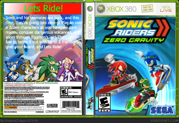
The front: very choppy renders, the logo is blurry and where'd you get the background from? You also forgot the ntsc logo.
The spine: That render at the bottom is out of place and choppy.
The back: Very plain, very bad choice of font, the bottoms screwed up and the background doesn't work with that text. The lets ride part isn't even rendered and its not typography its just a plain font.
Please stop using paint, if you don't want to learn GIMP then use paint.net its not quite as deep as GIMP but its a lot less complicated and it has a hell of alot more features than paint.
And the thing is this is your 79th box in 4 months here. And frankly you've hardly improved since that first box, you really need to work on a project or maybe try a couple of collabs. I hope that helped.
 Sonic Riders: Zero Gravity Box Cover Comments
Just a quickie, sorry some of the back is hard to read. 3D version coming soon.
UPDATE: 3D version by ChuckyCheese123, click Version 1 to see the original, 2D one
2- Ok, I deleted the "3D", and how do I clean it up?
Edited at 1 decade ago
[ Reply ]
@ChuckyCheese123
That isn't 3d, you just skewed the box and put on a bad reflection.
@SD
Box has usual problems for you, clean it up instead of making a new one.
[ Reply ]
Seriously, do you even try? The background is random, some images are choppy, back tagline is terrible, the spine with Shadow, ????? the typography is to plain, and why do all your boxes have such screwed up copyright information?
Edited at 1 decade ago
[ Reply ]
3- Yes, I DO try, the bg was chosen to look best, I got ALL the renders from sonicartarchive, the spine is just because it was part of the temp, the typography,maybe,I don't have alot of fonts, AND THE COPYRIGHT INFO IS PART OF IT TOO!!!
5- I have GIMP but I really dont know how to use it. And if you have any templates better than this, then fire away. And I am trying! Compare THIS to THIS link
6-
Front- WHAT NTSC
Spine- Ihad to have shadow SOMEWHERE
back- I dont have many fonts
Rest- I DO USE PAINT.NET and I've done several collabs and out of those 4 months, almost 1 was spent being banned (2 2 week segments)
Edited at 1 decade ago
[ Reply ]
#4, Get a better template, maybe? Use a better program. Try to improve! There's no point in trying unless your improving. Trying IS improving. Try using Gimp or the CS4 Photoshop trial.
[ Reply ]
Awful really. Reasons why:
The front: very choppy renders, the logo is blurry and where'd you get the background from? You also forgot the ntsc logo.
The spine: That render at the bottom is out of place and choppy.
The back: Very plain, very bad choice of font, the bottoms screwed up and the background doesn't work with that text. The lets ride part isn't even rendered and its not typography its just a plain font.
Please stop using paint, if you don't want to learn GIMP then use paint.net its not quite as deep as GIMP but its a lot less complicated and it has a hell of alot more features than paint.
And the thing is this is your 79th box in 4 months here. And frankly you've hardly improved since that first box, you really need to work on a project or maybe try a couple of collabs. I hope that helped.
[ Reply ]