Well, here I am! And just in time too! Day 2 of the BYTD Winter Party! I haven't been around much at all (and neither have my boxes =P ) but I couldn't pass up the opportunity to support the group here at the end of the year.
As for my submission, a little new artwork thrown into a classic game. I didn't spend half the amount of time I usually do on my artwork/designs, but I really haven't had the time! Hope you all still enjoy!
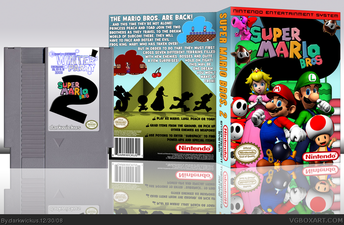
It's awesome! I agree with #1, though. The '2' on the front feels like more of a black swirl design. I suggest make it the same size as the height of the logo. The logo looks fine on the cartridge like that though.
lol, I really don't like Mario Bros. 2, it wasn't even supposed to be a Mario game. Anyway, I really like your logo for this. The back is hilarious to me. I can just imagine them getting chased back and forth.
Wow! You did some really interesting things! I especially like those black stars you made! I like to suggest to make a normal two though, because it just looks like a back design. ;) Nice job!
Happy new year guys! And thanks for the support on this one.
As for the "2" on the logo... there are not many new renders for many of the SMB2 enemies (I had to create the Ninji from SMG stars) and so I needed to fill a good amount of space. I tried to keep the characters from interfering with the 2 as best I could, but I did intend for it to be larger than life. It's also why I made the cartridge label the way I did... more like a demo/competition cart than a true label.
I recall this game from my childhood having an extremely cartoony feel compared to 1 and 3(and now all growed up, I understand that it was because it wasn't originally a Mario game) and I wanted to show that off with the art, so I am glad there is a positive response to the "chase scene" on the back!
#7: As for candy, I don't see it. But hey, whatever works!
 Super Mario Bros. 2 Box Cover Comments
'Tis sweet.
But the "2" on the front is barely legible.
And I don't like how you placed the BYTD logo on the cartridge.
EDIT: First comment and first fav. Woot.
Edited at 1 decade ago
[ Reply ]
Well, here I am! And just in time too! Day 2 of the BYTD Winter Party! I haven't been around much at all (and neither have my boxes =P ) but I couldn't pass up the opportunity to support the group here at the end of the year.
As for my submission, a little new artwork thrown into a classic game. I didn't spend half the amount of time I usually do on my artwork/designs, but I really haven't had the time! Hope you all still enjoy!
And party on!
[ Reply ]
Awesome!
[ Reply ]
Sweet :)
[ Reply ]
It's awesome! I agree with #1, though. The '2' on the front feels like more of a black swirl design. I suggest make it the same size as the height of the logo. The logo looks fine on the cartridge like that though.
[ Reply ]
lol, I really don't like Mario Bros. 2, it wasn't even supposed to be a Mario game. Anyway, I really like your logo for this. The back is hilarious to me. I can just imagine them getting chased back and forth.
[ Reply ]
Everyone on the front looks like candy :D
#6, Agreed!
[ Reply ]
Hell Yeah, you're back o/
Pretty sweet box, NES rules!
[ Reply ]
#7, Candy! lol have to say it does. Awsome box dude glad you were able to make it :)
[ Reply ]
Wow! You did some really interesting things! I especially like those black stars you made! I like to suggest to make a normal two though, because it just looks like a back design. ;) Nice job!
[ Reply ]
Happy new year guys! And thanks for the support on this one.
As for the "2" on the logo... there are not many new renders for many of the SMB2 enemies (I had to create the Ninji from SMG stars) and so I needed to fill a good amount of space. I tried to keep the characters from interfering with the 2 as best I could, but I did intend for it to be larger than life. It's also why I made the cartridge label the way I did... more like a demo/competition cart than a true label.
I recall this game from my childhood having an extremely cartoony feel compared to 1 and 3(and now all growed up, I understand that it was because it wasn't originally a Mario game) and I wanted to show that off with the art, so I am glad there is a positive response to the "chase scene" on the back!
#7: As for candy, I don't see it. But hey, whatever works!
Thanks again all!
[ Reply ]
Awsum. Oh wait, it's for the Winter Party. Never mind. Haha, just kidding. Still awsum. No complaints.
[ Reply ]
Love this one :D
[ Reply ]
This is amazing except u might wanna improve the lumas 2 look a little more like Ninjis. ;D
Edited at 1 decade ago
[ Reply ]