#2, Well, I put AO as in the first one there is a sex scene and whatnot and the series has only got more violent and smutty from there :D Also, how would someone cheat (apart from being influenced by the box). This is probably my quickest work yet at only about 2 hours, I have 2 800 word essays to write in 2 days for the start of term so I needed to get this out of the way, also, thanks #3... I think? What do you mean "would be"
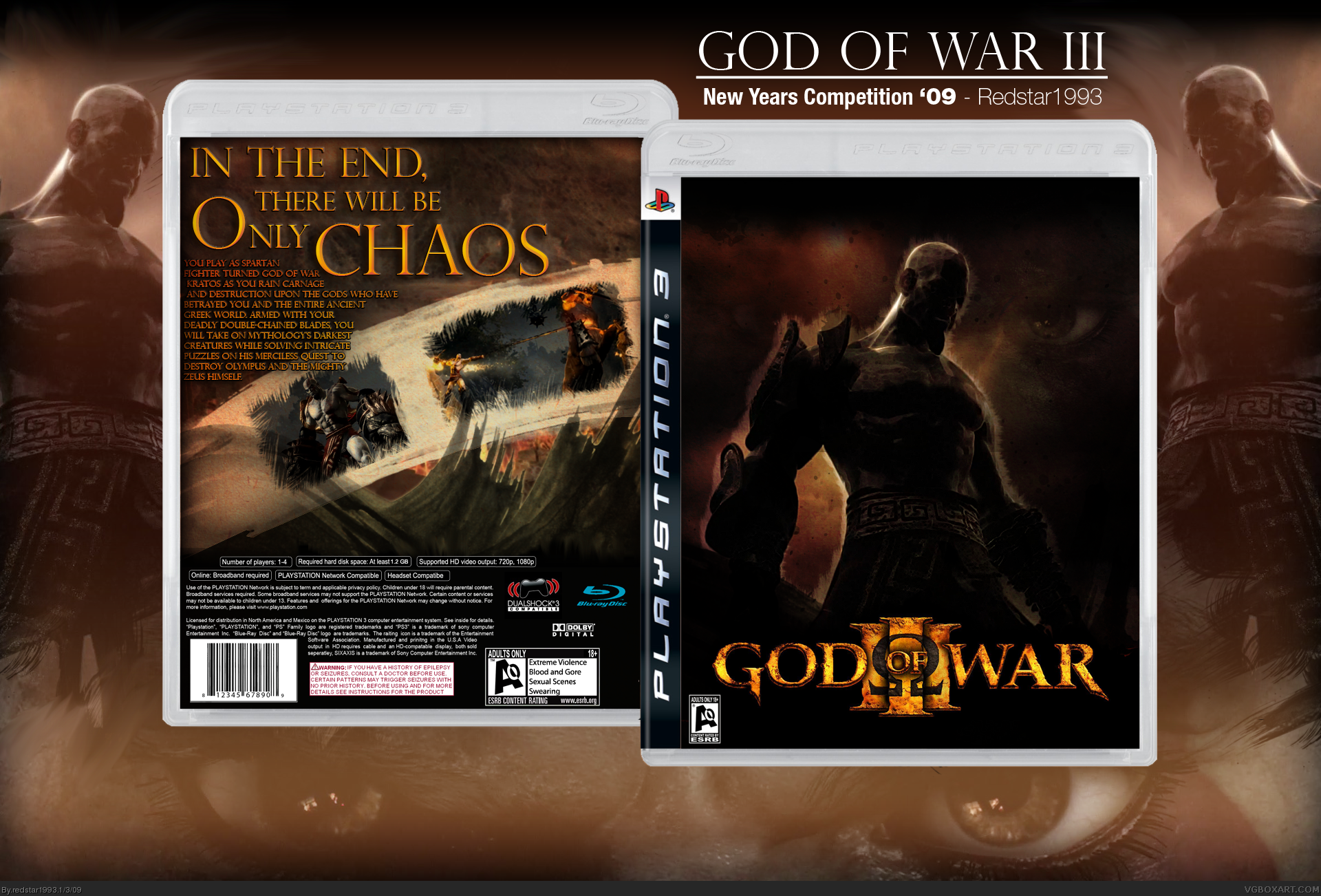
Edit - V2 is up, slight alterations and back text typo fixed where it says "his" instead of "yours"
This looks really awesome. Some things i might suggest to make look even better :
- Developer logo (in this case, Sony Computer Entertainment)
- Mature ESRB
- Try and incorporate some blood effects on the front, maybe some color burns
I really can't believe your still only rank 1, your a great artist and in a few months will be known as an accomplished artist for definate.
As for this box, the dev logo is way too small and it would also be Mature. You really need some blood splatters ( would work best on the back ) as this is a beautifully gory series :p
overall very nice style, good luck in the comp :)
EDIT: Completely off topic but I've just noticed that redstar1993 is my ebay account name! Weird or what?
#10, Thanks very much, with a bit of work and tips taken from you guys I could be looking at my first ever HOF, I have to write an essay now but I'll have a bit of a fix up afterwards if I can be bothered (It's bloody midnight here) Anyway, I'll fix it up before the comp is due.
EDIT - sorry if this is a noob question but is it 20 favs for a HOF?
#11, it doesn't go by certain amount of favs. nowadays, it's really just if your box is really good. It used to be about points, but i really think that doesn't matter as much anymore, but it does have a role. It used to be like 150 - 165 Points for Hall Of Fame.
POINTS - by every username, there are a certain amount of red squares. If a person has 6 squares, like me, his / her fav is worth 6 points. But at the same time, this can be weird. If you look at other HoF boxes, two people can have rank 9, but the person who is first or before another person has a more valuable fav. For example, on my Mario Party 4 box, jevangod and Cerium are both rank 9, but jevangod's fav is worth more, and thus he is before Cerium.
 God of War III Box Cover Comments
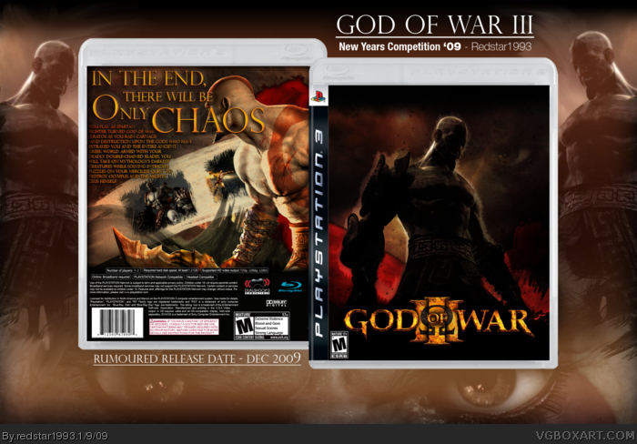
My entry for the 2009 new years comp, I am running against arooguy, Comments appreciated.
[ Reply ]
Holy Crap! Though Ao?
Okay, so if someone cheats, dont come crying to me :P
Edited at 1 decade ago
[ Reply ]
Aroo would be so pissed xD
Edited at 1 decade ago
[ Reply ]
#2, Well, I put AO as in the first one there is a sex scene and whatnot and the series has only got more violent and smutty from there :D Also, how would someone cheat (apart from being influenced by the box). This is probably my quickest work yet at only about 2 hours, I have 2 800 word essays to write in 2 days for the start of term so I needed to get this out of the way, also, thanks #3... I think? What do you mean "would be"
Edit - V2 is up, slight alterations and back text typo fixed where it says "his" instead of "yours"
Edited at 1 decade ago
[ Reply ]
I like the way the text is arranged on the back
[ Reply ]
#5, Thanks, I took the influence from the slew of mirrors edge boxes recently with the text all over the back arranged like a brick wall.
Edit - Sorry for comment bumping, The ratio is terrible, I'll stop
Edited at 1 decade ago
[ Reply ]
That back is really kool.
[ Reply ]
This looks really awesome. Some things i might suggest to make look even better :
- Developer logo (in this case, Sony Computer Entertainment)
- Mature ESRB
- Try and incorporate some blood effects on the front, maybe some color burns
Edited at 1 decade ago
[ Reply ]
Terrific design. I really like the back.
[ Reply ]
I really can't believe your still only rank 1, your a great artist and in a few months will be known as an accomplished artist for definate.
As for this box, the dev logo is way too small and it would also be Mature. You really need some blood splatters ( would work best on the back ) as this is a beautifully gory series :p
overall very nice style, good luck in the comp :)
EDIT: Completely off topic but I've just noticed that redstar1993 is my ebay account name! Weird or what?
Edited at 1 decade ago
[ Reply ]
#10, Thanks very much, with a bit of work and tips taken from you guys I could be looking at my first ever HOF, I have to write an essay now but I'll have a bit of a fix up afterwards if I can be bothered (It's bloody midnight here) Anyway, I'll fix it up before the comp is due.
EDIT - sorry if this is a noob question but is it 20 favs for a HOF?
Edited at 1 decade ago
[ Reply ]
#11, it doesn't go by certain amount of favs. nowadays, it's really just if your box is really good. It used to be about points, but i really think that doesn't matter as much anymore, but it does have a role. It used to be like 150 - 165 Points for Hall Of Fame.
POINTS - by every username, there are a certain amount of red squares. If a person has 6 squares, like me, his / her fav is worth 6 points. But at the same time, this can be weird. If you look at other HoF boxes, two people can have rank 9, but the person who is first or before another person has a more valuable fav. For example, on my Mario Party 4 box, jevangod and Cerium are both rank 9, but jevangod's fav is worth more, and thus he is before Cerium.
[ Reply ]
Hmm, strange indeed, makes sense though... in some weird way. It should be stickied so n00bs like myself know.
Edited at 1 decade ago
[ Reply ]
Daaammnnnn! I know I'm competing with this box but I'm still gonna fav it.
[ Reply ]
the back is very nice, but the front seems a little too dark IMO (that's probably because of my damn computer screen :)
EDIT: the PlayStation 3 and Blu-ray logos on the back template should be mirrored.
Edited at 1 decade ago
[ Reply ]
3rd and final revision for the comp, wish me luck. :)
Edited at 1 decade ago
[ Reply ]
Looks really nice, the front is pretty cool, its clean and sleek, but its missing the dev logo on the bottom right. D:
I love love love the tagline and how it looks, but not too big a fan of how it covers Kratos' face.
And as another has said, the temp for the back should be mirrored horizontally.
Other then that, i dont see much else to say about it, it's an overall great box, good job. :)
Edited at 1 decade ago
[ Reply ]