[ Buy Metroid Prime at Amazon ] By Wario22 11 on January 10th, 2009 No Printable Available [ Box updated on January 23rd, 2009 ] [ original ] Metroid Prime Box Cover Comments Comment on Wario22's Metroid Prime Box Art / Cover. Cancel Reply Wario22 11 [ 1 decade ago ] Wow! My Best Box Yet! my Birthday is 3. Feb. and i get Adobe Photoshop! *reading all photoshop tutorials* =D ok.... Logo: Err..... Damn, i forgot the name! [ Reply ] cooljay1622 37 [ 1 decade ago ] not bad would like to see a back though [ Reply ] Wario22 11 [ 1 decade ago ] no! I dont have good fonts for a Back! [ Reply ] cooljay1622 37 [ 1 decade ago ] go to dafont.com they have some good fonts there [ Reply ] Yami Mario 3 [ 1 decade ago ] Looks awesome. [ Reply ] CengizMan 29 [ 1 decade ago ] Looks great, make the PEGI smaller though. [ Reply ] Wario22 11 [ 1 decade ago ] ok i look on dafont.com and make the pegi smaller. [ Reply ] YoshiStar 46 [ 1 decade ago ] Pretty cool! Logo is barely touching the Gamecube panel, though. [ Reply ] Wario22 11 [ 1 decade ago ] UPDATE: the pegi is now smaller and here is a back. Edited at 1 decade ago [ Reply ] Jbone 32 [ 1 decade ago ] Well the back is pretty average, but the front is really good. Oh and the background comes out of the template in some cases. Edited at 1 decade ago [ Reply ] Wario22 11 [ 1 decade ago ] what? really? wait... O.O Oh no! Doh! This is too hard to fix........ -.- [ Reply ] Spiderpig24 48 [ 1 decade ago ] I really like the front but the back needs some work. It's definately your best so far. +fav [ Reply ] Veronica 41 [ 1 decade ago ] I really like the front, the back needs some work. Maybe make the font smaller, and put a render of Samus. [ Reply ] Ray Blade 40 [ 1 decade ago ] What Veronica said. Try adding some Text effects to the back text as well, it makes it pop out more. [ Reply ] Wario22 11 [ 1 decade ago ] update: the problem "the background comes out of the template in some cases." is fixed [ Reply ] a-beast-of-art 39 [ 1 decade ago ] Fantastic front, the back is bad, mabey do what Veronica said, but fav for the front. [ Reply ] Enchanter 36 [ 1 decade ago ] Love the front but the back... not so much. [ Reply ] Wario22 11 [ 1 decade ago ] BIG UPDATE: The back is now much better! [ Reply ]
 Metroid Prime Box Cover Comments
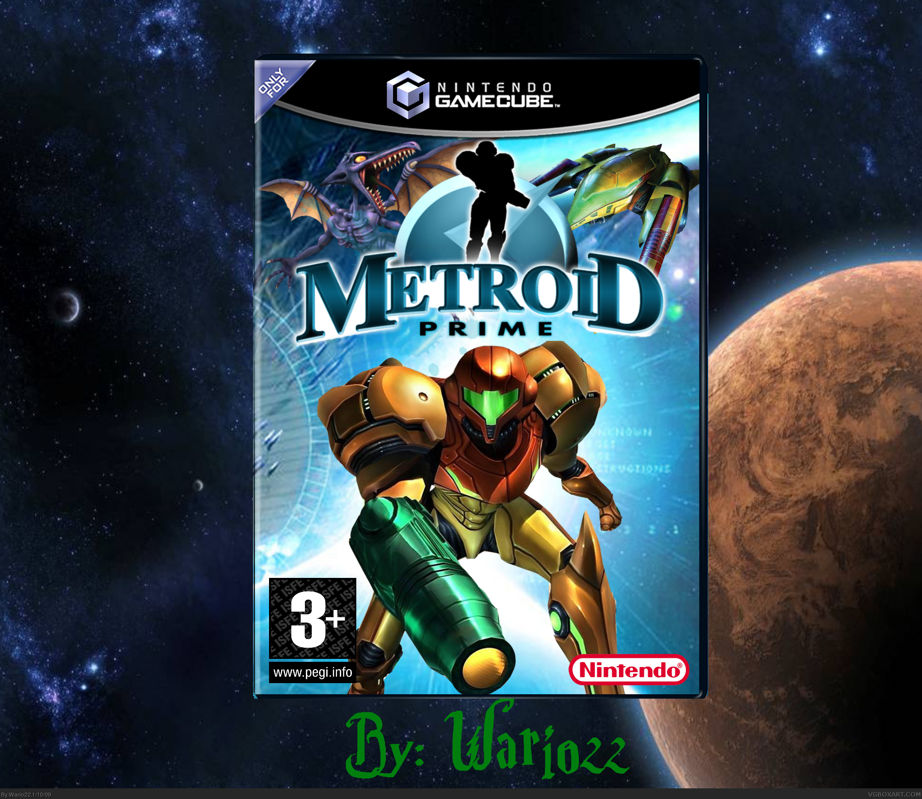
Wow! My Best Box Yet! my Birthday is 3. Feb. and i get Adobe Photoshop! *reading all photoshop tutorials* =D
ok.... Logo: Err..... Damn, i forgot the name!
[ Reply ]
not bad would like to see a back though
[ Reply ]
no! I dont have good fonts for a Back!
[ Reply ]
go to dafont.com they have some good fonts there
[ Reply ]
Looks awesome.
[ Reply ]
Looks great, make the PEGI smaller though.
[ Reply ]
ok i look on dafont.com and make the pegi smaller.
[ Reply ]
Pretty cool! Logo is barely touching the Gamecube panel, though.
[ Reply ]
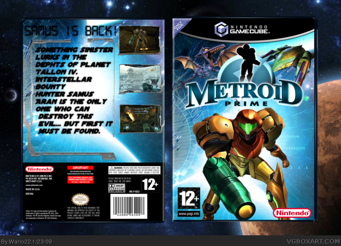
UPDATE: the pegi is now smaller and here is a back.
Edited at 1 decade ago
[ Reply ]
Well the back is pretty average, but the front is really good. Oh and the background comes out of the template in some cases.
Edited at 1 decade ago
[ Reply ]
what? really? wait... O.O Oh no!
Doh! This is too hard to fix........ -.-
[ Reply ]
I really like the front but the back needs some work. It's definately your best so far. +fav
[ Reply ]
I really like the front, the back needs some work. Maybe make the font smaller, and put a render of Samus.
[ Reply ]
What Veronica said. Try adding some Text effects to the back text as well, it makes it pop out more.
[ Reply ]
update: the problem "the background comes out of the template in some cases." is fixed
[ Reply ]
Fantastic front, the back is bad, mabey do what Veronica said, but fav for the front.
[ Reply ]
Love the front but the back... not so much.
[ Reply ]
BIG UPDATE: The back is now much better!
[ Reply ]